
There’s this concept in startups about giving customers a “moment of delight” – like, remember the first time you called a car to pick you up after a fun night out and got home safely? Or the first night you had a delicious meal from your favorite restaurant delivered and you got to enjoy it in your PJs? It’s the thing that happens when you’re like, “wow, this is AWESOME. I’m so glad this thing exists and that I tried it out.” That’s how I felt when I, in a design paralysis-induced panic amplified by a looming shoot deadline, reached out to Minted’s art styling service for help in designing my hallway’s gallery wall late last year. This is a free service they offer to ANYONE – you just text them a photo of your home along with a few details (dimensions and what kind of pieces you’re looking for, mainly) and their in-house experts will dig through their massive collection to help you pick work from independent artists that you’ll love. In case you missed it, this is where we landed on my wall… 
Gallery Wall Left to Right: Sandstone Dunes 1 by Liz Taylor | Malena by Alex Roda | Tangerine by Emily Kariniemi | Roller Skates by Cristiane | you are seen by Alicia Schultz | Face Study I By Chelsea Petaja | Arches by Alaric Yanos | Falconer by Andrew McClintock | Squares by Alisa Galitsyna MAN, DID I FEEL SEEN. (They usually render their selected pieces on your actual photo, but my stylists set mine up in this way – just against the paint color I had shared with them – because the hallway photos I sent in my rushed panic were #verybad.) And while the process couldn’t have been dreamier – they picked the sizes, frames, matting, orientation, and they added everything to my cart for a quick and simple checkout – I was most moved by their dedication to building the BEST home for independent art discovery on the internet. Like, guys, I’ve worked in startups. (Maybe you have, too! If so, I think you’ll relate to the following.) It’s a constant juggling act of figuring out what to prioritize and where to grow your business – it speaks volumes to me that Minted was like, “hey, let’s staff up on folks who will make sure our customers have a delightful, easy, fun experience and so we can make sure that every piece of art on our site has a chance of being discovered and loved.” (Cause, like, they could have instead chosen to invest in lots of pizza parties, or weird branded swag, or in a team that pivots into hand-building barely-functional hardware products – those were my last startup’s personal kryptonites, at least.) 
So that’s what I told the team from Minted on a recent Zoom call – I just really wanted them to know that I had a great experience and that they’d built such an incredible resource to discover affordable, beautiful art. I love that they’ve created a home where artists can make a living without the stress of trying to build a brand or a huge social following AND that Minted has invested in the tools to help us regular folks sort through their huge, fabulously-curated selection. Plus, more than 90% (!!!) of the artists on the site identify as female and a majority of artists are parents, too. Does it get better than this? At this point, I’m sure the Minted team was like, “uh, who is pitching who here??? Did we switch jobs and companies??? What is happening???” but they were also VERY nice about it, and they tolerated my rambling for a SOLID five to eight minutes. When I finally stopped to take a breath, they hit me with the most exciting news yet: they had declared April 3rd as the first annual Independent Artist Day – a holiday that shockingly did not exist until RIGHT NOW – and they asked if we could leverage our platform to shine a light on a few of the incredible and talented artists on their website. I don’t think I’ve ever said “yes” so quickly to a partnership offer in my life – I don’t think I even asked if they had a budget, I just wanted to help drive traffic to these creators!!! – so today, I’m SO excited for EHD to highlight a few of the pieces from Minted’s new Fearless Optimism Challenge. It’s a curated collection of artwork, home goods, and stationary all inspired by – you guessed it – a sense of fearless optimism. We picked 8 favorites that run the gamut for all types of decor style, but there’s still a whooooole bunch of other joy-inducing pieces available right here. But enough of my yammering (said you, reading through this post; said my internal monologue any time I open my mouth; and probably said the Minted team after our Zoom when I physically could not stop shouting unsolicited compliments at them) – CAN I SHOW YOU THE ART??? (If anything below strikes your fancy, you can grab 15% off – to celebrate Minted’s 15th anniversary – with code FIFTEEN.) 
The Art: Azalea en Noir 
The Art: West Coast Backyard 
The Art: Bliss 
The Art: Beige Flower 
The Art: In The Pink 
The Art: After The Storm 
The Art: Peeking 
The Art: Joy Comes In The Morning In case that’s not enough art for ya today, here are a few more standout pieces we fell in love with while browsing the Fearless Optimism Collection. There’s something for everyone, right? 
1. Persevere | 2. Blue Rain | 3. Chin Up | 4. Radhaben and the Gold Coins | 5. Sand of Whispers | 6. The light 
1. Morchella Pillow | 2. Paper Flower Pillow | 3. Summer Breeze Pillow This is where I’ll leave you. I think I’ve made my case for Minted – thoughts? (Can you tell I’m a huge fan? Did that come across here?) Again, you can grab 15% off site-wide – and 25% off Save the Dates! – through Monday, April 4th with code FIFTEEN. If you’re on the hunt for art, home goods, or stationary, there’s no better time to shop (and no better way to get funds straight into the hands of creatives). And if you need a little help navigating their awesome selection (you know, like I did), shoot a text to (415) 993-WALL for some fast and free expert guidance. Let’s celebrate some independent artists, spruce up our spaces, and make our houses feel more like home. CHEERS, FRIENDS. See ya down there. xx Opening Photo Credits: Design by Jess Bunge | Photo by Sara Ligorria-Tramp | From: Makeover Takeover: Jess’ Long Awaited (Small Space) Living Room Reveal The post Want Beautiful, Affordable Art? Want To Support Independent Artists? Need Help Finding the Perfect Piece? Boy, This Is The Post For You… appeared first on Emily Henderson. via Emily Henderson https://stylebyemilyhenderson.com/blog/where-to-buy-art-online-by-independent-artists
0 Comments

There is something about the design process that we don’t talk about much. It’s this thing where you spend a lot of time making one space beautiful and when it is finished you feel so happy and fulfilled. For a while. Then you start to look at the other spaces in your home that aren’t as beautiful and you begin to resent them. It eventually takes away from the beautiful spaces until you are forced to start the design process all over again. This, as you might have guessed, is where I am at with my bedroom. If you read my living room and dining room reveal, you might recall it took me about two years to finish. It was a long but worth it process and the result is a living and dining space my fiancé and I enjoy every day. In fact, we enjoy our living room and dining room so much that the bedroom has become a dreaded room we hate to look at. We want our bedroom to feel like our beautiful living and dining room, and the only way to do that is to dive headfirst into an exciting, nerve-wracking, inevitably long and tiresome, but ultimately fun design process. This is why you are here today and I hope you are ready to be introduced to a room that has given me more grief than I can properly describe. She is a challenging and hard-to-love room, so the best way to begin is with the top challenges we are facing. Ready? Here we go. Challenge #1: The Bed PlacementMy bedroom layout has been a high stake game of Tetris ever since we moved into this apartment. I am reluctant to admit this because this bedroom isn’t shaped like a trapezoid or anything crazy. It’s literally a rectangle. But for some reason (cough * lack of storage * cough), this room has been my Achilles heel for three years. Granted, the array of randomly collected furniture contributes to its downfall. None of the bedroom furniture we have was purchased for this room, most of it is second-hand (our dresser was a side of the road find), and it certainly shows. Our bedroom furniture belongs on the island of misfit toys. So for the past three years, I’ve been at odds with my bedroom with many of the battles taking place at 1 am in a furniture arranging frenzy. Here’s how it began: 

Our initial bed placement was the obvious choice for this bedroom layout. The bed was under the window, facing the door of the room. We had two nightstands on each side, and the remaining furniture was arranged wherever it would fit. At that time we had two dressers, two nightstands, a filing cabinet, a chair stacked with books, and a floor mirror. THE PROBLEM: We needed more storage. For over a year, we started accumulating furniture so having a bed and two nightstands taking up the emptiest wall felt wasteful (the other three walls are encumbered with doors). As time went on, we would forgo one of the dressers, replace it with a clothing rack, and add a corner desk which complicated the layout even more. Eventually, some late-night furniture arranging turned into this somewhat puzzling version: 

This choice was admittedly influenced by my very limited knowledge of Feng Shui. I heard that sleeping under the window is bad Feng Shui because it brings in negative chi (aka energy) that weakens your personal protection, thus causing interrupted sleep. I decided my terrible sleep couldn’t possibly have to do with any of my various bad sleeping habits (sleeping with the TV on, being on my phone in bed) and MUST be due to the direction of my bed. So to the other side of the room our bed went. THE NEW PROBLEM: Visually it was so uninspiring and weird. There was something so disorienting about walking into the bedroom and not seeing the bed right away. It felt like we were living in the upside down. Functionally, it was perhaps worse as the side of the bed near the closet was hard to get to and the far wall under the window always felt cramped and cluttered. The catch is that this felt like our only option because the corner workspace has become absolutely necessary for our lives. I work from home and Rocky has therapy clients that he sees over Zoom. So we’ve increasingly needed two workspaces, one in the living room and one in our only bedroom. If only there was a better way… The Solution: The Bed Belongs In The Corner
The idea of having a bed in the corner against the wall still feels very pre-teen. I’ve been under the impression that adult bedrooms require a bed in the center of the room, with two nightstands accompanying each side as the interior design gods intended. This idea was apparently branded into my brain because it wasn’t until a few days ago that I even entertained the idea of placing the bed in the corner against the wall. As soon as I thought of it, I realized it would open up the space tremendously but it brought up another design faux pas, or so I thought. If we put our bed in the corner of the room, it would be off-centered under a window which I thought couldn’t possibly be allowed. But then I remembered a very recent EHD project… 
Jess designed this bedroom for a friend of hers, and in doing so disproved my previous notions about bedroom layouts. If you would have asked me a few months ago if your bed can block half your window I’d be like, “there are no rules but it’s probably not the best option!!” and I’d be so wrong. Sometimes, it absolutely is the best option, and as the bedroom above proves, it can also look very cool and interesting. So I did two things I thought were against adult bedroom etiquette and ended up with this: 
Just like in the beloved game of Tetris, when you arrange shapes to fit just right, you end up with more space. But as I originally feared, a bed in the corner does feel very youthful. I can’t exactly articulate why, but I will say that it was difficult to find an inspiration photo of an adult bedroom with a bed in the corner. So that must mean something. The silver lining is it already feels better visually and spatially and hey, since when is youthfulness a bad thing?? Challenge #2: The Single Nightstand ConundrumSo it turns out when you rearrange your entire bedroom while your fiancé is at work, and then surprise him with an arrangement that means he no longer gets the luxury of a nightstand, they might be a little annoyed. Unfortunately for him, he had to admit this version is a 1000x better than our previous one, so he quickly got on board. His only complaint was about where to put his glasses and phone when he is ready to retire for the night. But luckily he is marrying a genius. Solution: A Built-Out LedgeLike many geniuses before me, I quickly decided we can build a shelf “headboard” so he has an area to put his items once it’s time for bed. I am notoriously *not* a DIYer, but this is a project I can get behind, especially if it can look anything like one of these: 


Now because of our layout, our shelf will not be a headboard in the traditional sense. Instead, I picture it aligning with the side of our bed, which can also act as a place to display art and various objects. Here’s how I imagine it: 
With a ledge by his side, my fiancé will have an easy-access spot for his items, and I in turn win fiancé of the year. As an added bonus, I have a feeling this solution will simultaneously create a more mature bedroom ambiance too. There is something about a built-in DIY ledge that feels very Adult with a capital A. By the way, the dog that takes up half of the bed is 100% optional. Challenge #3: Too Much furniture Not enough StorageThere is a world where I embrace a maximalist bedroom with so much furniture your eye doesn’t even know where to look next. It would be appropriate considering the amount of things both my fiancé and I have that need a place to live, but I can’t help but want a minimal, peaceful, organic feeling bedroom. A plethora of furniture, unfortunately, would not achieve this vibe. So with such little storage options what does one do? Solution: A Shift Towards Storage Furniture
I have avoided a storage bed for too long. The bedroom of my dreams does not have a storage bed but then again, the bedroom of my dreams has multiple walk-in closets. So, I have recently warmed up to the idea of a storage bed and was surprised to find out they can fit my desired aesthetic quite well. A solid wood storage bed has a natural, bare-bones look about it and can help achieve a minimal vibe. 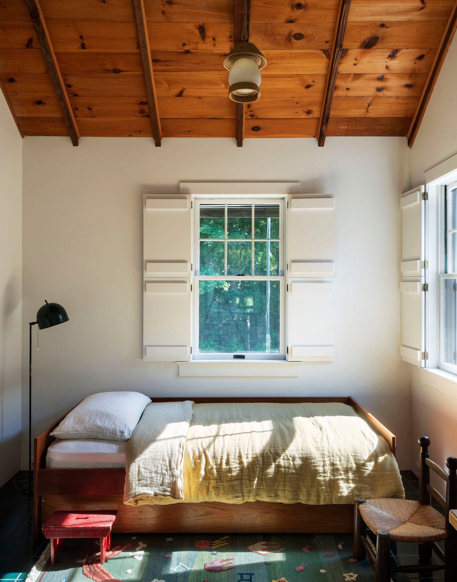
design by workstead | via ny times The more I look, the more I love the storage bed aesthetic. It has a similar feeling to a mattress on the floor because of the platform with no legs but is more sophisticated because well, it’s not a mattress on the floor. 

A fancy trick to hiding a storage bed is to have your bedding fall all the way to the floor, which is something we very well may do. Luckily for us, this simple bedding trend aligns with the Wabi-Sabi Monastery Chic that (spoiler alert) we actually are going for in this room. Stay tuned for more on that, in another blog post, on another day. For now, I am so curious what you think about this new layout, and whether you believe adult bedrooms can have a bed in the corner? Sound off in the comments below. xx Opener Image Credits: Design by Malcolm Simmons | Photo by Keyanna Bowen | From: Malcolm’s Bedroom Reveal Is Here… How He Found Healing Through Design + The Incredible DIYs That Transformed The Space The post Ryann’s Bedroom Layout Design Agony: Can An Adult Bedroom Have A Bed In The Corner? appeared first on Emily Henderson. via Emily Henderson https://stylebyemilyhenderson.com/blog/small-bedroom-layout-ideas 
Vintage and maximalist lovers, this one’s for you! Just kidding it’s for everyone because this house is pure design joy. Pattern, color, whimsy, the gang’s all here. I think it’s safe to say this home is filled with about 90% vintage and leans into color in a really fun but intentional way. Your eye is both excited yet not overwhelmed. This takes a lot of skill which the new HGTV designer of Fix My Flip, Francesca Grace, clearly has. She also made a pretty cool unexpected design choice in this 2-bedroom, 1-bathroom, 1100-square-foot Craftsman-style home that I can’t wait to show you…among all the other things I want to show so let’s dig in. Every designer has a unique way of attempting different styles, so I needed to get her top tips on how to go maximalist: “Don’t be afraid to mix different eras together. Whether it’s vintage, midcentury, a little bit of country chic, whatever your favorites are, throw them all together and I’m certain you’ll love the outcome, because everything in your space should speak to you. You’ll be surprised how well mixing different pieces together balances each other out, and if you don’t know already, balance is key. If one end of the room has a lot going on, don’t leave the other half bare. Plants are another great way to balance out your space.” Much like Emily says, “pretty looks good next to pretty”. Mixing all sorts of vintage from different eras, as long as the materials and colors talk to each other, is a super-easy way to inject your home with a lot of *your* personality. 
Here is Francesca’s awesome living room. The color pallet is fairly neutral with golds, corals, and whites from this angle (and dare I say a hint of chartreuse?). The colors keep it all cohesive while the actual pieces are everything from MCM, trendy 2022, victorian, etc. Also, each piece also has a fair amount of pattern and/or texture:) See how the flowers on that Tiffany lamp match the color of the club chairs but speak to the pattern of the sofa on the other side of the room? That’s an example of visual balance. 
Paint Color | Vintage Fringed Chair (similar) | Benni Ourain Checkered Rug But then SUPRISE! There’s a dark teal accent wall that makes the room feel a bit more grounded as well as helps to tie in the other end of the room, the dining room. Francesca is a clear color lover so I asked if she had a color palette philosophy: “I would simply say to not be afraid of any color! Every hue can work in a space so long as you use it in the right way and with the right design choices. If you want to achieve a comfortable and restful aesthetic, as if you’re in a cabin surrounded by trees, go darker with your color choices to create a warmer and welcoming environment. If you’re someone who thrives in a city environment, try lighter and brighter colors to mimic the high-energy of the concrete jungle. You want to ensure your color choices match what you feel, or how you want to feel when you’re at home.” 
Again the color palette is airtight! The wallpaper speaks to the pinks and florals of the living room and those hits of teal flowers tie in the accent wall. Speaking of the HOT TOPIC of accent walls, I asked Francesca, “do you have any rules about accent walls?” since she has a few of them in her home: “Yes, don’t leave them white! They are the playground, the epicenter, the biggest statement that could be. Yes, art can help a white wall, but an accent wall should be covered with either your favorite color, or wallpaper. The accent wall is ‘where the party is’. Don’t be afraid to bring the party.” So there are just a few white walls in her home but they feel intentional so that the whole room has a bit of visual breathing room. I really love that she kept the window wall white. First off, it has all of those beautiful widows to show off, and second, I think it highlights the other lighter tones in the room. That’s why it’s both bold and very maximalist yet easy on the eyes and not too overpowering. 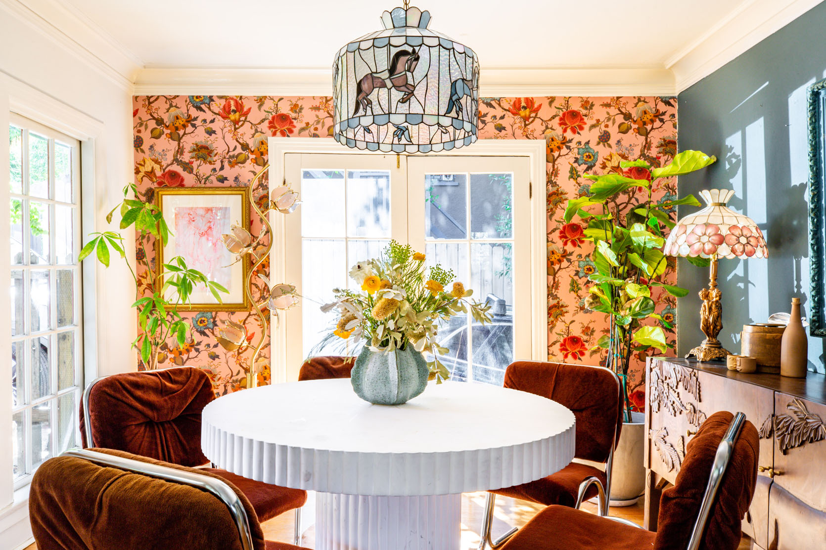
Wallpaper | Vintage Floral Floor Lamp | Dining Table When I asked her what were her favorite “unexpected” design choices she made in this house? Her second response was this: “My second unexpected, yet magical, design choice I made was placing a vintage Tiffany pendant that has carousel horses surrounding it in my dining room. People may think it’s childish, but I think it resembles my personality and makes the room completely stand out.” I think it’s so fun and special. But I’m pretty in love with it all. I also really like how this side of the room is more modern vintage and the living area is more “antique” vintage. However, it all just works because of the color palette and materials. 
That credenza is so sweet and beautifully contrasts the modern table and chairs. Plus notice how the frame is tonal with the wall. What’s cool, if you scroll back up to the photo of the entire wall, is that it looks like she very intentionally chose all gold or metallic frames for the living room and then chose this blue one to act as a zone signifier. What I mean is that our blue-framed blonde beauty “tells” you that you’re in a “different room”. Simple and smart:) 
Wallpaper | Bistro Table | Rug Ok, this kitchen is so sweet and pretty. Again, mixing lots of different eras/styles all the while choosing colors in these pieces that would speak to the neighboring rooms (she didn’t tell me this but I feel pretty confident it’s the reason:)). For example, in this shot, she picked wallpaper and chairs with red them to talk to the red on the wall in her bedroom. 

How awesome are those art deco chairs that are upholstered in a sweet, small-scale floral fabric that works perfectly with the medium-scale floral wallpaper? But let’s get into the bedroom and what about it was the most unexpected design choice she made… 
Wallpaper | Headboard | Rug | Nightstands (she took off the legs:)) “Turning the so-called ‘Family Room’ into my dream primary bedroom is my favorite unexpected design choice. I always wanted a grand bedroom, and I didn’t want the small guest bedroom to be the primary bedroom. I figured, why not take over the largest room in the house.” This is what we mean when we say “it’s your home, live in it how it best works for you”. Just because this room was labeled as a family room does not mean it needed to stay that way. Plus look how fun and beautiful it looks. That wallpaper that speaks to the pillows. The pillow color that speaks to the lamps and the nightstands. The pattern play. The headboard. The STAINED GLASS WINDOWS. Naturally, I had to ask specifically about the windows and if they are original: “This is a mystery I have yet to solve. When I moved in, they were already existing. But they do not feel old enough to have been there since the 20s. I have looked everywhere on the web to try and figure it out, but I have had no luck.” EHD Readers! If anyone has any theories, leave them in the comments. 
I know you see that white wall but it’s the only white wall in the space which again I think was chosen likely for balance and airiness. Plus it has that very cool huge mirror so it doesn’t really clock as a plain white wall. Also…that bench is incredible. 
Wall Mural | Coffee Table (similar) There is also so much I love about the lounge side of her grand primary bedroom. But my favorite part is the two-toned painted trim. So simple, but adds so much visually. This is something I would absolutely do in my bedroom. I also love this huge mirror too. It’s ornate and awesome so it works beautifully with a vintage, maximalist style while making the room feel lighter (and bigger). Lastly, I want you to note the cowhide. It’s a great contrast in shape to the grid rug (which I also love). Another rectangle would have looked odd. Also, it helps to visually break up the coffee table and wood floors since they have similar tones. The dresser is also in that medium wood tone family but since the light-toned hide is there it moves your focus. 
Wallpaper | Headboard | Lamp Base I know this shot is a bit of a tease since it’s the only one we got for the guest room, but how incredible is that lamp and wallpaper combo? Fringed lampshades are trending and I’m not mad about it. I actually found one for my friend’s room makeover at an antique mall. I love the romantic vibes of the bed, nightstand, and lamp contrasting with the more pop floral wallpaper. It just looks exciting and is a very fun bedroom for a guest. We’ve obviously seen many vintage finds in this house so I asked for her hot thrifting tips: “Travel outside of a main city, if you can. Usually, the best finds are off the beaten path. When you go, don’t hold back – dig! The treasures are often hiding, so bring gloves if you’re afraid of getting dirty. Also, get creative with your finds. For example, old hardware can make for a cool key holder or towel holder in your bathroom. Think outside the box.” 
Lastly, we have her sweet bathroom. I love that she still went bold with pattern but kept the colors very calming. Her version of an eclectic, vintage mini spa. Also, take note of that very cute towel hook! As someone who has been known to take her time designing, I wanted to see how long it took to fully design this special home that is so personal to her: “I have been in the house for nearly 2 years. And every day I create a new project for myself so I would say, it is still a work in progress. The overall furnishings were completed within the first year of moving in. I definitely had to be motivated to fully finish the wallpapering and painting, and to finally furnish both the front and back yards. I must say, it’s feeling close to done! My design style is a work in progress and is constantly evolving to reflect my mood.” Well, maybe that’s the trick! Every day a little house project. Maybe we could do like month challenge and see how much progress we make?! Just throwing out ideas:) Anyway, it was so fun to see Francesca’s home and I can’t wait to check out her show! Love you, mean it. *Design by Francesca Grace The post HGTV Designer, Francesca Grace, Made A Pretty Uncommon Design Choice… Wanna See What It Is And If You Would Do The Same?? appeared first on Emily Henderson. via Emily Henderson https://stylebyemilyhenderson.com/blog/uncommon-design-choices 
There is nothing that beats the ‘I miss Lake Arrowhead’ blues on a rainy Oregon day more than vintage shopping in Portland. It’s good up here y’all and feels limitless. And while I’m still holding off on some major pieces of furniture to see how we live in the house, that doesn’t mean that I can’t buy things that I feel could likely work somewhere. I figure worst-case scenario, if they don’t work I’ll use them in other shoots + I’m supporting the local businesses. So the last two Fridays I’ve gone vintage shopping and here’s what I found… 
Alright. I need to write a whole post about our powder room debate so you know properly what’s going on, but I’m debating this as the vanity base for the utility sink that we have to go into it. I was (and still might) have something custom-made based because I have the design already in my brain. But then I’m like, “just check the box, Emily, stop creating more work for yourself”. This would be more affordable but $600 + the cost of retrofitting would still add up. And this is a sweet pine piece but it’s not “freak-out worthy”. I would pop out the wood squares and do something more interesting there (metal grate and fabric maybe like I did in our old powder bath. Honestly, if it were $200 I think I would pull the trigger, but it’s just pretty expensive for how utilitarian and unimpressive it is. But at the same time, we have really cool things happening in the bath so this could just be a nicer calm moment! It’s a European pine “bar” with metal ice bins that pull out… I’ll do a post about it soon 
Y’all know I didn’t NEED this trunk, but it checked a lot of boxes and I somehow have great ability to use trunks in multiple ways (nightstands, side tables, end of bed, etc). This one being the trifecta of warm finishes that I love – wood, leather, and brass, so it was an easy decision. Of course, later I realized that the “brass” was helped a bit with gold spray paint which is less ideal, but I’m thinking it’s a good nightstand in the guest room. So for $90 it felts like an ok enough risk. 
I’m quilt hoarding hard right now. I now have two of these quilts that I’m not sure what to do with. They seem to be out of menswear fabric, and obviously have a more classic checkered pattern than a more decorative quilt. I keep fantasizing that I’ll upholster a headboard in it, but maybe it’s just an end of bed quilt. They are strangely “unhappy” for me and yet I love them – the colors are so good, in a grandpa sort of way. 
GAH. Seeing this one again makes me want to go back and get it! Those colors are just so good but it is really busy which I’m trying to stay away from. Mmy ADHD brain wants me to get it, but my current healthier mental health state knows that I live better with less stimulus (less stuff, less clutter, less color, less pattern, etc – it’s quite the challenge). It’s a real struggle to keep this house “quiet” and “calm” because as you know there is a real maximalist inside of me, too. My quilt hoarding is getting out of control (and they aren’t cheap – that one was around $300) but looking at it again makes me wish I had snagged it. 

The second I saw the quilt on the right I KNEW it was for me. It’s different calico blue fabrics, in triangles and squares. It has a LOT of age (I wish slightly less) but I know 100% that I’ll use it. It’s the most “Emily Henderson quilt” I’ve ever seen and is still relatively “quiet” in the blues and whites. Thank you, Annie (shop Wilma on Instagram) for your excellent picking skills. 

I LOVE this blanket. It’s a vintage train blanket (thus the ‘Pullman’ on it). The color is perfect. The pattern is simple and great. But I didn’t get it because it was over $300 and it was 100% wool which means that it was scratchy. I knew that it would look good in a shot (end of a bed, over the back of a sofa, upholstered on an ottoman) but it just felt super expensive for the impact it would have. I just wish it were like $120, not $300. It was HUGE, big enough even for a king-sized bed … 
Every time I see this portrait I want it, but it just feels weird to buy and own it has no connection to the featured gentlemen. I love portraits of strange men, don’t get me wrong, but this one feels more important because he’s in a uniform (also it is over $400). But the colors! The frame! The dignity! He’s so handsome – I just wish it were someone in my lineage. That would be incredible. 

Seriously regretting not buying these two pieces (both in the mid $100s, so not cheap but not crazy expensive). But the problem is that we’ve designed this house with so many windows that there isn’t that much room for art. And I have SO MUCH ART. I also don’t want a cluttered house so I can’t keep hoarding pieces that I really don’t think will get a spot on my walls. At the same time, I can see a floor-to-ceiling gallery wall in the media room – of moodier pieces like these. I also feel like these are both of Oregon so I do have a connection to them… might go back… 
Really not pleased with that photo of me… but that mirror was so pretty. I might go back and snag it for Birdie’s room, and then paint it one of the pinks or purples she’s obsessed with. Y’all, Birdie’s room is going to be NUTS. I’m embracing her love of all things pink/purple/unicorn/flower/fairy and while it might look like a totally different house, I promised myself and her that I won’t restrain her too much. She is absolutely my daughter and I remember needing and loving color the way she does – I’m SO EXCITED. 

As I keep repeating, I’m trying not to hoard more “stuff” but the weird vessel on the left was hard not to buy for $19. I’m picturing it with an odd sculptural branch floating out of it… The dude on the right was $49 so I skipped him, but had he been under $20 I would have snagged. One of the only problems with the farm is the amount of garage space – it’s NUTS. They were originally carriage houses for back in the day, but it allows me to feel like I can create more of an inventory of thrifted stuff… very, very dangerous. 
Those were three lovelies that I snagged. Both the little dish (for pistachios, obviously) and the large enamel bowl have handles that take them from cute to cool in my book. I keep picturing that bowl full of my vegetable harvest once I get the garden going. It’s huge and was $60 so I felt good about it. I also make pretty darn epic summer salads and felt that it was perfect for that. 
Now this gentleman was AWESOME which those chunky chrome tubular legs and that black leather. I was shocked at how comfortable it was (historically our sling chairs have not been and I’m not allowed to buy them anymore). This one is the right height – easy to get in and out of and the seat and back were very well proportioned. It was $2400 which is about $1k less than they are on 1stDibs, but still expensive. But it wasn’t the right vibe for our farm (I could have made it work, but Brian was a hard no). 

I found the chair on the left on FB marketplace for $100 and it’s really heavy and solid. I’m starting to collect what I’m calling “project chairs” for me to play with some reupholstering ideas. Obviously, I’d totally change the fabric and knock the shine off the wood. This might live in the corner of a guest room or even in our closet… not sure, but I liked the channel tufting and I can see it in the vintage plaid that I have been hoarding – lots of grandpa vibes. The chair on the right was good at first glance, but it was very patinated vinyl and I didn’t love the square legs. But the proportions are good (I like the scale of the arms). Once I sat on it I knew it was a hard no as the springs were so loose, you immediately sunk to the bottom. All fixable problems, but for $150 it was not right. 
This little bench would have been a fun reupholstery/refinishing project, too and something I could easily do with the kids. I keep fantasizing about our life once we move there, gardening, house projects, etc – Here’s to hoping that all my homestead dreams can come true while still being able to run the business 
I certainly don’t need this but was so drawn to it. Once I showed it to Birdie she FREAKED OUT (which she does often if something has a lot of pink and flowers on it) so I might go back and grab it. It is $185 which is a lot for something you don’t know what you are going to do with. Curious if I could hang it in the corner as a pendant? Rig it into a side table? It’s an expensive risk but we both love it so much (and we aren’t in agreement with a lot of her commercial unicorn desires – so I want to lean into the vintage stuff we both love). 
Lastly, I found these at Urbanite that are upholstered by a local maker. I then found her stuff on Facebook Marketplace and have reached out to do a couple of custom quilted mushrooms… Stay tuned Obviously, there is nothing I love more than vintage shopping, and it’s incredibly pleasant to do in Oregon versus LA. Sure there is more in LA but it’s very expensive and the traffic makes it less pleasant (as traffic does). I hope you are enjoying it, because I sure am The post My Recent Vintage/Thrifting Haul – A Peek Into Where The Farmhouse Decor Is Headed appeared first on Emily Henderson. via Emily Henderson https://stylebyemilyhenderson.com/blog/my-recent-vintage-thrifting-haul-a-peek-into-where-the-farmhouse-decor-is-headed 
The last Sunday in March is here which practically makes it summer. Or at least that’s how fast this all feels! So we think we should simply jump right into these links. We hope the weather is nice where you are:) This week’s house tour comes from designer, Sean Anderson. His designs are neutral but full of soul, style, and of course lots of texture. This modern rustic home is layered but feels fresh. Go take a look at the whole home. It’s pretty spectacular. From Emily: IS IT CAKE? is this new INCREDIBLE show about realistic-looking Cakes by cake artists. It’s insane. You have to guess which “shoe” or “purse” is made out of cake and the host goes around with a comically large knife to “test” them. Then the artists have to make their own and the judges (and us) literally can’t tell them apart. It checks all our boxes: funny, creative, inspiring, clean/positive, and gets the kids excited about baking (kinda like Nailed It did during lockdown – we binged that hard). It’s just awesome to be so impressed with people’s weird talents. And in case you missed last week’s “From Emily”: First, there was Lego Masters. Then Blown Away. Then The Great Pottery Thrown Down, then Making It, then Magic For Humans BUT THE BEST ALL FAMILY-FRIENDLY CREATIVE COMPETITION SHOW HAS JUST BEEN INVENTED. And when I say “all family-friendly” I mean Brian AND I, Charlie AND Elliot. We all are obsessed with it. It’s called Making Fun and it’s HILARIOUS and so impressive. The premise is four macho builders have a wacky invention for whatever kid who gets selected (from the audience). The guys are legit hilarious (and they “hate” kids), they are crazy skilled/talented, and the producers are having the best time behind the scenes. It’s by far the best-produced reality competition show Brian and I have watched in this genre. We laugh hard and we just LOVE IT. From Ryann: I would love to do an entire post on all the jeans I love right now but for now, I’ll share the one pair that is reigning over everything else in my closet. These jeans are so good. I used to be a denim snob, only ever wearing extremely rigid vintage Levi’s. But I am not a size 4 anymore!!! And jeans like that positively suck unless you are a size 4!! So I was forced to quench my denim thirst elsewhere. I have 3 pairs that I love but these are the ones I have been wearing for like 5 days in a row. I wear a size 14 because I wanted them to be a little oversized so they are very true to size (and curve friendly I might add!). From Mallory: This lamp would be so cute in a kid’s room I’m IN LOVE Exciting news! A YouTube first media brand called “Designer Home Tours” is on a device near you. What is this you may be asking yourself? Well, it’s an inside look at the work that goes into designing a home through interviews with the design professionals who did them. Basically all of the things we love. It’s also a nice addition to the YouTube space since most of the design content there is primarily DIY and celebrity home tours. Wanna see what you can except? Head here. From Caitlin: This is not my style but I’m obsessed with this layout!!! So much good furniture in 260 sq ft. Also From Caitlin: I bought a few of these white $5 t-shirts last year and y’all, lemme tell you, THEY ARE IT. I know people look for different things in white tees, so here’s the boxes they check for me: they have an awesome drape (I hate a clingy shirt), they’re lightweight and soft, the sleeves are a great length (miss me with those cap sleeve tees, please), and juuuust a little sheer (for me, sometimes “day to night” means switching from a nude bra to a leopard bra – it shows JUST a bit in the right light and it’s really fun and flirty!!!). If you prefer a structured or thicker t-shirt, I’d skip this one. But otherwise…I NEED MORE COLORS TO DROP, ASAP. Also Also From Caitlin: Does anyone wanna Venmo me $245 for one of these Zodiac sweaters? Alternatively, if you purchase one, can I live vicariously through you? From Jess: Add to Cart! I’ve gotten super into tailored wide-leg pants and these linen blend ones are PERFECT for spring and summer. “Resortwear Jess” might be the look all warm-weather long:) Have a great rest of your Sunday and see you tomorrow. xx Opening Image Credits: Design by Sean Anderson and Tom Adams | Photo by Haris Kenjar The post The Link Up: Em’s #1 Family TV Show, The $40 Pair Of Jeans Ryann Won’t Take Off, And The Colorful Table Lamp We All Want appeared first on Emily Henderson. via Emily Henderson https://stylebyemilyhenderson.com/blog/best-family-tv-shows 
I am famously horrible at packing for vacation. Not only do I do that thing where I bring the most random articles of clothing that I haven’t worn in years, I also tend to bring 5-6 pairs of shoes with me no matter where I am going. I’ll be going to Hawaii and I’ll bring cowboy boots. It’s like as soon as the word vacation enters my brain, it acts like it has never heard of getting dressed before. Of course, I hear via lifestyle influencers on TikTok that the goal is to pack light by planning outfits you will actually wear, according to the vacation you are going on. A novel idea! But I have truthfully always struggled with what shoes to bring on vacation so I asked Emily to weigh in on the matter: “I like to pack light so I’m into versatility rather than bringing 6 different sandals. The Madewell ones that I bought last year are casual, super comfortable, but easy to dress up. My tkees flip flops can go easily beach/pool to dinner (plus they are tiny, so easy to pack), and then one pair of wedges if we get a sitter to go out on a date (but still needs to be comfortable – like my new espadrilles with the white rubber sole). And then I love a pair of more active shoes for walks, hikes, or water play.” With Emily’s expert advice in mind, we rounded up the shoes we want that fit the bill for a vacation: 
1. Fisherman Platform Espadrille Sandal | 2. The Julie Espadrille Sandal | 3. Satara Platform Slide Sandal | 4. Marli Strappy Espadrille Flatform Sandal | 5. ALOHAS Leather Back-Strap Espadrille Sandals | 6. Cameron Flatform Sandal | 7. Espadrille Sandal Wedges | 8. Adea Wedge Heels | 9. KAANAS Medan Buckled Cotton Espadrille Sandal Espadrilles are a famous vacation shoe. They are great because they are casual but still cute enough to wear to pretty much any outing. They go from day to night easily so if you are spending the day at the beach or by the pool and then you are ready to transition to dinner, there’s no need to swap shoes. I love #9 because any shoe I can slide right into is my ideal form of footwear. Emily just got #6 and says they are extremely comfortable and cute enough to wear to dinner. 
1. Baminda Wedge Sandal | 2. Josiey Sandal | 3. Julianna Platform Heels | 4. Kali Wedge | 5. Silent D Katia Wedges | 6. Otis Wedge Sandal I’ve been waiting for a reason to wear wedges because I do love heels I just have no clue how to walk in them. So I need the extra support that wedges graciously give. If you know you will have a night out on your vacation, Emily suggests a wedge because they are comfortable but are still technically heels so they feel date-night appropriate. I am very interested in #1 for its sole that looks extra comfortable, but #4 is what I want to wear to a romantic ocean view dinner with my fiancé. And how cute is #5?? 
1. The Maggie Sandal | 2. Go-To Flatform Sandal | 3. Wiwiel Platform Sandal | 4. Santa Monica Sunrise X-Band Leather Platform Sandal | 5. Jonah Slingback Sandals | 6. Monroe Platform Sandals | 7. The Addie Sandal | 8. Dandra Leather Platform Sandal | 9. Pacific Sandals If wedges are a little much or if you have a good amount of walking to do, flatforms are our favorite alternative. They still give you some height but the straight platform makes them more comfortable to walk in. A flatform sandal is a good option for a day on vacation where you’ll be walking around shopping or sightseeing, but still want to feel cute and pulled together. 
1. Fisherman Sandals in Shiny Spazzolato Leather | 2. Marina Leather Fisherman Flat Shoes | 3. Fisherman Sport Sandals | 4. The Fisherman Sandal | 5. Pilcro Casual Gladiator Sandals | 6. Chunky Leather Gladiator Sandals The fisherman sandals are the casual, edgy cousin of the espadrille. They can just as easily go from day to night, but are more appropriate for like, grabbing a burger after a long day of window shopping on the boardwalk. I like a shoe with some extra sole support so my top picks are #3 and #6, but I really like the simple look of #1. 
1. Hurricane Drift Teva | 2. Holden Platform Sport Sandals | 3. Birkenstock® Arizona EVA Sandals | 4. Salt Water Original Sandal | 5. Shibui Cat Sandals | 6. Jadito Universal Sandal | 7. Classic Clog | 8. Hurricane Verge | 9. Neida EVA Two Band Slide Sandals Utility sandals should be comfortable enough that you can walk, hike, or do water activities in. They are usually waterproof or water-resistant and have a lot of support so you can comfortably be active in them for hours. You won’t want to do rigorous adventure activities like rock climbing in them, but if you are planning on a lot of walking near water, these are great options. 
1. Kashiba-Lux Print Slide | 2. Puma Shibui Cat Slide Sandal | 3. Inuikii Braided Leather Slide Sandals | 4. Beach Bum Slide Sandals | 5. APL Big Logo TechLoom Slide Sandals | 6. Alix Kashiba Slide Sandals This is my favorite category of shoe, vacation or not. I am just so into the ease and comfort of slides. I think they are really cute with shorts or jeans or even dresses, and you really can’t beat the ease of slipping them on and going. I currently have a pair of Adidas slides that I’ve worn to shreds so I am thinking about upgrading to a more fun, colorful version. I do love checkers so you know I am eyeing #3, but #2 look widely comfortable and that’s hard to resist in my eyes. So those are our current vacation shoe picks, but if you have any that you can recommend please drop them below. And if you have any packing tips for a chronic over-packer, I am all ears! xx Opener Image Credit: Photo by Veronica Crawford | From: The Fun, Easy To Wear And BOLD Dresses I am Opting For This Summer The post The 6 Types Of Comfortable And Cute Shoes We Want To Wear On Vacation appeared first on Emily Henderson. via Emily Henderson https://stylebyemilyhenderson.com/blog/shoes-to-wear-on-vacation 
A few months ago, one of my best friends was venting about her partner (you know, as folks who have been trapped in a studio apartment with another person for 2 straight years are wont to do) when she uttered this piece of absolute gold: “the things that you fall in love with at first are the things that drive you nuts in the long run.” AND GIRL, DO I HEAR THAT. Case in point: my apartment’s beautiful, huge, design-agony-inducing windows. 
The good news: there are 12 original windows from the 1930s in my little Koreatown palace. They’re sweet and charming and looking at them sends my dopamine and serotonin levels THROUGH THE FREAKIN’ ROOF, which I love. The bad news: they’re only 19″ off the ground (that’s 48 centimeters, for my metric friends) which means that while they’re beautiful to ogle, they’re near-impossible to design around. You can only float furniture for so long before you need to figure out how to get something on a wall, you know? To that end, I’ve spent the last few weeks digging my teeth in and trying to figure out how to make furniture – or, in my case, a credenza in the living room and a set of nightstands in the bedroom – look intentional and considered while placed in front of a window (as opposed to like, looking as if I just screwed up measurements by a few inches, which is what I’ve been worrying about). It turns out there are a few tips and tricks to pulling off furniture in front of a window, so today, I want to show you what I’ve learned. LET’S SOLVE THIS DESIGN AGONY TOGETHER! Before we really start, here’s one rule that you will notice in almost off of these photos… make sure your piece of furniture is at least a few inches higher than the top of the window sill. Can you make them the same height? Sure. But when the furniture is taller it looks more intentional. Ultimately your eye and personal preference is the only thing that matters but the more you know, right?? Benches

Kicking it off with the easiest and breeziest option out there: the bench. When in doubt, a light and airy option that’ll provide seating without obstructing the view will always look good in front of a window. But if you’re hoping to find a piece that’s a little sturdier or more commanding, keep an eye out for interesting construction – a special detail, like the squiggled seatback above, can contrast the straight angles of a window and bring a ton of oomph to the space. It’s so dynamic, right? Chairs
Again – it’s hard to go wrong with a classic chair in front of a window. I’ve always been really inspired by Ginny’s apartment as her layout is SO similar to mine (even down to those super low, super tall windows! Classic LA architecture!) and this shot, in particular, has always been a favorite. These vintage club chairs are the perfect scale for this space – not too wide, not too tall – and they feel like the perfect finishing touch in this room. 

The key here is to keep your profile a little lower whenever possible – like, the window may not be the best spot to display your wingbacks and balloon chairs. Plus, a fully-upholstered piece (or anything with a finished back, like this chair on the right) will look just as nice from the street. YOU’VE GOT THIS. 
Had to share one more example for my more daring folks – I mean, when your home is this eclectic, why not throw an iconic Le Corbusier chaise in front of your doors? (Beyond that, who woulda thought that Barcelona chairs look so cool next to blue and white ginger jars and Noguchi light fixtures and Thonet dining chairs and super classic portraiture?) Let this serve as license for you to experiment in your own space, too. Bistro Tables

You know what belongs in front of your windows? A sweet little breakfast table setup. Be sure to leave a little bit of breathing room, though – you see how the room on the right didn’t cram 3 chairs around the table? It would have felt way heavier, right? Just keep your styling simple and let that window shine, baby. EASY PEASY. (Also, in my dream life, I live in the hotel pictured on the left.) Desks

OOOOH. We’re upping the difficulty level a little bit here, compadres!!! When it comes to larger tables (like desks, for example) and case goods, scale is the name of the game. The desk on the left may overlap the window, but that dreamy near-perfect fit makes it feel like a conscious choice instead of a stopgap solution. The right is a total dream, too – the choice to paint the radiator in addition to the window trim, moulding, and ceiling makes a huge impact (and it’s a great backdrop for a contrasting desk, to boot). 
This one is masterful, too – check out the lineup between the ends of the desk and the mullions on those windows. SCALE IS EVERYTHING. Keep some general measurements of your space on your phone – how wide are your windows? How wide are your curtains? How big is the space between window panes? Knowing all of these will help you grab the perfectly-sized piece, no matter what you’re looking for. Sofas
Here’s a fun secret: if you’re rocking floor-to-ceiling windows on more than one wall, the world’s your oyster. Be sure to select pieces that are just as exciting from the back (that rattan chair is to die for; the upholstery on these sofas is swoon-worthy), but otherwise, feel free to play around. Normal rules about windows don’t apply to you. (Lucky.) 

If you weren’t blessed with a solarium (ugh, rude) and you need to throw your sofa directly in front of a window (been there), it all comes down to scale. (Again. Shocker.) In both these examples, filling out as much space as possible is key to these rooms coming together – these bespoke (or bespoke-feeling) sofas feel like they were meant to live in front of a window, you know? That said, don’t ditch your existing sofa yet!!! Window treatments, which we’ll dig into a bit more below, can really help your already-owned pieces feel much more tailored for your space. Console Tables
I’m struggling a bit with the idea of a console table in my own kitchen right now – my window is a liiiiittle higher in this room, but every piece I can find is RIGHT on the stool (that’s what the flat area at the base of the window is called). I feel weird about overlapping the apron and sill and trim, so I looooove this above inspiration shot – instead of opting for a lower bench or set of ottomans, this taller console creates an awesome pattern that brings a ton of interest back to the window. I’m inspired!!! 
And here’s another shot for all of you lucky folks with walls of floor-to-ceiling windows – again, look at that perfect scale of the console table! Topping the piece by balancing art against the window makes the placement feel really calculated and measured instead of haphazard, too. Beds

BABY. EHD has already published a full master class on bed placement, so if this is your specific design agony, read that post first!!! On a higher level, though, our advice is pretty simple and consistent: if your bed is going to overlap a window, opt for a lighter, more spindly headboard or frame. Let that light in, kiddo! 
But if your window placement is too weird and hard to live with (case in point: my bedroom), feel free to consider an extra-full window treatment that envelops a full wall. Above, Sarah Sherman Samuel was able to anchor her bed and create symmetry by choosing which parts of the window to show and which parts to hide. Such a simple and elegant solution, right??? Open Shelving

BIG SWOON. I’m curious to hear what y’all think about this trend – I loooove it for more rural areas, I think. (I love an open shelf, but if you could see the amount of grime coming through my windows from the billion-lane road next to my apartment, I think you’d agree.) The proportions in both of these shots are so chic – whether you’re sizing your shelving to line up perfectly with your windows (on the left) or you choose to stagger your supporting poles a bit (on the right), the effect is just SO special and exciting. Can you imagine a better backdrop for your favorite tableware? I can’t 
And here’s one with a more traditional shelving unit – turns out that if you treat your home like a gallery, it’ll look like a gallery. I always come back to one of Em’s famous maxims – “pretty looks good next to pretty” – and this is a prime example. If you have a collection of special objects (or objets, if you want to be fancy), why not try to display them in a little cluster near a window? It’s exciting and unexpected. Dressers and Cabinets

WE’RE IN THE BIG LEAGUES NOW, FOLKS. Case goods are by far the trickiest thing to style in front of windows, IMO – it’s so easy for things to look like “this is my first apartment and I can’t figure out another layout” (admittedly, I may be biased as *I* had case goods in front of the window in my first apartment). The trick to making it work? Frame your dresser, commode, or cabinet with your window treatments. I’m especially enamored by the shot on the right – it’s a little more traditional than what I usually find myself drawn to, but that cornice/valance situation frames that commode in such a beautiful way. 
MAJOR HEART EYES FROM ME. I’ve written before about my own vinyl storage woes and this is the best solution that I could ever imagine. (If I didn’t have south-facing windows in my living room, I’d copy this in a heartbeat. Curse my worries about records warping!) Again, this is such a great use of draperies to frame a solid piece – I bet it looks just as good from the street, too. 10/10. Huge inspiration. Sideboards and Credenzas

When it comes to bigger pieces, I’m ready to share the craziest tip of all: matching the style of your house is key to making things feel deliberate and planned. On the left, an antique sideboard is stealing the show in a super traditional Tudor home. On the right, a more modern brass-fronted pick (does this remind anyone else of Brady’s OG credenza?) just looks right in front of these bold, contemporary windows. (If that’s not enough, check out the scale on both of those bad larries!!! Perfect!!!) One major note: make sure the back of these pieces are finished so you don’t have weird pieces of plywood peeking out of your windows. You deserve to have your house look just as nice from the outside, you know? 
But also…curtains ARE always an option. (And boy, does Sarah Sherman Samuel know her way around some creative draperies or what???) If you’re looking to ground your space a bit more – or if you just feel weird about seeing the back of your favorite media center when you’re pulling into the driveway at the end of the day – consider carving out a corner where you can anchor your larger case goods. We love a creative solution! Nightstands

MY. ABSOLUTE. NEMESIS. These are driving me insane, guys. I’m a longtime fan of a pretty high nightstand (does it technically go against design rules? Yes! Is it way easier to put down a glass of water on a higher surface in the middle of the night rather than dislocating your elbow and flailing around for a low surface? Also yes!), so trying to find nightstands that work with my super-low windows has been a challenge. I feel really self-conscious and hyperaware of how my current nightstands are overlapping with my windows and I gotta be honest – I don’t love it, aesthetically speaking. If you’re in a similar pickle, it seems as if (YOU GUESSED IT!) window treatments maaaay be the solution. 

These shots are both so neutral and calming and traditional – three words I don’t think I’ll ever use to describe my own home! – but shape- and scale-wise, they’ve been SO inspiring to me. I loooove how this tiny nightstand just fits perfectly into a little niche on the left (can you imagine it without curtains? It’d be such a bummer!) and I have similar viscerally positive reactions to the little multifunctional writing desk on the right. In my own mind, I’ve been reframing the roles of curtains a little bit – from “things that make your windows look nice” to “things you can use to highlight pieces you love” – and I really think it’s been pretty game-changing for me. I no longer feel super stuck, you know? SO. If you have also had this problem, please share with the class…how did you solve it? Anyone wanna share photos of their own furniture in front of a window? Anyone else have any inspirational shots or tips or hacks? I learn so much from you every week – I hope today is no exception. Happy Friday. Here’s to eliminating all of our design agonies, one by one. LET’S CHAT??? xx Opening Image Credits: Design by Nine Dot Design | Photo by Jess Isaac | via Domino The post Can I Put Furniture In Front Of A Window? (Rules For Chairs, Beds, Cabinets, And More) appeared first on Emily Henderson. via Emily Henderson https://stylebyemilyhenderson.com/blog/can-i-put-furniture-in-front-of-a-window-rules-for-chairs-beds-cabinets-and-more Rugs and carpets are an important aspect of interior design as they can help define spaces, add texture, and make your home feel cozier. And perhaps one of the best rugs you can get is a Moroccan rug. However, since Morocco is filled with a lot of cultures, there's not just one type of Moroccan rugs but many different available styles. And in this article, we'll be highlighting the gorgeous Tuareg mats of Morocco. What Are Tuareg Mats?
The Tuareg mats can be considered as one of the gems of Moroccan rugs. The Tuareg mats are handmade and are a fusion of Moroccan traditions and Berber carpets. The Tuareg mats are very decorative and feature geometric patterns, tassels, and embroidery. The Tuareg is actually a nomadic people from the Sahara Desert, and they are known for their unique ways of weaving, such as using camel hair on their mats. These mats were traditionally used as cushions and blankets on their burros or camels. However, they are now being used as wall hangings and are often used in the home, too. You can find Tuareg rugs in different sizes. Smaller rugs can be used as throw pillows, rugs, or mats. Larger Tuareg rugs can be placed on the wall or used as a rug. These mats are also used as prayer rugs in mosques. What Makes Tuareg Mats so Distinct? The Tuareg mats are classic Moroccan rugs that have been around for decades. The beautiful and unique patterns and colors of these rugs are what make them so sought-after. Tuareg rugs were traditionally made by Tuareg people in the South of Morocco, but nowadays, they are crafted by both Tuareg and Berber weavers in Morocco. These rugs are made from goats, camel, and sheepskins. What’s unique about the Tuareg mats is that they have a wide variety of colors. The colors that you can choose from are red, yellow, orange, black, and green. These colors are blended together in a very interesting and classic way. They also incorporate geometric and zoomorphic patterns in the design. How to Take Care of a Tuareg Mat Like any other Moroccan rug, you should take care of a Tuareg mat properly by vacuuming it often. But, since these mats are a little delicate and can easily be damaged, you should also handle them carefully. When cleaning a Tuareg mat, you should use cold water to spot clean and vacuum it often. After vacuuming it, you can use a soft brush to get the rest of the dirt off of the mat. You should also regularly dust it. Since the Tuareg mats are handmade, the material can be slightly different when you compare one rug to another. You should let the rug air for a day before using it. This will help remove any musty or strong smells. You should also avoid using chemicals or harsh detergents when cleaning the Tuareg mats. Always make sure to clean them gently and carefully. Final Thoughts Overall, the Tuareg mats are one of the best Moroccan rugs you can get. Their beautiful and intricate patterns are perfect for livening up your home. The colors are also very fresh and welcoming. Decorate your space with a gorgeous Tuareg mat from Atlas Weavers. Atlas Weavers is a fair trade artisan project and a premier supplier of authentic Moroccan decorative rugs. Our Tuareg mats are handwoven with palm and leather from the Tuareg tribes of the Sahara of Morocco and Mauritania. Shop now! Via https://atlasweavers.com/blogs/news/everything-you-need-to-know-about-morocco-s-tuareg-mats Via https://atlasweavers.weebly.com/blog/everything-you-need-to-know-about-moroccos-tuareg-mats The Story Of A Classic Design Element That Became Trendy Then MainstreamBut Is it Classic Again?3/24/2022 
My dream in life is to own a home that has original 1950s checkered tile flooring in the kitchen (and obviously this home is located in the South of France or somewhere equally romantic). Also in this fantasy, I have chickens and horses and never ever have to put makeup on but somehow always feel flawless. Hold for applause. But honestly, the real important aspect of this dream is the checkered tiles. I’ve always loved them and have found them inherently charming ever since I became a lover of design. But when you work or immerse yourself in a creative industry, it’s inevitable that certain trends become oversaturated and a little unstimulating. I was completely on board with the resurgence of the checkered trend over the past couple of years, but lately, I’ve felt myself getting somewhat fatigued by these square decals. I truthfully didn’t want it to be true, so I confronted my recent distaste for checkered decor head-on. I sought out all the checkered interiors as a sort of immersion therapy and then noticed a clear pattern of thinking. The truth when a trend is everywhere it starts to feel basic. It doesn’t help that the checkered pattern is thriving in fashion as well, so this pattern is truly everywhere (I feel like as soon as Urban Outfitters is on the bandwagon, it is astronomically mainstream). But then I realized there will always be applications of this pattern that feels classic, refined, and timeless. And even still, it can be applied in trendy, modern ways. This pattern has been around for so long that it’s gone from classic to trendy, back to classic so many times and at the moment, I believe (and hope) it’s back to being classic. Let’s observe why: 
When we talked about it over zoom, Emily’s take was so simple yet so true: it’s just squares. I had to laugh when she said it because it’s amazing how a simple shape that we learn about as toddlers can be such a hot topic in adult life. But the fact that it is “just squares,” is why it’s so classic? It’s just a bunch of squares, pushed together, switching off between two colors. How fabulously simple yet bold. Is this why they constantly show up in art and design? Because it is so simple yet so visually interesting? Maybe so. In any case, I am getting ready to embrace them once again. I am happy to say I still love a checkered rug even though I’ve seen it done billions of times. But just because something is uber-trendy, doesn’t mean it is no longer good. When something has such a long history in interior design as the checkered pattern does, it can become versatile enough that it works with endless styles. In this case, the checkered rug remains classic yet cool especially when it falls within the color palette. 
A checkered rug moment can add a hint of playfulness to a minimal space with ease. The above bedroom is the epitome of a serene, natural oasis. All the textures and colors are calming and neutral and just a pop of checkered is the perfect accent to add a fresh modern flair. 
Over the past few years, we’ve seen the checkered pattern in every color possible but sometimes, it’s completely refreshing to see it in its original black and white form. 
When I chatted with the rest of team EHD about my thoughts, Emily noted that checks are the most classic looking when you leave it at just one per room. I tend to agree, but then a photo like the above stops me in my tracks. But the truth is, one check per room IS the most classic iteration of the trend. If you do mix with other checks, it’s immediately more modern (but still cool). The trick is to vary the scale of the squares and make sure the colors are different enough but still close enough in the color wheel. And adding a dog or two doesn’t hurt. 
Another modern interpretation of the checkered trend is small-scale patterned upholstery. The shape itself, as I’ve already pointed out ad nauseam, is simple yet interesting enough that it’s easy to mix with other patterns if you are going for a maximalist look. 
Small hints are always going to catch my eye and remind me of the impact even the tiniest amount of this pattern can make. With small checkered decor, a bright or unexpected color is a great way to add a pop of visual interest. 
It is my humble opinion that a checkered blanket or even scrap of fabric instantly adds an eclectic and collected feeling to a space. In the room above by Amy Convery of Pops and Piaf, the fabric draped over a vintage chair stacked with books is the interior styling version of the effortlessly cool girl. 
If you are wondering when the checkered pattern is at its most classic, it’s via large-scale tile. Full stop. I truly cannot see a checkered tile floor or wall and not stop scrolling. It’s always good and reminds me why this pattern is perhaps the most versatile and timeless of them all. 
Case in point, this bathroom has been on one of my various inspiration pinboards for years and years and years. This is my ideal checkered tile scale, and I love it paired with another small scale patterned tile. That is the beauty of the checkered tile–it’s so pleasing to the eye to mix with other tile patterns and scales because it’s (you guessed it) so simple! 

Now if you are wondering what tile floors I envision in my dream home, it’s this. Black and white oversized checkered tile is the hill I die on. I just think it always looks good and cool. 
I had to steal this photo from Caitlin’s chartreuse exploration post because it perfectly portrays how versatile checkered tile flooring can be. With so much good stuff going on here (cowhide rug, zebra print, a chartreuse ceiling to boot) the checkered tiles ground the space (both literally and figuratively). 
As much as I covet checkered tiles in a kitchen, I equally adore them in bathrooms. So much so in fact that I am desperately looking for the right scale of checkered vinyl tile so I can make this dream come true in my own tiny rental bathroom.
A modern farmhouse dining room is exactly where large checkered tile flooring belongs. It’s hard to beat because although it catches your eye immediately, it’s never too loud when it’s on its own so it becomes an easy vessel to add intrigue without going full maximalist. 

Another note on the checkered tile is how the color choice can inform the style you are going for. Classic green or red will give off a more retro vibe immediately, making it a great jumping-off point if that is the look you are going for. 

We often think of this pattern in association with the 50s but its roots go way way wayyyyy back. The actual checkerboard was created in 3000 BC so it should come as no surprise that the pattern in design came around earlier than we think. Possibly earlier than we even know about. So it makes perfect sense that it has an old-world allure to it as well, making it a perfect element in Victorian-style homes. 
I leave you with this famous shot of the Questel staircase in the beautiful palace of Versailles as a reminder that the history of this geometrical pattern, if nothing else, transcends its popularity in our modern times. So, will checkers ever cease being classic? I can’t imagine so. If you are in the market for some hints of this trend in your home, here are some of our picks: 
1. Nerikomi Black & White Checkered Ceramic Vase by Fizzy Ceramics | 2. Checkerboard Shaggy Rug | 3. Moroccan Checkered Ottoman Square Sofa Pouf | 4. Large Checkered Area Rug | 5. Checkerboard Throw Pillow | 6. Large Beige and White Checkered Rug | 7. Checkered Panel | 8. Irregular Checkerboard Bolster Pillow | 9. Sanna Room Divider | 10. Dark Brown & White Checkered Moroccan Wool Area Rug | 11. Check VI – Green — Checkerboard Print Bench | 12. Vintage Mid Century Checkered Berber Pouf Now I would love to know your thoughts so sounds off in the comments below. xx Opener Image Credit: Design by Gabriella Horn | Photo by Christian Harder | via Architectural Digest The post The Story Of A Classic Design Element That Became Trendy, Then Mainstream…But Is it Classic Again? appeared first on Emily Henderson. via Emily Henderson https://stylebyemilyhenderson.com/blog/checkered-pattern-trend-2022 
One of the things I love most about design is having to problem-solve. You know, the sort of situation you find yourself in when you have an awkward entryway, a tiny space, no storage, or a unique room layout. In my case, I’ve got all of the previous happening in my living room area. It’s also a very open space. Contrary to popular opinion, I quite enjoy spaces that aren’t completely open, because walls help to define a space’s intent and serve as a reminder of how I should be designing the space. For instance, I grew up with a den – for playing in and watching movies with my family. A closed-off kitchen, that had just enough room for a dining table and chairs. When it was time for dinner, we all knew it was time to disconnect from all of our devices, go into the kitchen, sit down as a family, while we ate and shared about our day. Our living room area was a small space where my mom would sit and have a phone chat with my grandmother, or with a friend who stopped by briefly to share some news. This was her “woman cave.” We didn’t go in there too much so that my mom had a place to disconnect, read, and nap (I totally get it now). That said, I love how purposeful walls can make a room feel, but I will knock one down if it helps the overall function of a space – that’s a post for another day. 
Sofa | Ottoman | Curtains | Rug (vintage from etsy) | Coffee Table (vintage) | Throw Pillows (no longer available from etsy) This living room layout is one of the reasons I enjoy areas that are not completely open. If we plan to have movie nights in this living room, there are really only two ways we can lay out furniture: with the sofa protruding into the hallway area, or with the sofa up against the wall, leaving us to mount the television in the hallway on the wall. This left me strongly contemplating not having a television in the living room and putting it in the bedroom instead, but that would go against my beliefs of the bedroom being a place where we find our peace, let our minds disconnect from everything, and rest. So TV in the living room it was. In addition to the unique layout of the space, it’s a bit on the small side, which I’m typically used to, growing up in a city where space is a unicorn. But with the unique layout and being limited on space, I had to be intentional about sourcing pieces that were to scale and would allow for storage. Visual Research

On the left is what we are looking at if we choose to mount the TV in the hallway. This was a common setup for the majority of my neighbors. A couple of my neighbors were nice enough to let me in their homes to scope out their layouts. This can save a lot of time and of course, money since it’s free. In addition, I scoured the internet looking for condos in my community that were recently remodeled and sold. I like to look at the staging in these spaces. I love doing this sort of visual research when I’m working with condos or single-family homes in a neighborhood that all share similar-to-identical interior and exterior architecture. Moreover, I should also mention that the nursery lies behind this hallway wall, so hanging the television on this wall would more than likely interrupt naps and bedtime sleep (my little guy is an extremely light sleeper – like his momma). This means we were down to one layout – the one where the sofa protrudes into the walkway. Which isn’t the end of the world I suppose, as I was still able to allow for three feet in the walkway behind the sofa. Scale For Space And Furniture Layout
A fun little app I like to use when laying out my own spaces and furniture is magicplan. It’s very simple to use, and you don’t have to be a CAD expert. Though I spent countless hours in school learning programs like AutoCAD and Revit, I tend to outsource this work, as I’m not thrilled with spending so much time drafting 2D and 3D renderings. I’m still getting the hang of momming for goodness sake. Nonetheless, magicplan is good for personal projects, as you can take measurements with your phone by just walking around a space and guiding your phone along the walls. Doing this helps you get measurements, and a visual idea of how to lay out furniture, this counters having to make numerous returns because furniture pieces do not fit. It truly helps to make sure everything is to scale in a room. 


I felt like it would be beneficial to the space to have a smaller sofa in place of the sectional I had in our last place. However, we are a family that enjoys plopping down and kicking up our feet for movie night, so it was important that I source an ottoman to complement the sofa. I’ve learned that having a sofa and separate ottoman provides a bit more flexibility in terms of laying out a space. In our case, our Sixpenny Amelia Sofa can stand alone and our Amelia Ottoman can create a sort of chaise that can be left-facing, or right-facing, or put in front of our window as additional seating (as you can see above). We can even use it as a coffee table (we just add a tray and sit our beverages on top of it). I’ve also learned that for our little family, a polyfill works best, as our little one loves to climb up and down the furniture daily – this fill keeps its form much more than down. I also grew tired of sinking into our old sofa while trying to nurse – this was a constant battle. In addition, one side of the sofa kept a completely different shape, as my husband favored sitting in that spot. Because we are in Las Vegas now, we opted for a medium-weight linen fabric, in the color Jasmine Rice. I sourced a small round wooden stool for our coffee table so that it could be moved around as needed, and an antiqued wooden stool small enough to be used as a side table on either side of the sofa. Create Storage
Faux Olive Tree | Media Console | Picture Light | Small Wooden Stool (vintage) | Vessel (vintage) | Wooden Dice (vintage) 
When I have a client that is concerned about storage in a small living room space, I almost always advise having a console with two-tiered shelves inside, and to mount the TV on the wall over the media console, to allow for shelf space on top. I also suggest having an ottoman with a removable top that can house items like blankets, trays for beverages, games, etc., but in our household this can get a bit scary, as we are more on the minimalist side of things and believe in Fumio Sasaki’s version of the Concorde Fallacy. This is basically the place some of us find ourselves in, where we are too overwhelmed with options, and this eventually leads to radical decision-making as it pertains to ongoing purchases, which leads to decisions we typically regret later on. All that to say, I have to be careful about just how much storage I give myself, because I tend to want to fill it up even though I don’t need anything. I took an inventory of the living room items we do have and use on a regular basis and specified the perfect media console for our blankets, books, and my husband’s game system and controls (which I’m very appreciative of now design-wise as it relates to aesthetics… if you have a gamer-partner you know exactly what I mean by this). Moreover, I’d like to end this section by stating: there are a variety of ways to design a home, keeping in mind the people living in it. None of them are wrong or right. They are simply the way we choose to live, with our values in mind, while making ourselves comfortable at home. Minimalism isn’t for everyone, but it makes me happy in my home. Create Boundaries

Here’s the thing about not having walls… you’ve got to define the space using other items, like area rugs, colors, floor lamps, or some sort of divider. In my case, I’ve used an area rug to do so. I also like that the space feels cozier when I apply the ottoman left-facing to the sofa, which further divides the space from the dining area. I moved the sofa away from the window so that it feels a bit more separate from the front door and exactly 36” from the walkway wall, to give the walkway a feel of its own. This way, we don’t have to worry about bumping or brushing up against any furniture during our truck to the kitchen. 


Voila! This is the living room layout I’ve come up with, given how we function as a family. I’ll admit, it was a bit tricky and in the beginning and I felt like it was also a bit wonky But having lived in it for some months, it’s quite enjoyable. I am curious to know what you would have done differently. I love hearing different design perspectives, and welcome your design ideas! That said, how would you have laid out my living room space? *Design and Photos by Ajai Guyot The post Ajai’s Small Living Room Layout Agony (+ A Pretty Genius And FREE Hack That Will Save You A Lot Of Well, Agony) appeared first on Emily Henderson. via Emily Henderson https://stylebyemilyhenderson.com/blog/small-space-living-room-layout-tips |
ABOUT MEHi, I am Rashad Mello from Licking, MO. I am a textile designer by profession. I am also managing my online store for selling my designs. Archives
April 2023
Categories |


 RSS Feed
