
This year we MIGHT be able to have a little Easter gathering at our house – the sod is going in as I write this and while the work won’t be done (and our driveway is painfully broken up, waiting to be redone) I’m hoping to execute my favorite Easter tradition – a ham, mustard, and pickle sandwich bar. I have no pictures of this tradition but will be sure to document it this year. We started this in LA years ago and it was SUCH a crowd pleaser, so easy, relatively affordable, kids loved it, adults loved it, and I don’t think I can ever look back. Here’s what you’ll need: The Universal Power of The Humble Hawaiian RollsY’all I didn’t know these existed until 9 years ago when we started doing sliders for kids’ parties, and my goodness the sweetness of these rolls combined with the saltiness of the ham is incredible. Last year I got pretzel rolls, too, just to give variety but everyone gobbles up the Hawaiian rolls first. So soft and sweet – don’t bother getting the healthier options. Honey Baked HamYou’ll likely need to order ahead, but this is the only time of year that we really indulge in ham (and if you are vegetarian this sandwich totally still works with multiple slices of cheese). They usually pre-score it for you, but if not you cut about 1/2 of it for your guests in sizes that would fit the sandwich and lay it out on a platter (you’ll have leftovers so try to give it away to guests at the end because you won’t want to eat ham for 6 months after this day). Lots Of CheesesYou can get a cheese variety of course, but we have found that swiss or provolone works best here. Please tell me I’m wrong in the comments and suggest another cheese that works with ham because I’m certainly open. The sharper the better and of course supporting local farms feels nice if you can:) 
Many The Mustards!In order to fully indulge in this sandwich bar we need many types of mustard (this is where the cost can add up if you aren’t careful, but we are a mustard family so we’ll go through them). Sure, you might be fine with just yellow – but let yourself live out all your condiment fantasies on this glorious day. Obviously dijon, spicy dijon, stone ground, etc. Classic + Artisanal PicklesWhatever you do, do NOT think you are above bread and butter sweet pickles. It’s my humble opinion that these are the best, despite their basic reputation. However, this is your chance to indulge in all your pickle dreams and support some local pickle makers and impress your friends (if they are into pickles – this will not impress them if they are not into pickles). Dill, spicy, sweet, relish, etc. My LA team loves Kaylin + Kaylin pickles (they swear by the honey mustard flavor) and I might have them ship a jar to me. Heck, with enough time I might even make my own. Yes, you can try relish, but for me, I love a sweet pickle SO MUCH in this sandwich that I dabble in dill but only momentarily before I head back to sweet. ExtrasLast year I got horseradish and fried onions (from a can) which I enjoyed. You could also go for capers or literally anything canned from the condiment aisle. You can even get a variety of chips and put chips in your sandwich (if you have never done this might I suggest you stop denying yourself the deliciousness of the internal sandwich chip? Salt and vinegar, ruffled Lays, and classic salt & pepper are all good options. Lastly, we love mayo a lot but this more popular condiment takes a back seat on this day. Feel free to go full “Starke” (my maiden name) and indulge in some Miracle Whip or make your own aioli (which I just started doing and is delicious) should you want to offer something a little less artery-clogging. ? 

That’s about it. We usually do bunny pancakes in the morning and Brian makes deviled eggs while I make a huge delicious salad because I love combining it with a cold crunch. Then in the afternoon when we invite folks over we’ll put all the above ingredients out on platters, on the island, or dining table. Please save yourself a big headache – don’t decant or label the mustards. Just shove a knife in each jar and line them up next to each other on a table. Part of the charm of this grab-and-hang meal is its ease and casualness. This is obviously not best for a sit-down meal, it’s more for a party atmosphere. Let the kids help themselves (what’s the worst that could happen? Yes, they might just eat roll after roll but it’s Easter and they are going to have a sugar hangover regardless :)). So pop some white wine or local IPAs and indulge in what will be a joyous and gut-busting Easter day. ? Opening Image Credits: Photos by Sara Ligorria-Tramp | Styled by Julie Rose and Velinda Hellen | From: Need Some At-Home Easter Brunch Inspo?? Our Never Before Seen Easter Shoot From Last Year Has You Covered The post Our Easter Tradition (AKA The Easiest Easter Party Meal That We Look Forward To All Year That Pleases The Whole Crowd) appeared first on Emily Henderson. via Emily Henderson https://stylebyemilyhenderson.com/blog/our-easter-sandwich-bar-tradition-easy-meal-ideas
0 Comments
What You Bought This Past Month The Data Is In And Its Clear We Are All Thinking The Same Thing3/30/2023 
Now it may have been a cold and rainy month (at least it has been in LA) but it’s clear that sunshine or more likely, vacation is on everyone’s mind. But hey it’s March! Are we really surprised?! We have warm days full of sunshine and outdoor activities heavily on the brain. However, we are a design blog after all so there were a few big winners that are definitely also helping our homes look and maybe even feel warmer too. Ready to see what’s been coming off the shelves quick this past month?? Staggered Glass Adjustable Sconce
Man, I was happy to see this sconce on the list!! I have a personal attachment to it because it’s from my sculptural sconce post. I know there was some interesting debate in the comments but we are FIRM believers that if you have the wall and/or space, a sculptural sconce is such a cool and beautiful design piece. Sadly this one is no longer available. Did y’all sell it out?? I’d like to think so, ha! Here’s a similar one if you’e interested. Lewis Double Push-Button Switchplate
I’d like to take credit for this one with my special switches and switch plate post but I don’t think I can. This beauty was probably snagged from Emily’s farmhouse kitchen and that is anything but a surprise. I know switching out outlet covers and switch plates can feel unnecessary but if you have the budget it’s such a special touch that we love. I’m planning on switching out as many of mine as possible! (At least the visible ones:)) Round Mini Shoulder Bag
This is what I was talking about when I said vacation was and is on all of our minds. This is Ryann’s new favorite bag (that is going to be perfect for her upcoming Japan trip) and this is what she had to say about it: “My husband and I are going to Japan in less than 2 months (EEEEEEEK) and a few weeks ago he surprised me with this super versatile shoulder bag. I love how simple and utilitarian it is and think it is going to be perfect for our travels. Speaking of our travels, I would love any Tokyo recs! Know of any restaurants, shopping, design stores, excursions, or sights we must see?? Let me know!!” It also comes in a bunch of other really cute colors. PowerChill 7/8-Length Cami Jumpsuit
Oooo baby did y’all have OPINIONS about unitards last Saturday. However, the popularity of this little number in the link up was the final straw that told us people were into this trend because of how many of you bought it. Thanks to Albie and her new self proclaimed title of “comfort influencer” a lot of you are owners of fashion’s current hottest trend – unitards. As a reminder this was her review: “Hi my name is Albie and I’m your fave comfort influencer lol. One of my fave new comfort finds is this jumpsuit from Old Navy! So good! I purchased two colors to start and now I want em in every color. What I especially love is that I can wear em around the house with a robe and then switch out my robe for a shacket to pick up the mini from school or do a quick Target run. There’s a built-in shelf bra that’s surprisingly supportive considering how too heavy I am, although to leave the house, I pair it with a bralette to be safe.” Poetto Pull Down Faucet
This is a mystery link but there’s zero mystery why this beautiful faucet was popular! It’s modern but timeless and that Rejuvenation brass is without a doubt stunning in person. You just can’t go wrong with anything from them. “Plungey” Swimsuit
GET US TO A WARM BEACH… or pool… or lake… or river… or even a clean puddle at this point! Once I’m there I want to be in this swimsuit because not only did Emily make an incredible case for it, so did Caitlin because she bought TWO. It seems that a lot of you felt the same since it’s #5 on this month’s list. Here are Caitlin’s exact words: “I have been #emfluenced (yes, it happens to our team, too) and I AM GLAD. After reading Em’s glowing review of her new TA3 swimsuit, I grabbed two of my own (the Plungey, which she recommended, and the Lacey, which is a little more covered up – that’s the one I’m wearing up there) and both are AWESOME. I love swimming/the beach/the pool and don’t have a ton of swimwear-induced agony – like, I’m at a place with my body where my general feeling is “it is what it is” – but these suits made me feel SUPER comfortable AND cool. They were both incredibly supportive (the lace-up back is NO JOKE – you’re in TIGHT, in a good way!) and held up awesome after hooooours and hours in the ocean. My friends and I are renting a blow-up waterslide later this month and I can’t wait to wear this one again for the whole day.” Now, I know we shouldn’t care about how we look in a swimsuit but I think most of us still do and this shapeware swimsuit really does a great job at making whoever is wearing it feel confident. What’s also so great about this brand is that their sizing goes up to 4x and they show models in varying sizes. I think this is the year I’m investing in one. Infrared Sauna BlanketIt may have taken momentary break from this list but IT’S BACK! Maybe we’re all still cold or maybe it’s just an incredible product that I also very much want. If you didn’t catch Em’s updated review after three years of use check that out there? IT’S COMPELLING. Wide Leg Linen Pants
EE! This was my link and I hope whoever bought these pants loves them as much as I do. I truly would sleep in them if I could BECAUSE they are that comfortable. I even bought a slightly different black pair because I couldn’t get enough. I’ve been dressing them up and down depending on the day so I stand by their versatility. Now, they are linen so the wrinkling is real after a day of wearing them but that’s what irons are for right? Tropical Groove Midi Dress
Same brand as the pants (Farm Rio) but an incredibly fun and colorful dress that Mallory almost bought to wear to a friend’s wedding! While it didn’t work for the style of wedding Mal was attending, it’s SUCH a cute dress and hopefully whoever bought it has been loving it. I think anyone who has tried on Farm Rio’s clothes can attest to the high quality. They just feel so good on. Women’s Boxy Long Sleeve T-Shirt
AH! It’s been a minute since one of my links was #1 so this is an exciting Friday for ole Bunge:) But truly, this shirt is one of my new favorites because of how soft, cute, and AFFORDABLE it is. A perfect layering piece when it’s cold (I have my Paris trip to prove that) but can easily be worn on its own. 1000/10! It also comes in other colors. Well, that’s it for today! Hope you enjoyed this little data review and if you bought something we really hope you are loving it. Love you, mean it. Opening Image Credits: Design by Sarah Zachary | Styling by Emily Bowser | Photos by Sara Ligorria-Tramp | From: Afraid Of Designing A Boring Home?? This Designer Will Steer You Clear By Showing You Her Tricks The post What You Bought This Past Month – The Data Is In And It’s Clear We Are All Thinking The Same Thing… appeared first on Emily Henderson. via Emily Henderson https://stylebyemilyhenderson.com/blog/vacation-products-you-loved 
Happy hump day friends!! We’re here to chat about the latest animal-inspired trend that’s popping into our homes in 2023: the tortoise shell. Now I could’ve seen this one coming given the fact that leopards and leopard print have been on the rise for the last few years. The tortoise shell is a similar color way and pattern but it feels slightly more new, fresh, and modern in the year 2023. I’m not sure why but I LOVE animal motifs in design, so this is right on the money for me. I bought some tortoise shell decor a few months back and I must say it is a controversial trend in my household. I found two of these vintage candle votives at Big Daddy’s Antiques (thank god I bought two because I dropped one and broke it a mere two weeks after purchasing but what’s new). Here’s what the last one standing looks like: 
I am a HUGE fan but my boyfriend is confused by the tortoise shell pattern. I’ll admit it’s specific and certainly not for everyone. Also note in the above photo I put a tea light in there but once it ran out of juice I swapped it to a battery operated candle and I am in love. I love having candles in the house at all times so this is my “backup candle” for when I run out of real ones and am desperate for ambiance. It works great! I also recently realized that I purchased a phone case that’s tortoise shell and I’m also thinking of getting this apple watch band. Too much?? Turns out I’m a tortoise shell addict and it might be getting out of hand. Now this trend is most common in glassware, but I’ve recently seen it expand to furniture, lamps, coasters and all sorts of other items. Because it goes hand and hand with glass materiality, one of my favorite ways I’ve seen this trend incorporated in the home is in the dining room. If you’re having a dinner party and are in need of some fun new dishes, glasses or coasters, here’s are some fun ways you can add tortoise shell decor to your table, starting with this cute placemat styling by CB2: 
I love the red undertones of these placemats and think it’s such a chic and subtle pattern addition to a dining table. If placemats aren’t your thing I love some of the tortoise glassware (linked below) in a table setting. Or for an even more subtle accent coasters are great too. It’s all really good, here’s what we love for the dining room: 
Another cute way to add tortoise shell decor to your home is through vases and lamps. There are SO many good ones on the market, and a lot of them have expanded colorways and designs beyond the classic black and brown pattern. Here are some very cool vases styled by Anthropologie so you can get a sense on how to bring these into your home: 

Want more options?? Here, let me show ya some of our favorites!! 
Aren’t these so cute?? I MUST give an honorable mention to this vintage tortoise shell mirror as well (proof that this trend has been around for a while, but is just coming back around the course)!! How cool is this?? It’s $4,000 so certainly out of my price range but man it’s fun to look at ? 
I am in love. So what do you guys think? Are you sold? Comment below if this trend is a hit or miss for you, we’d love to chat! Xx Opening Image Credit: via Anthropologie The post This Animal Print Trend Is Taking Over But We’re Not Mad About It appeared first on Emily Henderson. via Emily Henderson https://stylebyemilyhenderson.com/blog/animal-print-design-trend 
When I see a colorful home, it reminds me of why I love interiors. A colorful home is not only exciting to look at, but it shows the art form that is interior design in a really powerful way. Much like a painting, the decision to use color (or not use color) in a room plays a huge role in how a space will turn out. Although there are no strict rules, there are ways to use color well and Dee Murphy’s home is a prime example of that. Her home is colorful yet balanced, making it feel personal, layered, and eclectic. As I said there are no rules, but virtually touring her home is like taking a Masterclass on how to use color (and pattern) in your home. So, shall we begin taking notes? Let’s get into it. 
The entry stairway wallpaper should give you a good idea of her style and bravery when it comes to pattern and color. The size of the stairway and her commitment to this wallpaper really intrigued me so I asked how she chose this wallpaper for this space (and how she approaches choosing wallpaper in general): “When I choose wallpaper, whether for myself or for one of my clients, the inspiration comes from both the home (how old is the space, what does the architecture provide?), and from the aesthetic we are aiming for (moody and cozy, bright and cheerful?). My home was built in 1920 and feels very much like a Parisian apartment. You enter from a center courtyard into a tall, somewhat dark staircase. I wanted the wallpaper to be impactful and dramatic, to embrace the moodiness, and to ‘speak to’ the flowers and foliage just outside the front door.” 
At the top of the stairs, you can see Dee’s expert eye when it comes to mixing colors, tones, and patterns. The wallpaper brings in varying tones of blues and greens which she complements with the green framed mirror. The plant and coffee table books pepper in more blues and greens, which are grounded by the clear glass console table. For more movement and texture, there is the concrete ball sculpture that is both bold and dramatic. This might be one of my favorite vignettes ever! It is balanced, eclectic, and so fun. 
Immediately to the left of the stairs, you enter the most sun-filled room of the house where Dee wanted to play with the beautiful tension between dark and light. When introducing colors to a neutral room, balance and cohesion are key so I asked how she goes about mixing colors. She explained, “When mixing colors in a room, you begin with the strongest hues from your statement piece (for me that usually means the wallpaper or the rug), and you layer in some accessories in those shades. The more interesting and fun part, though, is to find the ‘supporting cast’, and to work those less obvious choices into the room.” In this case, the colorful Persian rug creates the backdrop for so many different colors to come through. The most obvious is blue, which is showcased most notably with the gorgeous blue sofa. Then you see more blues peppered throughout. The throw pillow, the coffee table book, the art, and even the wallpaper in the connecting dining room create a calming cohesion throughout the space. 
The more subtle tones in the rug allow for other colors to shine in the room as well. The tan sofa color is pulled from the rug so it feels very connected to the rest of the room. The styling on the bookcase also speaks to the rug so there is so much continuity throughout the space. 
It is my opinion that we can’t fully appreciate color without first recognizing the absence of it in a space. In this room, for instance, the white walls and molding create a canvas for all of the colors and patterns to really pop. With a really bold wall color or wallpaper in here, all the wonderful colors in this room could get lost, so the white walls are the perfect backdrop. 


I love how the light green fireplace breaks up the white walls and adds another calming color to the space. I was really curious about this color choice so I asked Dee if it was painted prior to her living there, or if she painted it herself. She told me, “The fireplace was painted that color when we bought the home, and I always found it to be an interesting choice, so I have lived with it that way for the past six years. I recently repaired the firebox, though, and had a stone specialist take a look at what might be underneath that green. There are roughly six layers of paint! I am finally going to strip it all off to restore and reveal the original stone, which will accentuate the beautiful details.” 
In the dining room, the wallpaper is the focal point that introduces color and pattern but instead of pulling colors straight from the wallpaper, she introduces new colors and patterns for an eclectic look. The pink curtains are light and neutral enough that they blend with the room effortlessly and speak to the light wood tones and the jute rug. The stripe pattern on the rug adds another dynamic pattern to the mix that creates more visual interest. 
With many colors and patterns blending together, I love that she kept the wood tones similar so the space feels grounded. By the way, how incredible are those chairs?? I am sure you have already noticed that Dee has a keen eye for blending vintage and contemporary furniture, which gives her home a sense of warmth and “lived-in” energy that is intoxicating. 
This balcony off the dining room is SO dreamy and I love that she kept this area of the home quite neutral and inviting. 
In her kitchen, Dee still manages to play with color in a really exciting way through decor. Of course, the vintage rug runner adds fun doses of color and pattern that really pop against the white cabinets and neutral tile backsplash. I also love the wood paneling on the ceiling that adds so much texture and warmth, which contrasts the dark floor tile. 
The green oven range creates another powerful color moment that I am obsessed with. I also love how she played with more green tones by adding the landscape oil painting. It is also worth noting that we are big fans of leaning mirrors in kitchens ? 
In the hallway, I really love this colorful wall-to-wall gallery wall that displays a mixture of art and family photos. The different frames make it feel extremely eclectic and personal. 

Dee’s bedroom is a primary example of maintaining a cohesive (but striking) color palette. I even wrote an entire post about it here. Again, the rug acts as the perfect jumping-off point which allowed her to pull colors from and sprinkle them throughout the room. 
The wall color (Off-Black by Farrow & Ball) immediately pulls you in and creates a moody vibe, but I love how she sprinkled in warmth through the decor. The brass details, wood tones, and floral accents balance the room so it doesn’t come across as dark or gloomy. 

The bathroom mirrors the moodiness of the bedroom which creates continuity between the two spaces. I love how she honored the architecture of the home by working with the vintage tile and keeping the decor classic and timeless. 
Another way she expertly mixes colors is by playing with different tones. The dark blue paint color is paired with a brighter, more saturated blue dresser and both are tied together with the blues in the vintage rug. 
To end this home tour, we are going full circle and back to where we started. Off of the entry stairway to the right, there is this magical bunkroom that is doused in rich color and pattern. 

Isn’t it lovely?? The green paint color is a custom color by Fine Paints of Europe and it is STUNNING. It is such a happy color that pairs beautifully with the whimsical wallpaper. For more color and texture, I love how she hung tapestries on brass rods in each bunk, which almost gives a ‘headboard’ effect. This is such a cool feature that creates a really dynamic, eclectic look. Big thanks to Dee Murphy for giving us a tour of her vibrant home. Which part is your favorite? Sound off in the comments! xx *Design by Dee Murphy The post Dee Murphy’s Home Tour Is Giving Us All Wallpaper Envy appeared first on Emily Henderson. via Emily Henderson https://stylebyemilyhenderson.com/blog/dee-murphy-colorful-home-ideas A Kitchen Makeover That Focused On Small Changes For A BIG Impact (Julie And Velinda Did It Again!)3/27/2023 
How has it been over a year since we “EHD-alumns, turned-sister-team” reported back?! Today, Julie and I, along with Grace (our other EHD-found-friend who supported this project while juggling many others) are happy to say it’s been for good reason. We have a couple of large projects that will be INCREDIBLY fun to share when they are installed this/next year. We also aim to revisit some more E Design reveals (of which, we’ve nearly reached 300!) soon. (Shameless self-endorsement: you don’t have to be in Los Angeles to work with our team! Join us through E-Design!!!!) 
For today’s reveal, we’re rewinding time… Back to the days of wiping down apples and oreo packages before bringing them into our homes, back to when wood prices were sky high and sofas were taking 9+ months to deliver instead of the “currently-impressive” four months… yes, I’m sorry, we’re going back to 2020… to the Days of Quarantine… the “DQ”. During the DQ, VHD (Velinda Hellen Design) was a months-old team and were lucky enough to have a still-to-this-day-favorite client reach out with this proposal: “Is Ojai too far??? I promise it’s a nice break from LA!”. Alongside this client, during a crazy time, we found a new appreciation that “small improvements” really do matter! Changes don’t always need to be big, to be high-impact. Great news for most of us “human-projects-in-works”! I can speak for myself, despite all the therapy, there’s still clearly some sorta “mold or asbestos-like” infestation up in these “studs”. It’s probably safest to just keep some wonky drywall in place and look the other way, am I right?! (Legal Disclaimer: this is not home advice. If you fear spores below surfaces, call remediation asap. If you’re personally a little “wonky,” join the rest of us!). Back in the DQ, Julie, who was the lead designer on this project, was new to the VHD team and we hadn’t-yet ventured outside of our own city for “Full Service” projects. Although, thanks to remote projects as a part of the EHD team, we already had tools for that type of experience. Our client’s promise of being merely a fun road trip away, nearby orchards, and a tour of a newly-attained Airstream had us nature-needing designers trekking. When we arrived, the space looked like this: 
Upon meeting our client, we discovered that during a time of absolute unease, she was, well… an ease and a delight! Frankly, we had forgotten anything in the world could possibly be so. She and her husband are smart, have great taste, communicated well, already had a contractor that they trusted, and the capacity to serve as their own project manager. This is something we never really encourage, but in a household of multiple lawyers, we didn’t doubt that every “T” would be crossed. We felt lucky to get to help (and eventually camp with???) this client. 

Appreciating simplicity, they wanted a clean look with a natural coziness that didn’t pull the eye from the surrounding views of nature. I’m SURE their THREE boys UNDER the age of 10 never distracted from this Zenful setting. But juuuust in case they ever did introduce chaos (doubtful) we all agreed some hidden storage and a better “running through and out of the house flow” might prove beneficial. 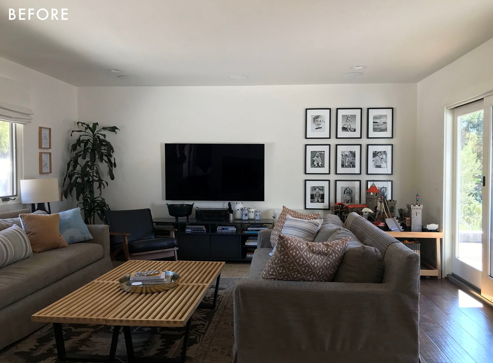

While the location and home were a dream, the allocations of some pretty unimportant walls were not. The dated, pass-through wall, half-heartedly divided the kitchen from the rest of the space unnecessarily. Meanwhile, the entry seemed to be missing part of a wall that would transform the function and visual impact of the home’s first impression. 
By client-request, we originally explored additional footprints. For fun, here’s a quick look at a variation; the “what could have been”. 

We love the puzzle-solving nature of the design process and appreciated a client who wanted to see varying project scopes in order to fully compare, but in the end, this was the simplified design we landed on! Notice that the “befores” shown above and the “afters” to follow are the results of changing only TWO, ITTY-BITTY PARTIAL WALLS. The major footprint, plumbing, and windows were left alone. The aim was to solve the following dilemmas:
So, onto the solve: 
The first thing to note is that the layout of the major plumbing and appliances remained the same. To do this we simply combined the stovetop and oven into an induction range (which is environmentally friendly!). At first, we encouraged moving the sink from the diagonal, but it was important to our client to keep it there for easy surveillance of backyard activities, which I assume means watching her boys garden and meditate. ? 
We put a huge emphasis on seamlessness within this design in an attempt to keep the eye flowing throughout the zones of the home. Where it was previously unnecessarily divided, a few tricks helped hide functionality within visual unity! An obvious help was panel-ready appliances, which we love for their ability to contribute to a clean, unobstructed look. When it came to cost, this was a priority more so than shifting appliance locations. So, leaning toward accepting existing plumbing provided extra funds for added panels and panel-ready machines. 

Appliance Pulls | Brass Handles And while we’re hiding appliances, let’s talk about the coffee and small appliance “garages”! The desire to hide frequently used, usually countertop-located machines is common, but not all of us have the extra space to lose to added widths required for retractable doors (which has become a popular “appliance garage” solution). Since this was a smaller space and we needed to utilize every inch, the solution became soft-opening cabinet doors that operate on a mechanism to go “up” and get out of the way. 
A few additional space-and-clutter-saving solutions we opted for: pull-out drawers to flank the range to eliminate “stuff” on the countertops (spices, oils, cooking utensils, and cutting boards). A small shelf above the range for an easy-to-reach surface space when cooking. Lastly, keep a “ledge” behind the corner sink to display some greenery & bring that Ojai nature feeling indoors. 
By losing that unnecessary wall and keeping the sink in the corner, we were able to create a large, seamless island with a wonderfully “unbroken” countertop surface for cooking day prep, homework, crafts, and beyond! (By “unbroken” I mean there isn’t a sink or stovetop). We used the island’s depth to hide even more cabinets for storage on the stool side which is operated by subtle, finger-pull hardware. The design of the doors was meant to be softly disguised as a millwork face. 
While on the other side of the island is where we have some necessities that are hidden away from view when you first enter the home. A built-in microwave with a large drawer below, in the middle two large drawers for pots and pans, and last but very necessary the pull-out drawer for trash & recycling, topped off by the staple of everyone’s home, the “junk” drawer. 
The other note-worthy cabinets in the space are the full-height, countertop cabinets. We really hate letting vertical space go to waste in a smaller kitchen, but we didn’t want to overpower the eye with heavy/solid floor-to-ceiling cabinets since they were so close to the corner windows. We found a solution that our client could store infrequently-used items up top, while masking plates, bowls, and your favorite mug behind the glass fronts which creates a sense of depth and “airiness”. The MVP for this game: reeded glass. It comes with a lot of the expected perks of a glass cabinet (“visual room” and lightness) but it hides more. If you like to keep your cabinets styled and ready to feature in the next issue of (insert your favorite home magazine here), you may not need this option. If you have three boys, two dogs, and an active cooking life, meet your new best friend! 
Dining Table | Pendant (similar) | Chairs (Simiar) | Rug The dining room was simple, both in style and solution. The idea was to increase the “feel” of the size of the kitchen by confusing the eye as to where it stopped and the dining room began. So, we tied the tone/style of the custom buffet build into the kitchen cabinetry. Aiming again to reduce visual bulk, open shelving was utilized within the overall goal to keep most storage “hidden”. And as an extra, nod to the kitchen, the same wood detail on the sides of the kitchen island was used as the back of the open shelving. This also contributed to added depth and texture in this open dining space helping to define and “anchor” the area a bit more from its before version. 
Both of these spaces lived within the eye line of the home’s main door, meaning they contributed to all “first impressions,” but not perhaps not as immediately as the entry itself. Our clients had lived in their house for years prior to renovating, which meant they knew what they needed more and less of within their space… and what they never used. The latter proved to be the under-utilized access between the front door and the living room. We decided to redesign this “zone” for something a bit more craved – a spot to “land,” put on shoes, and hang jackets. So, we turned that “dead zone” into storage, adding a drawer for shoes and hooks to the space above to hide unsightly leashes and doggie bags in baskets. 
Then, on the other side of the new wall, we gained shelving in the living room, providing the perfect place to display book collections and family photos. The client loved the new spot for a cozy reading chair by the fire. Bonuses on all sides! 
Table Lamp | Built In Color | Coffee Table | Leather Pouf (similar) | Rug Since we’re in the living room, let’s look at the major impact the custom build had on the space. That’s really the only major change in the room…. Well, it’d be unfair not to emphasize what a MAJOR impact a good vintage rug can have. We actually added one to every room we touched on this project. We customized a full-height, wall-to-wall storage unit, built around the size of their television and customized it to store large speakers and electronics. The design allowed for unobstructed sound and ventilation as well. We also balanced open shelving for displaying cherished collections and art with hidden storage for lots and lots of legos! Above it all, awning-style cabinets function well for accessing more seasonal items. 
Small, careful changes made a big impact for our clients who proved, in the end, to be as delighted as they were delightful. And though we have yet to see them in person without masks, we’ve decided we’re invited along for their next Airstream camping adventure! Should they find themselves asking us for small-design solutions for said camper, SO BE IT! Bring on project #2. Until then, we’ll leave you all with one last, post-COVID thought: you still need to add at least a week or two to listed lead times, but your apples no longer taste like Clorox. Cheers to improvements! 


ROLL CREDITS: The post A Kitchen Makeover That Focused On Small Changes For A BIG Impact (Julie And Velinda Did It Again!) appeared first on Emily Henderson. via Emily Henderson https://stylebyemilyhenderson.com/blog/organic-neutral-kitchen-ideas 
This past week Emily giggled when we (the LA team) decided to reschedule a team lunch because it was raining…HARD. “Oh you definitely can’t have lunch when it’s raining,” she playfully mocked. And look we get it! But we are also crossing our fingers that sunny days are soon for us all. So for now, grab a warm beverage, sit in a cozy chair (or sofa or bed), and enjoy this week’s link up:) This week’s house tour is pretty out of this world but also extremely personal which is why we are fascinated by it. It’s the home of actress Debby Ryan and musician Josh Dun and was inspired by their love of treehouses, games, and fantasy. Go check out their Ohio home and we highly recommend you watch the video. From Emily: A big shoutout to two of my favorite Portlanders today – Max Humphrey and Kaitlin Green. This feature in Domino was so warm and welcoming and Max’s new line of Sunbrella for Pindler is AWESOME (I have some of it in my upcoming dining nook that I can’t wait to show you). The Irish blockchain motif is really perfect for me (and you might see it on some Adirondack chairs, soon). It’s only to the trade right now so I’m not sure where to link it, but hoping that someone will make pillows out of it so any of y’all can have it in your home. Great write up Domino. From Mallory: When I tell you my life changed from getting this phone charger, I mean it (the cord is sold separately here). We refer to it in our house as “the fast charger” because it does exactly that. Your phone will be FULLY charged in less than an hour. I hate carrying around portable chargers, so this was a real game-changer for me. Even if we’re leaving the house in 10 minutes, I’ll plug it in and it will go from like 20% battery to 60% that fast. It’s amazing and I don’t know how I ever lived without it tbh. From Jess: I’ve been using my oven more lately and want to re-shout out these baking sheets. They are nonslip, easy to clean, and I’ve had them for at least three years and they still look great. These would also be such a great gift! ATTN Vintage Lovers! Drew from Lone Fox is dropping his second highly-curated vintage haul on March 26th at 10 am. He has an impeccable eye so be sure to check it out! Last time it sold out very fast so we suggest heading over there quick:) From Caitlin: My former startup advisor-turned-friend Lucas just relaunched his app, Hipstamatic, as a social network!!! If you’re chronically online like me, you may remember Hipstamatic from the late aughts – they invented the square filtered photograph (!!!) and it was also the only app Steve Jobs EVER named as Apple’s “App of the Year,” which is incredible. ANYWAY, Hipstamatic relaunched this week as an IG competitor and it is AWESOME – a chronological feed, no algorithms, no AI, and no ads! Just simple, square, filtered photos of your friends and family that disappear after four weeks (it’s user supported – you can pay for more features. I do :)). Remember when IG was just photos of your friends having a nice breakfast or sweet photos of sunsets? WE CAN HAVE THAT AGAIN!!! Come check out unstaged, unstyled photos of my house, my nails, my pets, and my vintage finds right here – I’m SO EXCITED for this to be the next big thing in social media:) From Ryann: I am in love with my new sneakers. I wear them almost every day with leggings, a plain t-shirt or tank top, and a zip-up or hoodie. They are so comfortable and cool and it’s becoming hard to wear any other shoe. 10/10! From Albie: A few years back, I remember when @signedblake released her very first collection with Amazon The Drop. It was glorious! The colors. The silhouettes. The fabrics. I’m actually wearing a dress from that first collection in my living room reveal from that year. Then she released a second… and a third… and a fourth… each collection arguably better than the last. During this same time I’ve also been trying to refine my personal style outside of the house — I have my work-from-home wardrobe on lock! — and had been on the hunt for a leather pencil skirt. Ask and ye shall receive! The faux leather midi skirt from Blake’s most recent drop is exactly what I’d envisioned in my fashion mind. The material is luxuriously soft. The way it drapes over my hips is like a glove. Now that I’ve found the skirt, I just have to figure out where I’m gonna actually wear it lol. Hope you have a great (and dry) rest of your Sunday and see you tomorrow. xx Opening Image Credits: Lead Design by Julie Rose | Styled by Emily Bowser and Assisted by Lauren Day | Photo by Sara Ligorria-Tramp | From: A Dark Attic Becomes The Most Joyful Bedroom For THREE Kids – Thanks To Velux Skylights And Some Clever Storage Solutions The post The Link Up: The Fabric Line Em Is Using At The Farm, Albie’s CUTE Faux Leather Midi Skirt, And A Lighting Fast Phone Charger appeared first on Emily Henderson. via Emily Henderson https://stylebyemilyhenderson.com/blog/cute-faux-leather-midi-skirt 
Look there’s something we need to address. We’ve been seeing this article of clothing EVERYWHERE in 2023 and it’s time that we brought it to your attention. I’m not sure how this came to be but it turns out that this is the year of the unitard. Yup you heard that right. We are stripping down to our skivvies and pulling on some surprisingly comfortable, shaping unitards (which are also affectionately referred to as bodysuits or onesies, the unitard is rebranding). Albie even talked about a unitard she bought and loved in the link up a few weeks ago. Here’s what she had to say about it: “Hi my name is Albie and I’m your fave comfort influencer lol. One of my fave new comfort finds is this jumpsuit from Old Navy! So good! I purchased two colors to start and now I want em in every color. What I especially love is that I can wear em around the house with a robe and then switch out my robe for a shacket to pick up the mini from school or do a quick Target run. There’s a built-in shelf bra that’s surprisingly supportive considering how too heavy I am, although to leave the house, I pair it with a bralette to be safe.” Now at first, I wasn’t sure I would be diving into this trend, but when I saw the viral target unitard all over TikTok, what was I supposed to do? I clicked on that link. And was it already sold out? You bet it was. Did I sign up to be notified when it came back in stock? YES, I DID OKAY. So low and behold, it came back in stock and I immediately added to cart. Here’s what it looks like for those of you who are curious: 

It’s a dupe of the Aritzia jumpsuit and it’s honestly a very good one for half the price. Now note it’s not AS shaping as the Aritiza one, but I bought it and find it incredibly comfortable and I constantly want to put it on. Once I solidified that I’m a unitard kind of girl, I invested in this next lil number and I love wearing it to the gym and to my Rumble boxing classes ? 

So I know what you’re thinking…is this all just workout gear?? Or is this a real fashion statement that I can wear around town? I’m happy to report that athleisure IS fashion right now (which is ideal), and we love a sporty-street wear kind of look, so yes you can wear this around town and HERE’S HOW. There are 3 main formulas, let’s break them down: Dad Shoes + High Socks + SweatshirtOne of my favorite ways to wear a bodysuit like this is with a sweatshirt tied around the waist or around the shoulders (like in example #2). I love how effortless it looks with a simple tied sweatshirt even though I know getting that sweatshirt tie to look good involves much effort. Another notable element of this outfit formula is the dad shoe + high sock combo. We are not wearing ankle socks anymore no no no, instead we’re wearing cool white 90s dad socks with some chunky white sneaks (Just kidding, if you love ankle socks that’s great. This is just what’s very much on trend:)). Also the more accessories, the better. I’ll show you in some other examples below but just know you can never have too much. Add that fanny pack belt bag over your shoulder, pair it with those sunnies, and throw on a baseball hat. The thing about the unitard is that it’s simple and you make it your own with the accessories. So that’s a daytime athleisure look. Here’s how you’d wear a onesie in a more “going out setting”. Chunky Boots + Blazer + SunniesYUP, that’s how it’s done. I know it may feel WILD to wear a unitard out to a restaurant but I’m telling you it’s fun and comfortable. The blazer adds some structure to the shoulders while the uni SNATCHES that waist. The contrast makes for a gorgeous silhouette and a trendy outfit. Now onto the last bodysuit formula and maybe my fav: Sneakers + Button Down + AccessoriesHow cute right?? I love the open button-down or the button-down tied at the front. So into this look. Now if you’re convinced that these are the best ever and you want to purchase a bodysuit to call your own, here are our favorites right now!! 
1. Target Shorts Bodysuit | 2. Lowback Bodysuit | 3. Mindset Jumpsuit | 4. Ecostretch Jumpsuit | 5. Cami Bodysuit | 6. Good Karma Onesie | 7. Skims Rib Stretch Cotton | 8. Berry Flare Jumpsuit | 9. Alosoft Sunsout Onesie What are your thoughts on this new trend?? Drop your comments below, let’s chat!! Xx Opening Image Credits: Photo by Sara Liggoria-Tramp | From: I Let My 20-Something-Year-Old Staff Dress Me in 2019 Fashion Trends The post This New Fashion Trend Makes Getting Ready FAST And We’re Into It appeared first on Emily Henderson. via Emily Henderson https://stylebyemilyhenderson.com/blog/this-new-fashion-trend-makes-getting-ready-fast 
“Oh no, she’s talking about Paris AGAIN??” Yep! You may remember that I picked up a porcelain and brass vintage light switch at the flea market I went to. I actually only considered it because my dad had already bought a couple for his home and I was admiring them when he showed them to me. Hey, if he can figure it out how to install them then so can I, right? Ha. This could easily be a cool “statement switch” moment (well in the US at least where they’re less common:)). So while a very dreamy goal, I don’t think you need them for every switch in your house. They are perfect in a room with only one switch (duh) or if you’re like me and you have a standard switch in a very prominent area that is begging to be replaced with something special. Playing with small, often overlooked details like these is an easy and (can be) affordable way to quietly make your home feel extra special and carefully considered. 
This is my dear ole dad’s powder bath. While not perfectly styled (I sorta surprised him with my photo request), how cute is his little switch? Likely (in the US at least) if you’re not renovating with new drywall and a circular junction box, then you’ll need to come up with some kind of cover to go under your cute little switch. That’s because there’s going to be a rectangular hole that is larger than most of these round switches. My dad clearly used a black metal cover which nicely works with the switch’s black base. Now depending on the size of the switch you might need to DIY the plate a little and make your own holes to attach the plate securely to the wall. This is because the switch might cover the holes you would normally screw your plate into. That’s what those little gold screws are. I, of course, have other “plate plans”. 
Here is my situation if you need a visual refresher. First off, why is there a switch in such an awkward spot?? Especially when I have a switch 6′ away by the doorway that doesn’t even have a function??? Not the point but happy I got that out. Back to problem-solving. In my dreams, I would love to not need a backing plate, but I’m clearly not going to be replacing any drywall or junction boxes. So I am either going to get a round piece of wood to cover the rectangular hole and ideally inset the switch into the wood a little or get a round brass plate like this, make two new holes for securing it into the wall, and call it a day. I think I’m leaving toward the wood:) Now my dad promises it was easy to install but he’s pretty good with electrical stuff. If you aren’t or don’t have someone in your life who is, hire an electrician, ok? 
Imagine how much cuter that’s going to be. Also, this is definitely going to be a “statement switch” since I only bought one. For my other switches, I’ll probably just upgrade the switchplates to brass. However, that’s not what we’re talking about right now. We are talking about cool, unique light switches for YOUR home. “But Jess, this sounds like a cool idea but where can I find these ‘unique light switches’??” Glad you asked… 
1. Black Ceramic Dimmer Wall Switch: Vintage-inspired and would look SO cute in a dark bathroom with a moody wallpaper. 

But maybe you aren’t into the round look or want to avoid dealing with a rectangular hole issue. I get both of those arguments. Check these out and also remember to measure to make sure they actually are covering those holes:) 
1. Vintage Style Brass Light Toggle Switch Plate: This square is so chic! Get outta there! I wish they were big enough for my other switch holes…is that a real term? 
Ok, so while switches were the inspiration for this post, changing your outlet covers (even if it’s just the visible ones) is an even easier upgrade to your space. No electrician required;) 
1. Zaha Switch Plate: I love almost everything burlwood and these are so sweet. There you have it, choosing a unique switch is such a great way to mix things up *she says to herself, staring at her “new” switch*. Just make sure that whatever you buy works with the electrical in your country and enjoy a whole new light switch experience. Love you, mean it. Opening Image Credits: Photo by Kaitlin Green | From: Farmhouse Kitchen Reveal The post Design Idea: Unique Light Switches And Covers (Vintage Options Included:)) appeared first on Emily Henderson. via Emily Henderson https://stylebyemilyhenderson.com/blog/unique-light-switches-and-covers 

It feels slightly odd (and a little unnerving) to be writing this while rain and wind patter on my rooftop relentlessly but I promise to deliver a cheerful post about outdoor spaces nevertheless. In fact, a storm should be a reminder that sunny days are ahead (because rain can’t last forever, right??). At least that’s what I tell myself. So wherever you are right now, despite any and all weather forecasts, today I want us to look toward sunny spring and summer days where we can enjoy our outdoor spaces with vigor. But here’s one thing I know about outdoor spaces no matter how big or small: The more functional and aesthetically pleasing they are, the more you will seek to go outside and enjoy them. They don’t have to be magazine worthy by any means, but some furniture and light styling can make a small, unused area feel like an inviting outdoor oasis. So if you are looking for some small changes you can make to make a BIG impact in your outdoor space, this is for you. Jess’ Balcony

If we are talking about small outdoor spaces, Jess’ balcony is a great place to start. It is long and narrow (30″ x 20′) but that didn’t stop her from packing it with beautiful and functional furniture. The chaise lounge chair is vintage and not only fits the width of the balcony perfectly, but it also helps take up the length of the balcony which is, as you can see, quite long. When it is warm and sunny, she styles it with pillows and blankets for ultimate comfort and relaxation. The trick with outdoor decorating is to visualize how you will want to use your space (which is, in fact, how we suggest approaching designing indoor spaces too). For example, Jess lives in LA which is USUALLY quite sunny most of the year, so a lounge chair where she can hang out, unwind, and listen to music was a main priority for her. If a chaise is what your outdoor space is currently missing, here are some we love: 
1. Grotta Outdoor Wicker Chaise Lounge | 2. Wicker Modern Chaise Lounge | 3. Cape Coral Aluminium And Mesh Chaise Lounge 
On the other side, Jess added a vintage bistro table and vintage chairs to create another separate zone to enjoy. Her dining area is a perfect little outdoor escape where she can enjoy meals or sit outside and drink natural wine with a friend. Also, please note the blankets draped over the backs of the chairs. They are not just for style. She uses them to add extra cushion to the chair because the iron back was not the most comfortable. When it rains, however, she brings her cushions and blankets inside to protect them. If you are looking to start building a small outdoor dining set, here are some bistro tables to get you started: 
1. Canova Modern Metal Outdoor Bistro Table | 2. 28″ Etched Round Bistro Patio Table | 3. Tile Top Bistro Table 
Before we move on, Jess’ DIY floor deserves a moment. She used these IKEA plastic outdoor tiles and spray painted them to create this checkered moment that is just so cool and fits her Parisian aesthetically perfectly. You can read all about how she did it here. Caitlin’s Balcony

Caitlin wanted to transform her rarely used, charming but “needs work” balcony into a functional and beautiful space she would actually want to spend time in. Her first step in doing that was to provide more seating which started with this loveseat. It comfortably seats two and she says it’s her favorite place to lounge in the whole apartment. She usually stacks up those pillows on the right-hand side, closest to the window, and props her feet up on the bars when she is doing some morning journaling. It’s just such a great, comfy place to watch the sunrise (yes, Caitlin often rises before the sun – something I admire yet probably will never accomplish myself :)). The pillows, blanket, and outdoor rug add a layer of warmth and coziness which is so important if you want to use your outdoor space as often as possible. If a loveseat is just what you need, we suggest these picks: 
1. Sora Loveseat | 2. 2-Seat Modular Sofa | 3. Cushioned Wood Outdoor Loveseat 
On the opposite side, she carved out a place for a bistro table and chairs but what’s perhaps most exciting is the styling here. Who knew you could put a mirror on your outdoor balcony??? Not me until I saw Caitlin do this! It’s such a great idea and actually makes the space feel bigger and more open (and draws the eye up). Another thing that draws your eye up is her ingenious idea to add curtains to cover the bar wall that she not-so-endearingly likened to a “prison backdrop”. The curtains are made from Sunbrella fabric so they are durable and heavyweight so they can weather even the most intense LA storms. If you want to steal Caitlin’s look and for a simple wall styling idea, here are some mirror picks: 
1. Oblong Natural Wood Wall Mirror | 2. Vintage Bamboo Rattan Framed Wall Mirror | 3. Rattan Mirror Malcolm’s Deck
When Malcolm set out to design his 10’x11′ deck, he wanted to create three distinct zones: a lounge area, a food prep/grill area, and a gardening area. The other important goal for him was to build a privacy wall that would separate his space from the dozens of other units on the property, but would still allow him to enjoy the outdoor views. Being the fantastic DIYer that he is, he built the wall with 2x4s from Home Depot and door hinges to keep them together and allow it to be moveable and portable. I love how seamless the wall is with the rest of his deck and if you want to know more about it, you can read all about that process here! 
We simply love how cohesive and functional his outdoor deck turned out. The bench lays out the ideal spot for lounging, with a small drink table to accompany it, and he also made space for a bar cart where he can food prep or make drinks. At the risk of repeating myself again, I think it’s important to note that styling outdoor spaces as you would the indoors really helps to make them more attractive and therefore enjoyable to use. Plants, some textiles, and trays can really elevate your outdoors with minimal effort. If you want to start building your own lounge area, here are some durable bench options: 
1. Caspian Grey Outdoor Bench | 2. All-Weather Woven Wicker Outdoor Dining Bench | 3. Fairmont Metal Patio Dining Bench For some more outdoor inspiration and some wonderfully innovative DIY ideas, we asked readers to submit their outdoor transformations. Here are some we love! Morgan’s Front Porch
This incredible front porch transformation was sent in by a reader named Morgan, and right away I knew we had to feature it. It is such a wonderful example of making an “OK” space into an idyllic outdoor retreat. To freshen up the flooring, she used brick pavers and grouted over them to create a rustic look. Then she strung lights, added plants, and DIY’d a lovely swing that was assembled by using reclaimed wood, rope, and some hooks. For a relaxing seating area, she found chairs on Facebook Marketplace and scored that bistro table from Target. 
I love the sweet farmhouse vibe (I mean, what’s more farmhouse than 3 cute chickens clucking around??). The log stand also adds to this effect beautifully. Also, for anyone wondering the exterior paint color is Pure Black by Behr. Caitlin’s Side Yard
This narrow sideyard was submitted by one of our readers, Caitlin. As you can see the area was previously unused and uninspiring, so she decided to makeover the space into a garden sanctuary. The pebbles, stone walkway, and raised garden beds make it a 100x more inviting and useful space. Brava Caitlin! Bev’s Balcony
We have featured this incredible NY balcony transformation before, but it is worth revisiting because the transformation is awe-inspiring AND it includes a quite simple DIY. With a bamboo fence, a faux trellis, and zip ties, this reader’s balcony was transformed into a slice of serene outdoor heaven. She calls it “The Easiest DIY Green Wall Ever” but it’s also the smartest. Since NY experiences all of the seasons, her bamboo and faux greenery should hold up beautifully. This is incredibly renter-friendly (no tools needed), small space friendly and for a rough total of $500, you can make one yourself. She wanted to point out that the $500 is for two panels so if you need only one panel then slash that price in half. ? That is all for now, sweet friends. I hope this post helped anyone who needed it ? Thanks for stopping by! xx Opener Image Credit: Design by Jess Bunge | Styled by Emily Bowser | Photo by Sara Ligorria-Tramp | From: Jess’ Long And Skinny Balcony Reveal!! The post 6 Small Patio/Balcony Decorating Ideas To Get Your Outdoor Space Ready For Spring appeared first on Emily Henderson. via Emily Henderson https://stylebyemilyhenderson.com/blog/small-patio-and-balcony-decorating-ideas 
It’s pop-quiz time, how many of you are currently sitting in your living room, looking around at things and wondering why something feels off but you can’t totally put your finger on it? If you have to take a second to think about it then this post is for you. And if you are confident that you’ve got everything all together in your living room then this is a good quiz for you to take to see how your living room measures up to “EHD’s Living Room Rules”. Think of these as the 10 Commandments of arranging furniture in your living room although technically there are 22 rules. However, unlike said commandments sometimes design rules can be broken and things can still look good. We get it, it’s confusing, but we pulled these together to act more as guidelines to follow more so than rules. All of these “rules” below should help you answer the basic questions that we get asked every day like, “how tall should my coffee table be in comparison to my couch” or “how big should my rug be if my living room is blank big” or maybe “where should I hang my TV”? In case you need more design rules, check out: Bedroom Design Rules | Dining Room Rules Today we are talking living room layout, planning rules, and all the basics so that you and your living room feel pulled together. Furniture Placement
RULE: Give 30″ to 36″ of a walkway between large furniture pieces (if your living room allows for it) if not then at least 18″-24″. This rule specifically pertains to the large pieces of furniture in your space and is here to help you avoid overcrowding your living room with too many large pieces which will have you and your guests trying to squeeze between pieces. There’s a lot of pretty furniture out there but when designing a room you want to make sure have enough space to walk around it. Bruised shins are a bummer as is having your space feel too crammed with stuff and having to shimmy in between a sofa and another large chair. If your room is on the smaller size then opt for pieces that are more small scale which will give you the negative space you (and your shins) need. 
RULE: Make sure there is no less than 3.5′ and no more than 10′ of space between seating. This rule helps you to space out your seating for maximum enjoyment. We’ve all been on that awkward date where said date leans in WAY too close to ask you questions and talk to you during dinner. It’s an invasion of privacy and just too close for comfort. So it goes with your living room layout. This general rule helps make sure you aren’t too cramped or have so much space that you end up shouting at the person across from you. Sofa
RULE: If possible sofas should never be flush with a wall. Pull it out 3-5″ and give it some breathing room. While this rule can be tough when you have a small space since you need to make every inch count and it may sound contrary, it does help the room feel less crammed together if you can spare a few inches to get your sofa off of the wall. Coffee Table
RULE: Your coffee table should be at least half the length of your sofa. Scale is key in making any space cohesive. Making sure your coffee table is at least half of the size of your sofa will ensure that the two pieces look great and belong together. 
RULE: Your coffee table should be no more than 4″ higher or shorter than the top of your sofa seat cushions. To avoid the awkward visual of having your coffee table too high or low in relation to your sofa’s seat cushion use the 4-inch rule. There is no reason to have your coffee table feel like a high countertop or have it so short that you hurt your back bending down to grab a drink. 
RULE: 16″ to 18” is the ideal distance between the sofa and coffee table. While every room is sized differently you don’t want to have your coffee table so far from the sofa that you can’t reach your drink or put your feet up after a long day (depending on your house rules, of course). Keep them at least 16″ apart so you can walk around it but not have to get up to walk over to it. Area Rug
RULE: Your area rug should be large enough for at least the front legs of the sofa and all chairs to rest on top of it. Rugs that are too small for a room are like trying to fit into your jeans from high school. Sure, you may be able to squeeze into those pants but wouldn’t you look and feel better in a bigger size than one that doesn’t allow you to properly breathe? The short answer is YES to pants and YES to your rug. Most living rooms need at least an 8×10 with most needing larger. Don’t try and “stretch” a small rug into the room and then have all the furniture floating around it. 
RULE: Allow about 24″ between the wall and the rug in a large living room, and between 10″ to 18″ in a smaller one. We are talking about the need for negative space and breathing room. Your rug is not wall-to-wall carpet, so don’t make it look like it. If you follow this rule it will immediately make your living feel airy and light while giving a defined seating area to your space. This will also help any furniture (aka console, upright pianos) that are against the wall from being unsteady in a half on half off thick rug scenario. Lighting
RULE: Make sure the shade of your floor lamp is covering the bulb when you are sitting down. Nothing is worse than trying to have a relaxing evening on the sofa and having a harsh light in your eyes every time you look over at your lamp. It is said that the ideal floor lamp height is 68″ but that all depends on the seat height of the sofa or chair. When you pair a lamp with your seating make sure that the lamp isn’t so tall that a bare bulb is glaring down at you or so short that when you go over to turn it on the light blinds you from below. Ideally, the light should be at around eye level when seated, which brings us to our next rule. Also, porcelian bulbs are a great way to avoid harsh light! 
RULE: For a lamp sitting on a side table the bottom of lamp shade should always be at about eye level. It’s the same concept as the floor lamp rule. You want to have the light enhance your living room time not make it uncomfortable with harsh light in your eyes. Take the seat height of your cushion, side table height and lamp height to figure out what is going to be the best option for you and your home. 
RULE: Place wall sconces between 5′ to 6′ up from the floor. A sconce hung too low or high not only looks strange and won’t give you the right kind of ambient light you are looking for. Putting them at least 60″ above the floor is a good rule of thumb so you can easily avoid this potential issue, and cast a nice glow into all corners and areas of the room. 
RULE: There should be 3 – 6″ between a wall sconce and the edge of a mirror or piece of art it’s next to. Much like how your furniture needs space to breath and looks its best, so does your sconce. By keeping your hanging art and wall decor at least 3″ to 6″ away from the sconce it will give both pieces the space they need to shine…pun intended. 
RULE: For determining ceiling light width: Multiply your ceiling height by 2.5 – 3 to get the recommended measurement in inches. So if you have a 10 ft ceiling you would multiply it by 2.5 giving you 25″. That should be your approximate hanging ceiling light width. Another way you can calculate the right size light is by using the room size. Just measure the length and width of the room. Then add those two numbers together and convert the total into inches. For example if your room is 12 feet by 16 feet, your ceiling light should roughly be 28 inches wide. These handy formulas will give you a starting place for the proper size you will need for your living room ceiling light. Ordering the wrong size is the worst and very annoying so hopefully this will take the guesswork out of light shopping and will help you in the process. 
RULE: In an open space where people are walking, 7 feet is the minimum distance the bottom of a hanging light fixture should be from the floor. But for ceilings over 8 feet just add 3 inches of hanging height per foot. So if your ceilings are 10 feet tall, the light fixture should be about 8.5 feet from the floor. As we stated before, bruised shins are a bummer but so are head injuries. This rule (unless you live with a VERY tall person) will keep you and your loved ones safe from hitting your heads on a ceiling light. It will also make your home look more spaciously aware and feel proportional. Side Table
RULE: Side table shouldn’t be deeper than the depth of sofa they are next to. This is kinda a no-brainer but just in case, make sure your side table is no deeper than your sofa. It’s an awkward look have a side table that looks too big for a sofa. 
RULE: Keep your side table close enough to set down a drink with ease. Which is typically 2-3″ from the height of the arm. Another no-brainer. A side table is meant to be used by the seat it’s next to. You want to be able to set that glass, book, or whatever else you are holding down with ease. Bookcase
RULE: 12” is the ideal minimum depth of a bookshelf (or 15” to fit oversize art books). To easily avoid a “book overhang” crisis make sure any bookshelves purchased or custom made are at least 12′ deep. Your books and “shelfies” will thank you. And if you don’t have a bookshelf that is that deep than try to steer clear of displaying any books or items that will hang out from the shelves. Accent Chairs
RULE: You want around 42” (size of your room willing) between a set of living room accent chairs to be able to fit a small table (or vintage trunk in this case) in the middle. For a smaller room just place chairs side by side. Do you sense this theme of giving enough space in between pieces of furniture? 42″ is a great standard to give you the right amount of space between your side chairs. 
RULE: When pairing a sofa and accent chairs choose seat heights that are within 4″ of each other. It helps to have similar seat heights in a living room so that when your family and friends are all sitting in the same space no one is awkwardly at a very different height. Plus it just visually looks better in the room. Sofa Console Table
RULE: Make sure your console is the same height or a few inches shorter than the back of your sofa. It should also ideally have about 6″ of space on either end. It just looks strange to have a sofa console table that’s taller or wider than your sofa. Keep it a few inches shorter and style away with your favorite keepsakes. Television
RULE: An optimal height for the center of the screen is 30 inches above the lowest seat height in the room. Give your neck a break and use this rule to avoid hanging your tv being hung too high on the wall. 
RULE: The distance between TV and sofa should be about 7′. We all have different preferences when it comes to how close we like to be to our beloved televisions but a good rule of thumb is 7′. Your eyes will be very happy, and you won’t feel like you are either in the front or back row of the movie theater. Phew… we made it out alive. As mentioned before these are all guidelines and some of these rules can be broken and the room can still work cohesively together, but hopefully these will give you a good foundation for your living room layout. Let us know if you have any questions below or if there are any rules that we left out that you want answered. Now what room should we tackle next? Let us know your burning questions below. Check out the rest of our design rules: Bedroom Design Rules | Dining Room Rules Opening Image Credits: Photo by Sara Tramp | From: My Living Room Update The post How To Design A Living Room – Our Go-To Rules (And When It’s Ok To Break Them) appeared first on Emily Henderson. via Emily Henderson https://stylebyemilyhenderson.com/blog/living-room-rules-know |
ABOUT MEHi, I am Rashad Mello from Licking, MO. I am a textile designer by profession. I am also managing my online store for selling my designs. Archives
April 2023
Categories |
 RSS Feed
