
Perhaps one of the most difficult things to do when designing a room is creating one that is functional, stylish, cohesive, and reflects your personality. All rooms don’t have to be all of those things, but I think because we are used to seeing perfectly styled rooms that are also UNIQUE, it’s normal to crave that satisfaction in our own homes. But I must remind you (and myself) that the perfectly styled rooms we see on the internet are the result of SEVERAL professionals working together and often borrowing products and styling for one specific shot. Most people don’t live in magazine-worthy homes. That said, I know what it feels like to want a home that is functional, stylish, cohesive, and reflects MY personality. There are many ways to do this, but today I am talking about creating unexpected furniture and decor combinations to make a room feel fresh and exciting (but still cohesive). So how do we do it? I’m glad you asked. The three simple ways to achieve this are: 1. Don’t be afraid to mix several different styles. 2. Combine different textures, patterns, and colors. 3. Incorporate a variety of shapes. Simple enough, right? And guys, you can even do all three! Just remember, the #1 rule is you can mix ANY style as long as you have a consistent color palette throughout the space. So since Lulu & Georgia is having their annual Labor Day sale (praise be) and they are our favorite one-stop shop for all things furniture and decor, we put together some shoppable pairings that are exciting and make our hearts beat a little faster. (P.S. all of the products are currently on sale, and the price listed under the product photos is NOT the marked-down price. Be sure to click the link to see the on-sale price). Let’s get into it. Sofas + Coffee Tables
Let’s start with the main living room players: the sofa and the coffee table. In the mountain house living room above, Emily matched a modern vintage sculptural sofa with a modern organic oval coffee table. This choice feels unexpected because the shapes are so different, but they still feel cohesive together because both are neutral and work within the color palette of the room. 
1. Gunther Sofa + Duke Round Coffee Table: I love that both these pieces have flat, curved bases but their style and color are different. The sofa is very quiet and minimal so it contrasts really well with a black table that has a dramatic marble texture. Side Tables + Lighting
Side tables and lighting are often coupled together in a room, and both are small enough that you can really get creative by pairing different styles or shapes. In the above bedroom, Jess scored two vintage nightstands and added a modern flair by using two brass dome table lamps. The brass coupled with the dark wood is STUNNING and really gives the room a fresh feel. 
1. Culver Side Table + Enno Table Lamp: I love how the inverted triangle shape of the table makes it wider on the top and narrow on the bottom, and on the contrary, the bulb-shaped lamp has a wider base and narrower top. That contrast just looks so cool together, and the smooth all-white lamp really pops nicely against the natural wood grain and fluted detail. Dining Tables + Chairs
Mixing the style of your dining table and chairs is the easiest way to create a unique look in your dining room. The more opposing the styles, the better IMHO. I love in the above dining room by Allison Pierce, she mixed a sleek, mid-century modern table with antique farmhouse chairs. The chairs are so stunning and have the coolest details. Do you see those chunky back legs and the back design?? It looks so fresh and exciting paired with the more modern, hard lines of the table. 
1. Sandy Dining Table + Whit Dining Chair: That Sarah Sherman Samuel dining chair is something else. It’s so sculptural and elegant that it could potentially look stellar with any style dining table. The unique pairing with the industrial farmhouse table though is such a cool look. Rugs + Wallpaper
Wallpaper or a rug can easily be a jumping-off point for designing a room since they can be very large and stand-out pieces. If you want to create an exciting room right off the bat, you can start with a bold wallpaper mixed with a bold rug. Take this bedroom for example. If you don’t immediately recognize it, this is home of Kirsten Blazek, who I personally revere for her expert use of wallpaper. I love how the large-scale, colorful cactus flowers bring in an eclectic desert vibe, and then the rug grounds the room but still has a pattern and color that contrasts the wallpaper. The pair together truly elevates the room and is so pleasing to the eye. 
1. Apple Wallpaper + Senna Rug: Moody Victorian-style wallpaper plus a thick geometric lined rug equals me falling head over heels. I really want to see these two in a room ASAP. Wall Art + Decor
Our final category is wall art and decor which is probably the area you can have the most fun with. Decor is often smaller in scale (I say often because statues and large sculptures do exist and are AWESOME) so it’s low risk and high reward. In the above vignette, a large abstract painting (leaned instead of hung which is one of our favorite styling tricks) is matched with a miniature ladder. I love how the ladder feels eclectic yet quiet and vintage, while the painting is modern and bold. The two together feel special and intentional. 
1. Study of Clouds + Ema Vases (Set of 2): A classic vintage style cloud painting with muted blue tones pairs beautifully with these two marbled gray narrow-necked vases. I love how the modern vase shape and dark color contrast with the soft colors of the painting and the ornate brass frame. Alright my friends, this is where I begrudgingly leave you (I swear I could fantasize about unexpected furniture pairings all day long). Which one is your favorite? Are you feeling inspired to try any of these out in your home? Tell me everything. xx Opener Image Credits: Design and Styled by Emily Bowser | Photo by Sara Ligorria-Tramp | From: All Your Living Room Styling Questions Answered The post Decorate Like A Designer – 20 Unexpected Furniture/Decor Combos Picked From The Lulu & Georgia Labor Dale Sale appeared first on Emily Henderson. via Emily Henderson https://stylebyemilyhenderson.com/blog/how-to-design-an-exciting-room
0 Comments
The 5 Go-To/No-Fail Living Room Layout Configuration Options To Make The Most Out Of Your Space8/30/2022 
Have you ever had a tough time trying to figure out the right seating layout for your living room? ME TOO. Remember this post? You just want it to make sense AND look good. Now, every living room is basically its own little snowflake, unique and likely stocked with architectural features that make you question if anyone involved in the home building process thinks about furniture placement. Not trying to throw shade buuuuttttt… So today we have our 5 go-to seating furniture configurations to hopefully be the Advil for your layout headache. Now since living rooms aren’t all shaped the same, you may need to slightly modify these to make them work best for your space. But don’t worry because we are going to talk through them all. 
As I was compiling these layouts based on rooms we have actually designed, this one was one of the most popular. It offers lots of seating options, is perfect for a living room with one main focal point (yes, like a fireplace or where you want to put your tv), and really fills out a room but not in a super crowded way (unless you have a small living room). MODIFICATIONS:
DESIGN TIPS:
Let’s now look at some examples: 
This living room belongs to the founder of Schoolhouse Electric, Brian Faherty, and was styled for Em’s first book. Notice how Brian chose a traditional leather chesterfield sofa, with two midcentury modern style matching chairs in a classic patterned fabric, then to mix up the seating even more he chose a beautiful MCM lounge chair and ottoman. None of the seating matches but they all work together and are perfectly complemented by that simple industrial coffee table. Notice also how he only has one side table. I think it would have felt crowded otherwise. So then with a few other furniture pieces along the perimeter, this layout is comfortable, visually interesting, and perfectly fills in the space. 

Here was Brady’s first iteration of his living room layout. Same idea as Brian’s but flipped. Brady also added a side table between the set of leather chairs. 
Here you now can see that the layout is focused around his awesome fireplace:) Also instead of a larger lounge chair, he choose a fun-shaped accent chair in a lighter toned leather without any kind of ottoman or table. Since his living room was smaller he didn’t need it for the room to feel full. 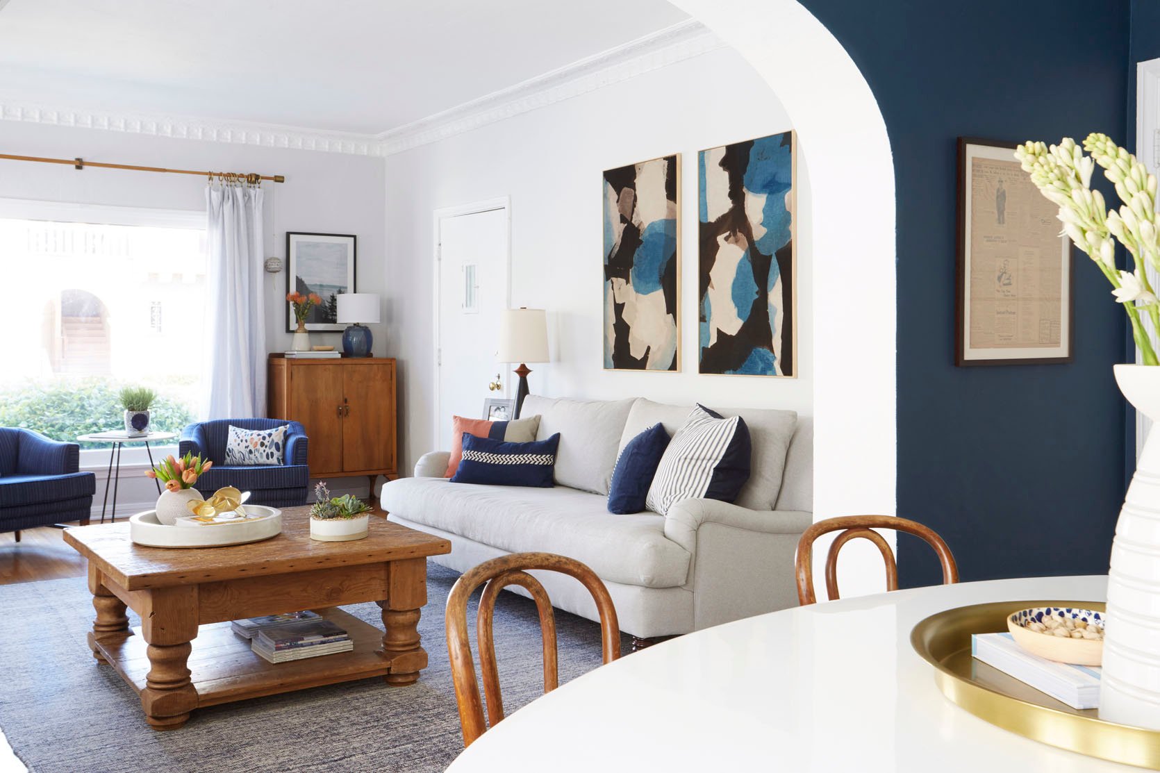
EHD alum, Ginny, also decided this was the best layout for maximum seating and focusing on her fireplace. 

Ginny also had to deal with the fact that her front door opened into her living room. Because of that, the two matching chairs are slightly further from the sofa (not touching the rug), giving the illusion of a separate seating area and entry. A very slight modification that makes a big difference for the flow of the room. 
Now for Option Two! So maybe you don’t love that first layout or maybe you have more than one focal point. This is a great option for you then. Having two chairs directly across from your sofa is a great way to prioritize conversation while still making sure your TV can also be a priority. MODIFICATIONS:
DESIGN TIP:

Another EHD Design Team Alum, Mel, perfectly achieved this layout in her old living room. Her view was clearly a priority for her so she chose to have her sofa facing that direction so she could enjoy it. Then to have her living room still feel cozy yet airy, she placed those two beautiful light leather chairs directly across for when she had a few guests over. Notice how the wall with the credenza is another focal point and this layout also invites it in. 

When Sara helped her parents refresh their living room this was also the perfect layout given the two points of entry and the fireplace. It feels open yet cozy. They also didn’t have to worry about a tv for this space so using the taller wingback chairs was an awesome design choice that gave the room more visual levels. 

While this isn’t a pass-through room, this is a great layout if you have one. Actually, this is a great example! 
If you have a large living room with one designated focal point, this could be a great option for you. It gives you a ton of seating and is perfect for facilitating conversations. I think we could all use more of that! MODIFICATIONS:
DESIGN TIP:

This is best shown in the Griffith Park Living Room. The focal point is clearly the fireplace (ornate and traditional), the sofas (simple and modern) are matching as well as the chairs (modern and vintage). Can you just imagine all the fun game (and maybe wine) nights that have been held in this room?? Also, that organic coffee table is incredible and brings so much movement and contrasts the traditional style of the home perfectly. 
design by annie segal and marieke ochtman of asom home | styled by pop up home | photo by corey gibbons | from: tour this house flip in the hills (by emily’s friend of asom home) So these boucle beauts are more loveseat sized but you still get the idea. The difference with this layout is that the chairs are next to the fireplace and are on a diagonal. Looks very cool and fun. 
You knew I wouldn’t leave you without talking about a sectional layout:) This is another Em Henderson go-to. It’s great for a large living room with a focal point like a fireplace. Let’s just jump right in: MODIFICATIONS:
DESIGN TIP:


Ahhh. The stunning Glendale house. Em has always said she didn’t finally nail the layout and color palette of this room until this version (the one she styled to sell it). But the brown leather chair is spaced just far enough from the sectional’s chaise to not crowd it but isn’t so far that it feels all by itself. Then the opposite chair helps to bring in the other side of the room. Big fan. 
At the mountain house, Em did more of the “pair of chairs” look across from the sectional but choose mix-matched chairs for a unique, eclectic look. Those organic side tables and coffee table also help to really fill out the space. 
The media room from the Portland Project, has this layout but used matching accent chairs and they look great. 
Also because they are close to the wall, it was the perfect opportunity to use high-back chairs. No need to worry about blocking any views:) 
Last but not least we have “the small living room” layout. I kinda covered this in Option One but I wanted to give you some visual examples. MODIFICATIONS:
DESIGN TIP: Don’t be afraid of standard-sized furniture in a small space. Sometimes “small space” specific furniture can make a room look even smaller. Of course, be sure to measure to make sure the pieces will fit and not overcrowd. It’s a balance:) 
Here’s my old little baby living room. I didn’t choose the smallest size sofa offered and was able to fit two side tables and that fun little accent chair. To be honest, the chair wasn’t sat in very much because of its size BUT it added a ton of personality and was useful for the couple of “parties” I did throw. 

Ryann’s living room is also on the smaller side but she was able to get that wonderful vintage wingback chair in there without it feeling crowded. Instead, it helps to define the living space from the dining area. 
Emily’s mountain house family room is definitely a more “standard” size but this layout is still great! The key is to make sure the proportions of the furniture are correct. This sofa is big and deep, that incredible chair is larger with a good sized ottoman, and the coffee table is also a great size. Scale is always the hardest in any furniture layout design. You don’t want to overcrowd but you don’t want things to look bitsy. When it’s right is when it looks really well designed:) 

Here’s one more because it’s pretty and I wanted to add it in! It feels really approachable and relatable. Hope it gives you even more confidence to go for it! So there are our five living room seating layout configurations. There are definitely more but hopefully, these are universal enough to get you the living room you want. Love you, mean it. Oh and here they are all together if you want to have them pinned in one place:) 
Opening Image Credits: Photo by Zeke Ruelas | From: Ginny’s Living Room Reveal The post The 5 Go-To/No-Fail Living Room Layout Configuration Options To Make The Most Out Of Your Space appeared first on Emily Henderson. via Emily Henderson https://stylebyemilyhenderson.com/blog/the-5-go-to-no-fail-living-room-layout-configuration-options-to-make-the-most-out-of-your-space 
Hey friends! It has been such a looooong time since I first started working on the dining room dilemma. It’s been so long in fact I thought I’d start by sharing my design agony here so you can catch up on all my struggles with this space. If you have a good memory, you’ll remember our dining room is an open concept and a pass-through space from the living room (which had its own problems that Emily helped me solve, thank you Em!) to the kitchen. Here is the floor plan so you can visualize the space: 
As you can see we don’t have a lot of space here to work with and only have two walls on either side. The wall with windows has piano windows installed, not because we have an upright piano but because we live in the city and houses are placed within an arm’s length of one another. Trust me, we love our neighbors. Remember this post? But….we also don’t want to stare into their windows through our windows, ya feel me? Awkward. Sometimes projects, however well intended, create a snowball effect that maybe you or I didn’t foresee. That’s what happened to us in our dining room. I loved our original dining room design and I especially loved our antique corner cabinet (ahem, I mean I did haul that thing from house to house with us as we moved), and I also really loved the table (still do, it’s been moved to the basement as my work surface). But when I re-designed the living room, we LOVED the way it took shape and how it started to vibe and feel organic. Which is great, except our dining room didn’t have that same FEEL. The Living Room Now:
Wall Sconce | Sideboard | Stump Table (similar) | Arm Chair | Rug | Coffee Table | Round Ceramic Tray (large) | Modern Bowl The Dining Room Before:
Both are very pretty and feel very us, but they didn’t flow together and complement each other, especially when they’re a mere two feet away from one another and in the same visual path. For context with this project, this all began during the pandemic and just as the world started to open back up. So if we were going to tackle a dining room makeover, some of my must-haves were:
Before we get into the reveal, you should know a lot (and I mean a lot ) of planning went into this space – keeping in mind, that we didn’t make one structural change. It was actually quite a few readers and Instagram friends who suggested banquette seating under the piano windows. (I’m always listening, folks!). Sadly, that would mean I would lose the corner cabinet I’ve held onto for 15 years but after much debate, it was time to let her go. This time, instead of retiring her to our storage unit, she found a new life with a new family who was looking and looking for a piece like her to complete their space. So now that the idea of a banquette was heavy on my mind and since I was still grieving the loss of parting with my beloved corner cabinet, I knew something equally special had to replace her. So I began sketching out my ideas of bench seating and landed on this: 
Don’t judge my not-so-3-D attempt at drawing. Yes, this is what I turned over to my friends at Traditional Cabinetry. Andrew and Liz both came out to measure (because you can’t take my word on measurements) and talk through the project. They really listened and we had really good chemistry right away. If you’re ever commissioning a custom-built piece just be aware that 1) it’s expensive (and rightfully so) and 2) you really need to have a good communication plan and relationship with your trade partner so that a drawing like this can actually be delivered. Insert Megan (not thee Stallion) – who took my chicken scratch and turned it into an actual buildable rendering. 
Then the magic happened: 


I just have to over-share because the amount of work and attention to detail that actually goes into a custom piece is remarkable and the Traditional Cabinetry team deserves their flowers. Finally, it was install day! 


Our very own in-house Quality Assurance Tester (AKA my husband) tested it thoroughly. And it was so good I could’ve stopped here. 
Table (similar) | Chairs | Vase (similar) | Candle However, while all of the hard work and heavy lifting was going on I was literally holding meetings with Calico Corners to partner on phase II of the bench – the upholstery. Then we landed on these fabrics to complete the bench: 
Calico Corners Stripe Fabric | Calico Corners Green Velvet Fabric The Calico Corners team stopped out to measure the bench in person and off to the workroom they went to create the perfect complement to the white oak bench while also keeping within my organic aesthetic. 

I’ve worked with Calico Corners on 4 projects now and every time, they exceed my expectations. 

Did you know velvet is a wonderful performance fabric? So easy to clean and remove pet hair. I see you Remi and Mister! Also, these soft-close drawers feel so buttery. Clearly, you can see how much I’m over the moon with this whole bench. The table and chairs really helped bring in warmth and comfort as well as the legs on this table are just well…sexy. Now it’s been such a long time coming so I am so thrilled to share the reveal! 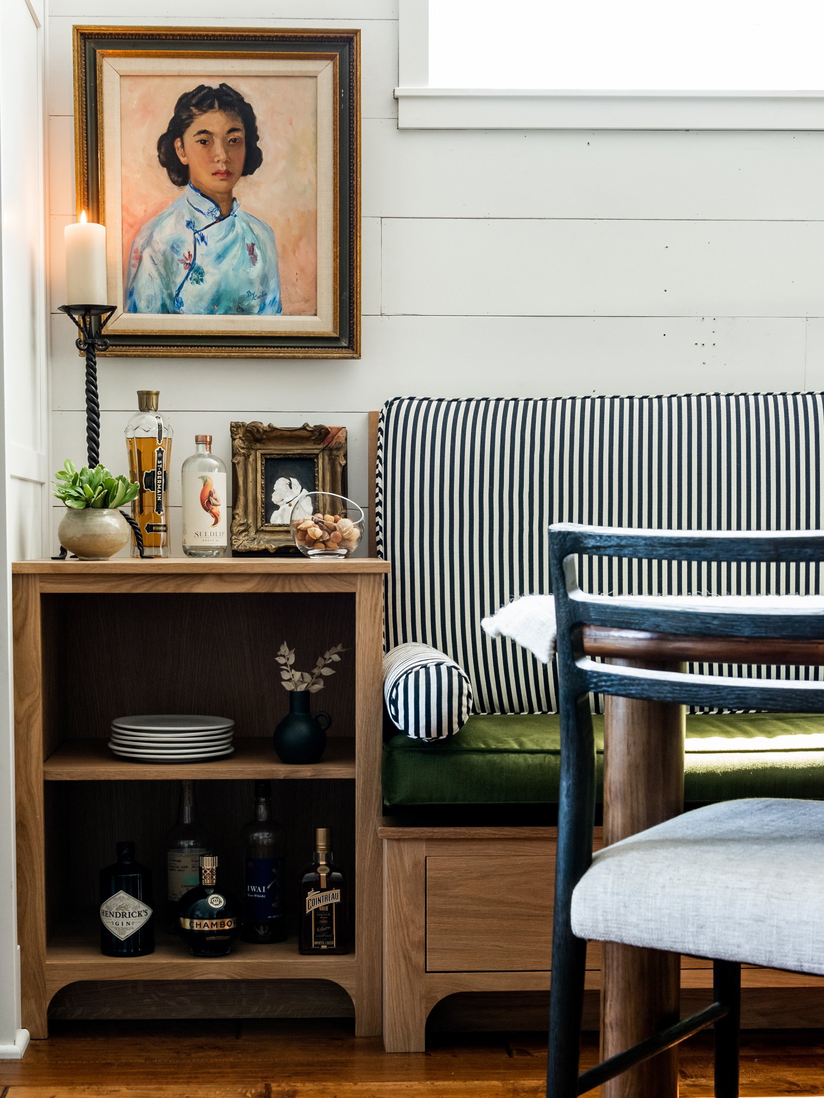

Calico Corners Striped Fabric | Calico Corners Green Velvet | Dining Table (similar) | Chairs | Chandelier | Counter Stool Since we’ve snowballed here, I made a very simple swap of lighting and stools in the kitchen to also carry the flow of the dining room through to the kitchen a little bit more because we are SO not ready to look at a kitchen remodel. 
Pendant Lights | Counter Stools | White Fruit Bowl And now that we are older, I VERY much appreciate a stool with a back and these are so comfy while contrasting a bit more than their predecessors against the all-white cabinetry. 
I know I shared a peek of them before in my build-up to this post but I have to share again how these cabinets balance out this space while also providing much-needed storage and display space because as a stylist well….let’s just say I have a lot of stuff ? Visually, the weight of the cabinets works so well with the adjacent wall where the bench and windows are. It’s a narrow room so shifting the seating to the window wall really helped define the walkway. See those sexy table legs I’m talking about? Also, your eyes aren’t going crazy, the table has a slightly irregular shape as well which made me fall even harder for her. Thank you, High Fashion Home. 
And although I wish I had moved this chair for photography, it really is this beautiful and comfortable. 
Back to those beautiful cabinets that so many people swoon over on Instagram. 
I do get a lot of questions about how I styled them but truly I filled them with the pieces that I love and since I am a very earthy color pallet lover, well, it all just meshes on its own. Sure, I play with heights and arrangements but keeping within the same muted color family makes life easier when you have this many shelves and glass doors. Play with textures, glass, pottery, wood, etc. If this speaks to you as it does to me, I also gravitate towards artisan handmade items for their organic shapes and irregularities. Most of the items here have been thrifted and if you do choose to thrift, understand patience and persistence are your best friends because it takes time. But anyone can do it so don’t be discouraged. If this is where you find design paralysis within your own home, you can help narrow down what you like by saving inspiration photos from magazines (yes, I still do that) or of course, Pinterest. Now just pay attention to the photos you save. Something about those images even if they’re not matching your exact vision caught your eye. Study the image to find what is it that your eye is drawn to. The color? Shadowing? Textures? Does it spark a feeling you long to feel? The shape or silhouette of an object can also be alluring to the eye. 
Stylist Tip: Vary heights and scale so that your eye dances around to look at everything but leave enough visual breathing room for your eyes to rest. AKA – don’t cram all of the things into a cabinet just because they physically fit. 
Dinner Plates (similar) | Pasta Bowls (similar) | Ceramic Cups (similar) Like anything, styling takes practice and everyone works through design dilemmas and paralysis. One tip I learned with open-concept floor plans is to design them in a way that all of the spaces feel like they’re in the same relationship even though some may have different personalities. You can achieve this through color, textures, pattern-play, etc. Did I check off every single one off the must-haves in the dining room? No. But it finally feels juuuuust right. I think it feels cohesive with the living room now and that was one of my end goals. I like that the two spaces don’t match but they do complement one another and tell the same story. I get it, open-concept floor plans are tough! But, that doesn’t mean they are impossible and if I can do it without any structural changes being made, so can anyone else. The biggest lesson I learned when designing our dining room? Design with intention and purpose and ask yourself those tough questions such as investment vs. expense. Do you truly love it or can you wait until you find that perfect vintage/antique piece? Long story short, taking a scalable design approach really allowed me to thoughtfully curate our home. 
*Design by Lea Johnson The post Lea’s Open Concept Pass-Through Dining Room Design Agony – SOLVED! appeared first on Emily Henderson. via Emily Henderson https://stylebyemilyhenderson.com/blog/open-concept-pass-through-dining-room-layout-solution 
Happy Sunday, everyone! This was a pretty good week if we do say so ourselves. The Hendersons moved into the farmhouse (AHHH!!!), the team got together for lunch and finally got to celebrate Ryann’s marriage in person, AND it was the last work week of August since Emily is the best boss and is giving us all off next week! Needless to say, no Sunday scaries over here. While we know not everyone gets off next week, we hope it’s still full of fun hangs, activities, and food. Links, anyone? 
This week’s house tour is a feast for the eyes! Especially those who love a farmhouse look with modern accents and hits of whimsical decor. Fun fact, this home/property is an actual former Australian dairy farm from the 1860s. The extra fun part about this project is that it’s a vacation home. This meant that the owners were much more willing to play with color and decor which was a relief to the design firm, We Are Duet? Check out the whole space here. 

From Emily: My wish for everyone renovating (or simply repainting) is to love their color choice as much as I love Dew Drop from Sherwin-Williams. Every time I walk into the mudroom I feel a ping of excitement. Sometimes it’s blue, sometimes it’s green. It’s really pale but not in a baby way. It just looks and feels really fresh. I can’t recommend it enough. Of course, always test before you place a full paint order because a color can look so different depending on the room and light it gets. But this is one to absolutely try if it sounds like what you are looking for:) 
From Ryann: If you ever see me wearing jeans, 90% of the time they are from Abercrombie. I have many different pairs but I am a huge fan of these in particular (in the black wash) and always get compliments when I am wearing them. I am not one to gatekeep so anytime anyone says “I like your jeans” I end up spilling where they are from immediately because I think they are too good to keep a secret. If you are looking for a new pair of jeans for fall, I can’t recommend them enough!! 

From Mallory: I wanted to zhuzh my shower products bottles up a bit because the shampoo/conditioner bottles I use are green, yellow, and purple which is way too much of a “barney” color palette for me to enjoy looking at every day. I decided to get these 32 oz bottles with these labels and I must say I am much happier with this decanted situation. I was in fact inspired by the “how to make your shower look better” post I wrote a while ago, and I will say my shower experience feels much more spa-like. I am aware that these are glass which freaks people out in the shower, so here are some plastic options, or you can use a clear adhesive to hold down the glass ones (which please note can make refilling annoying depending on where your products are in your shower). I will say after using these for a while, they’re heavy enough that I don’t feel unsafe with them being glass but if you do, please take precaution. I also got this $7 soap dish and I was very happy that for less than $45 I made my shower experience 1 billion percent better!! From Caitlin: Need to take a second to hype up one of my all-time favorite beauty products: this Matte Velvet Lip Crayon. I’m awful at putting on regular lipstick so the pencil shape is WAY easier for me to apply, plus I find that “Cruella” is simultaneously an awesome/saturated red AND a great everyday shade (definitely a “my lips but better” color) when I only apply a bit and smudge it out with my fingers. I’ve had the same stick for over a year and it’s still going strong – HUGE FAN. 
From Jess: I don’t know why I waited so long but I finally got an insulated tumbler for my iced morning drinks (currently iced oat milk matcha lattes). This $10 gem has been a game-changer! It’s large so a lot of liquid capacity, it’s double-walled so my ice doesn’t melt until maybe the end of the day, and it fits in my car cup holder. I love it. 10/10. That’s it from us! There will still be new posts every day so while we’ll be taking a break (and working on our MOTOs), the content will still be here for you. We hope you love it:) Opening Image Credits: Design by We Are Duet | Styled by Olga Lewis | Photo by Anson Smart | via Domino The post The Link Up: Em’s New Favorite Paint Color, Ryann’s Most Complimented Jeans, And Our Favorite Red Lip Crayon For The Best “Natural But Better” Look appeared first on Emily Henderson. via Emily Henderson https://stylebyemilyhenderson.com/blog/best-red-lip-color 
There are about a million things I miss doing with my mom but one is definitely shopping together. I know that sounds shallow and superficial but they were times full of discovery, joy, and a lot of laughter. Ok, not every time was pure bliss since we were still mother and daughter, but most of the time those shopping trips just felt really special. So recently, when Em was mentioning how much fun it was to shop with Birdie for her back-to-school dresses, hearing that took me right back. But also, how could it not be when you have a kid like Birdie who LOVES color, fun prints, and of course, sparkles?! Obviously, we all wanted to see what they picked out and boy did our hearts melt when we did. The dresses are so stinking cute! We told Em this needed to be a blog post. However, since the Henderson’s are MOVING INTO THE FARMHOUSE this week and are extremely busy, I volunteered to write it. I mean once upon a time I was also a little one who loved a pretty dress to wear to school. Needless to say, I felt qualified. Also, school has already started for a lot of families. Time is of the essence! I did, however, ask Em what their dress requirements are in case that’s helpful to any of you shopping for your little one: “Birdie is very specific and particular about her dresses and needs them to be the following: bright, comfortable, twirly, and she likes fitted on the top (as opposed to blousier – we learned this the hard way). Last year we both became obsessed with local kids’ dresses by Little Stocking Co. (who also makes awesome thick stockings for girls who want to wear dresses in the winter). This year she wasn’t as into the colors (brighter! she says) so we shopped around a bit to find a few that she loved and that felt high enough quality to at least last the year and be layerable in winter, etc.” Now that we are all prepped with what to look for, let’s get into their purchases and some other fun picks. Patterned Play Dresses
I love that Birdie wears a dress for almost any occasion. Outside, in the dirt, no problem. And she also loves a print:) Here are two that Em and her picked out: 
Mattie Dress | Long Sleeve Print Pocket Dress That pink polka dot number is adorable. The color is so happy, the pattern is fun yet classic and the twirl capabilities look top-notch. Then that little cat dress is perfect for Birdie’s animal-loving heart. The print also feels fun and a little modern, making it pretty cool:) Also, both of these dresses have pockets which are perfect for storing little found treasures. Then she can throw on a pair of leggings as the temperatures go down and she’s set for a lot more wear time. Em also wanted me to mention that she knows that the dresses they bought aren’t cheap but she tried to shop from small, sustainable companies. But if these prices aren’t in your budget (especially since kids grow so fast) we have plenty more options for you… 
1. Cotton Jersey Dress: I love how this dress looks a little dressy but is made in a causal, play-friendly material! Solid-Colored Play Dresses
Tillie Dress | Mauve Rose Charm Dress | Mattie Dress Prints are great but having some solid-colored dresses are also fun and good to have. These are Birdie’s picks. The colors are so fun and the dress in the middle (and #8 from above) are from Little Stocking Co. and according to Em,”are super comfortable, drape really well, girls find them fun to wear, and most of the time they have pockets.” Also, they are made in Portland and lasted all year long, without a stain or rip. So while they are on the higher price tag end, they are a good investment. Here are some more affordable picks: 
1. Cotton Dress: Love the sleeves and will be easy to layer as the weather cools down. Special/Party Dresses
Laurie Dress | Brisa Ruffled Capsleeve Basic Twirl Dress | Rainbow Dress As we all know, Birdie loves all things colorful and shiny. Rainbows are her favorite. So naturally, she was going to want some bolder dresses too. The shiny one on the far left is actually her birthday dress (Caitlin and I are honored to have her in the Libra club:)). It’s pretty darn special and was why Em was willing to splurge a little more. Then the one in the middle is perfect with those big, happy flowers. Lastly, a rainbow dress was essential and this one from Hanna Andersson is incredible. Emily also says that this brand’s quality is awesome. Birdie has others from them and they have lasted a year and look brand new still. FYI none of Birdie’s dresses were gifted. Both Em and Birdie both just love them and want to support (well, the supporting part is more Em:)) Wanna see the other options? These ones are a little more expensive since they are more “special occasion” dresses. 
1. Butterfly-Sleeved Tulle Dress: It’s perfect. Love the colors, love the fabric, and love the sparkle. Oh, and the price isn’t too bad either:) Ok, that’s all for today! Even if you don’t have a little one to buy for, I hope this was a happy feast for your eyes. Oh, and if any of you have other small and sustainable kid clothing brand recommendations, drop them in the comments. Love you, mean it. Opening Image Credit: Photo by Suraya Barbee The post The 8 Back-To-School Dresses Emily And Birdie Picked Out Together (+ 24 Other Affordable CUTE Options) appeared first on Emily Henderson. via Emily Henderson https://stylebyemilyhenderson.com/blog/affordable-back-to-school-little-girl-dresses 

Art hung the wrong way on a wall is like a character in a movie wearing a really bad wig. It’s just kinda hard NOT to see it, and you wish so bad you could just rip it off, knowing that everything would be so much better without it. It doesn’t ruin your experience, but it’s just terribly distracting. Whenever I walk into a persons home, whom I don’t know too well, they always ask me, nervously, “Do you instantly start analyzing the design and pick it apart?” I typically say some sort of generic, “Oh no! I just shut it off – when I’m not at work I’m not at work!” The truth is, yeah, I totally do. It’s like a chef noticing how food tastes at a neighborhood bbq, or a fashion designer noticing a good dress on a stranger. You just do it whether you want to or not. Do I stare and judge and care? Not at all. But I am aware and often I see the same easy mistakes over and over and over again. So often that I’m just dying to give unsolicited advise to fix them – which is why we started this series. Besides, The Generic Sofa Roundup | Rugs That Are Too Small | Painting A Small, Dark Room White | Bad Wood Finishes | How To Hang Curtains | Generic Art | Not Having A Plan | Who Pays For Design Mistakes | My Biggest Design Mistakes -And What You Can Learn From Them | When to Hire vs. DIY, I Too Much Furniture In One Room | Different Walls, Same Art Configurations I constantly notice art hung all wrong – mostly too high and too small. 
Growing up our art was always crazy high – it always took up the top 1/4 of the wall and you practically had to crane your neck to see it. This trend is still happening. Here are some general tips: 1. Yes, it should be “eye level”, but not if your ceilings are really low (typical is 8 – 9 feet) and not if you are really tall. If the wall were cut up vertically into four sections (going from bottom to top) then think of the art being in the third quadrant (counting from the floor). 2. If it’s a collection of art then you need to treat the whole collection as one piece, and start and stop it where it makes the most sense, as if it were one. 3. Engage as much of the wall as possible and orient the collection in the shape of the wall. The last thing you want is your art to look itty bitty on a big wall. It doesn’t look intentional and isn’t making your art look its best. 
It hurts my soul to see these things. I mean, the room on the right doesn’t really have a chance, but the room on the left (above) could be fine/cute if they just moved that whole collection down 6″. Although they are suffering from the “rug too small” disease as well. If you need a formula for hanging a great gallery wall head here. Speaking of too small, the second thing that I notice constantly is art that is just too small for the space. 
Both of these are cute photos with good art and sometimes intentionally choosing a small piece of art can look dope. However, the rule of thumb is that the space that the art is trying to fill is just way bigger than the pieces can handle. Generally the piece of art or the collection should be in the same shape and orientation of the wall that it is trying to fill. I get it, big art can be expensive, but you have more options these days – check out my epic online art roundup post here. 
You know these people. Now let’s save them from themselves. While the situation is rather nuanced we tried to come up with some general rules for how high or how big the art should be. Remember, if your walls are really tall then you can go higher and if your piece of furniture is really low then consider going lower to help engage that whole space. But generally try to fill as much space on the wall as you can, allowing for a space around the pieces so they aren’t crammed towards the furniture, wall, or moulding. 
I like art to be around 8″ above a piece of furniture, give or take. I’ve done it closer (like in Orlando’s place below/right), and that one did always look a bit crammed to me. You don’t want it to hit your head if you’re sitting in front of it so typically 6″ – 10″ gives you enough clearance to do that. Everyone’s “eye level” is different because we are all different heights, so that rule doesn’t really apply too much anymore. I’m sure that galleries have a rule about the middle of the piece being at eye level or something and often that does work, but if there is no piece of furniture below it then it might need to come down. Don’t be afraid of going lower. Consider the space you need to fill (from above a credenza to the ceiling) then place it 6″ – 8″ above the piece of furniture (if it’s big enough) and see how it looks. The artwork and the piece of furniture should relate to each other and live near enough to each other that they collectively engage the whole wall together as a unit. Often, if there is a huge gap in between it will look disjointed. 
I think these two photos above (mine on the left with it prohibited by the sconce and Orlando’s on the right) could have their collection or that piece of art start a bit higher, but scale-wise its awesome. 

Slightly “too big” art is always better than too small. So if you have to choose, go bigger. It looks like you made a really cool choice instead of a size accident. Here are a collection of spaces that I’ve styled with art – showing a variety of what works. 
Photos Above: Living Room Update – AGAIN – Our New Sofa, My Dream Floral Chaise And The Pop Of Red I Always Wanted In My Life | Our Master Bedroom – Finally | Mid-Century Credenza | A Modern and Organic Dining Room Makeover | Cup of Joe’s Bedroom | Cup of Joe’s Living Room To see some of my favorite projects where we incorporated art, check out these different spaces: Oh Joy’s Studio, Mid-Century Eclectic Artist, LA Bungalow Makeover, Oprah Weekend Makeover, and My Best Friend’s Basement to name a few. And if you are looking for good/affordable art check out my roundup of Best Online Art Resources. I know it’s kind of a complicated situation (for instance, I put the big photo of the face at least 12″ above the piece, breaking my own rule). Here’s a good trick I do ALL THE TIME: Put up the piece of art then stand back and take a photo of it. Pretend it’s not your house and that you have no emotional connection to it. Look at that photo and ask yourself, “if I passed this picture in a magazine would I think that art is too low or high?” This is a tricky one, so any questions? Again, in case you want to know what else we think everyone is doing wrong check out these design mistakes: The Generic Sofa Roundup | Rugs That Are Too Small | Painting A Small, Dark Room White | Bad Wood Finishes | How To Hang Curtains | Generic Art | Not Having A Plan | Who Pays For Design Mistakes | My Biggest Design Mistakes -And What You Can Learn From Them | When to Hire vs. DIY | DESIGN MISTAKE: Too Much Furniture In One Room | DESIGN MISTAKE: Different Walls, Same Art Configurations Opening Image Credits: Photo by Zeke Ruelas | From: Oh Joy’s Studio The post How to Hang Art Correctly appeared first on Emily Henderson. via Emily Henderson https://stylebyemilyhenderson.com/blog/how-to-hang-art-correctly Berber carpets are indeed one of the most popular types of carpets on the market today. Often made of wool, they are durable and have a high degree of insulation, making them ideal for use in homes and businesses. Berber carpets are also known for their distinct style, which features large, looped fibers that create a textured look. While most people display their Berber carpets in the living room or bedroom, they can actually also be a great addition to your bathroom. 
|
ABOUT MEHi, I am Rashad Mello from Licking, MO. I am a textile designer by profession. I am also managing my online store for selling my designs. Archives
April 2023
Categories |


 RSS Feed
