
I don’t know about you, but I’ve been feeling VERY inspired by some old Emily Henderson projects lately. Maybe it’s a generational thing – Em was about my age when she designed some of the rooms I’m lusting over – but to this day, I’m so impressed by her bold mix of bright colors, caramel leathers, and brass tchotchkes styled alongside so many incredible flea market finds. So on a recent Zoom, I brought up Em’s stylistic evolution – you know, her growth from almost-maximalist to the designer of a dreamy, quiet, timeless shaker farmhouse – and then asked if she’d design any of her former rooms differently if given the chance. That’s when this photo came up… 
I have to be honest – I know this picture is almost 8 years old, but this vignette still makes my heart skip a beat a little bit. (Anyone else?) I’ll always be a sucker for an orange-y wood casegood and that painting is one of my all-time favorites, but the real standout for me here are those weird and fun leg molds. For what it’s worth, today’s Emily said she would have toned down the styling on this dresser, but those legs swept me off my feet and got me thinking. I realized that there’s something special about a statement piece of furniture or decor – be it shaped like a hand, or a foot, or a head – that adds a little something extra to a space. Once, when I asked Em what to save on and what to splurge on, her answer was simple: splurge on the conversation starters. When it comes to body decor, though, there are conversation starters and showstoppers available at all kinds of sizes and price points. You can make a statement with one piece. You can fill an awkward corner (no more arbitrary plant placement!), add the perfect finishing touch to your shelf, and express your personality with ONE PIECE OF DECOR. I ended up digging around and y’all, I found SO MANY EXAMPLES of this in the wild. Today, I want to give you some eye candy – let’s look at the tiny tweaks and major renovations that bring body parts to the forefront of the home. And at the end, EHD rounded up some decor options at every price point (like, from $10 to uh, a piece that basically costs a month’s rent) so you can bring some easy, conversation-worthy pieces to your home, too. LET’S GET STARTED, YEAH? 
Let’s kick it off on the right foot (sorry, I swear that’s the only pun in here) with this office by Chelsea Hing. The space is minimal and simple, but it’s anything but boring. It’s proof that you don’t need a ton of stuff to make a huge impact – a thoughtful hit of pink, a huge piece of bold art, and a made-you-look accessory take the room to the next level. 
I’m in love with the sweet, quirky addition of two hand sconces in this shop. It takes a classic vignette with timeless styling (hello credenza topped with flowers, vessels, bowls, and candles) and elevates it just enough. Imagine the same space with a more linear sconce and it’d fall flat – the organic nature of the hand speaks to the items being displayed and makes a cohesive, soothing space. 
AH. Sigh. How serene is this apartment? In a space filled with quiet neutrals, soft textures, and curved shapes, the two-faced vessel adds the perfect amount of quirk while echoing the more robust pottery collection in the back half of the room. 
I love this vignette as it says SO MUCH about the person who lives here. The face bowl is unexpected and a little playful – this home belongs to someone who is cool, but in a fun and cheeky way. Of course, you can never go wrong with a peace sign cast in a shiny brass finish. On the left, it adds a little shine to an incredible textural and layered space; on the right, it’s the cherry on top of a happy and glam Hollywood Hills entryway. I think it’s easy for metallics like this to go cheesy or young really quickly, so I love how both are styled with a ton of breathing room and alongside some grown-up coffee table books. It’s a simple and clean finishing touch that won’t break the bank. Big fan. 
Oh my, we LOVE this Carmen Ellis footed vessel at EHD – so much so that you can actually spot it in Julie’s bedroom and in this makeover of a teen’s bedroom that we published last year! There are so many incredible statement-making moments in this room – the wallpapered ceiling! The lime-washed walls! The arched door! The textured chairs AND rug AND bed AND headboard AND…. (you get it, right?) – so it was a super wise decision to keep the dresser’s styling VERY simple with just one standout piece. And if you’re only going to use one vessel…why not go with the unforgettable choice? 
HOW SWEET AND HAPPY. Everything in this space has a buddy – the black accessories pop off the white quartz countertops while echoing the hex tile floors; the onyx bowl’s veining echoes the wooden vanity, but this whole space really sings because of that jade hand, which shines next to those walls and brings a ton of spunk to this space. Plus, it’s practical for jewelry storage Never thought I’d be this into feet, but uh, HERE WE ARE. Those shelves on the left are masterfully styled, but that foot adds juuuuust the right level of funk (in the good way). It’s silly, whimsical, and it has more interesting proportions than a bowl – something dense next to those vases and that mint piece would have made the shelf seem a little heavy – but the curvature of the foot sends your eye right back up to the lamp. WELL DONE. And I can’t get enough of this tiny foot on this console-turned-bar – it’s the perfect way to start a conversation between strangers when you throw your first big dinner party. (Plus, it does a nice job of balancing out the dark bottles.) SEND MORE FEET (DECOR) PICS TO ME, THANKS. 
Hi, Liz Kamarul, I’m a fellow ribbon chandelier owner (albeit a much smaller one!) and a huge fan of this space. You don’t need a ton of stuff when every piece is this special, and I love how this bright white torso brightens up what could have been a dark void of a corner. (Get a load of that hand at the top, too! Body parts for days!) Who doesn’t love a bust? (I just bought this one for my bathroom makeover and am so excited to get it in the mail!) This is the dream decor choice for folks looking to bridge uber-modern and traditional styles. It’s timeless but it’s also graphic, and it looks just as comfortable on an end table/bar as it does chilling next to a disco ball on a pistachio green cabinet. If you’re looking for versatility and longevity, this is the best choice. But OH MY, these installations TOOK MY BREATH AWAY. Boy, does this elevate a space!!! Like, guys – this is a gray room with tan carpet and a beige room with tan carpet, but they BOTH look like a million bucks (or even a billion bucks, TBH) because these busts are so dynamic and cool and fresh. Who needs a plant in a corner or a cabinet in the entryway? BUST IT UP. I also love this from a budgetary perspective, as you can find both pedestals and art pieces at the local flea market – style them out in a corner together today; throw the bust on a mantle and a plant on the pedestal later. Infinite decorating options that are guaranteed to look good. HAVE I SOLD YOU YET? 
I’ve been lusting over the entirety of Nicole Byer’s bedroom for years at this point, but I’m especially partial to all the mixing going on in this shot. Sure, you’ve got the mint bust (so good!), but the vases are a liiiiitle anthropomorphic and the lip pillow reflected in the mirror is flirty and bold. But beyond that, this shot is just a masterclass in going for it – the modern credenza with lucite pulls, the classic marble bookends, the fresh take on the bust, the ornate mirror reflecting the classic banana palm print…I think that a lot of the time I worry about making the wrong choice, or about my colors looking just a little off, or about being too weird, and this just assuages those fears. (Can you tell I’m a big fan?) 
Obviously, had to throw in one more banana palm wallpaper shot for my regency and Palm Beach fans! This home’s styling is so eclectic and cozy and welcoming that the bowl on the table just says, “Hey, come on in. Sit down and grab a nanner. Let’s chat for a while“. (Okay, it probably actually says “banana,” but this is my post.) In a more sparse or minimalist home, this would be an elegant statement piece (imagine it solo on a huge island!), but it’s cheery and accessible and homey when styled here. 
Continuing our little foray into the maximalist world by showing y’all this incredible mantle vignette by stylist Heather Nette King. The back of this piece is stunning, and it’s elevated on a simple black box (it almost disappears into the wall, right?!) so that the bust’s face is reflected in the mirror. This is such a cool and fun way of making the things you already own feel new and fresh – are there any pieces you could turn around and throw in front of a mirror so you could experience them in a new way? The above shot on the left is a different angle of the space we chose for the opener photo. When there are so many geometric and measured shapes at play, it’s refreshing and dynamic to add in something organic, like the human form. The same goes for the space on the right – when working with so many earth tones and simple lines, it just feels right to include some natural shapes, too. (Check out the art on the wall for more examples of the human form at work!) I love these two shots as they show that any existing space can be spruced up with a quick decor addition. Whether it’s a tiny head, mini bust, or little hand gracing the top shelf (I know – that one on the right was a little bit of a Where’s Waldo :)), each of these choices add a ton of personality and life to the shelf without impeding functionality. 
You don’t need much to polish off a space when the pieces you’re using have THIS much soul. It harkens back to my all-time favorite Emily lesson – the conversation starters are the things worth splurging on. A more compact dining nook may have been jammed into this space, but it’s not necessary when the things in your home could probably pull double duty as an art exhibition. 
Speaking of exhibitions – this Gucci setup has held a place in my mind and heart for a while now. There’s a ton to say about the pattern mixing and absolutely wild layering (can you spot the peacock?) but what I’m really drawn to is the collection of porcelain hands on the left. They’re special and rare enough that even a collection of 3 (or 4, or 5) can make a huge and special visual impact. Plus if Gucci says it’s cool… Speaking of collecting…OH HEY. And did you see that ear on the left, too? On the right, I love how this maximalist vignette is connected by the elevated hand reflecting back the white from the painting above and to its left. And you know I’d be remiss to leave out something as iconic as the Dali Lips sofa, which may just be the original body part decor piece. This little lady turned 50 last year (she doesn’t look a day over 25!) and she’s a guaranteed showstopper in every room (and in any color). Throw her in a room with cathedral ceilings or dress her up with some Groucho Marx-esque eye paintings above – she works everywhere. The original cool girl, right? 
Last but not least, an option for those who want a more permanent installation…can you believe that these floors are real?! Eyes are a pretty timeless motif and the most accessible body part but it’s hard to go wrong when you go this hard. (“If you’re not going all the way, why go at all?” – every ice skating coach I’ve ever had, in advice that’s surprisingly prescient here.) It’s a full-on art piece in the home that will be enjoyed for years to come. Wanna bring something special home? Check out your local flea market or thrift store first, but then take a peek at some of our favorite picks… 
1. Hand Vessel | 2. Hand Bowl | 3. Classic Legs | 4. Carl Auböck Model #4273 ‘Foot’ Brass Paperweight | 5. Traditional Decoration Tattoo Rooster Articulated Hand | 6. Polystone Foot Statue | 7. Calfee Hand Jewelry Holder Tabletop Figurine | 8. The Original | 9. Candle Holder Handsup | 10. Female Body Ceramic Vase | 11. Mannequin Hand | 12. Eye Trinket Tray Set | 13. Memorabilia Mvsevm Nose | 14. Figurative Surreal Sculptural Nose Vase | 15. Hand Object on Stand 
1. Adeebah Rock on Hand Sculpture | 2. White Face Sculpture | 3. Decorative Brass Hand Figurine | 4. Porcelain Female Foot | 5. Hand Ashtray | 6. Brass Hand Ring Holder | 7. Decorative Hands | 8. Palma Candleholder | 9. Vintage Chalkware Feet | 10. Vintage Bust | 11. Stark Hand Sculpture | 12. Michelangelo’s David Nose Classic Greek Roman Art Wall Sculpture And to that end, I ask – DID I WIN YOU OVER? Will you be adding a body part to your decor any time soon? Fingers crossed that next time you see a glove mold at your local antique store or flea, you’ll look twice (and maybe even bring it home). LET’S TALK WEIRD STUFF, PLEASE? Opening Image Credits: Design by Paradowski Studio | Photo by Pion Studio | via Sight Unseen The post Are Body Part Decor Pieces Back? And Are They The Ultimate Conversation Starter?? appeared first on Emily Henderson. via Emily Henderson https://stylebyemilyhenderson.com/blog/body-parts-decor-trend
0 Comments
The ORC Reveals That Blew Us Away And The Design Lesson From Each You Can Use In Your Home6/29/2021 
As design lovers, I believe there are few things more exhilarating and satisfying than seeing a really good before and after. All of us (?) have experienced the perils of design paralysis, so seeing someone design a room in 8 weeks is WILD and so freaking inspiring. For those that don’t know, The Better Home a& Gardens One Room Challenge is a bi-yearly, 6-week (I think this year it was 8 weeks though?) design challenge where selected featured designers, guest participants (as well as anyone wanting to unofficially participate) completely transform a room of their choosing. Truly all of them are INCREDIBLE but we thought it would be fun to show some of the ones that really knocked our socks off. But why just ooooo and ahhhh over these pretty rooms when we can also get some killer design lessons and hacks to possibly bring into our home?? So my plan is that by the end of this post we will all be so inspired and fired up that in 8 weeks our next room will be totally designed and finished. Deal? Ok cool. Ready, set, goooooo! Fariha Of Pennies For A FortuneLesson: Carpet CamouflageIn my opinion, Fariha can do no wrong. Remember her painted DIY outdoor marble diamond tiles?? This room went from builder grade to high-end sweet romance flawlessly with all of that beautiful wall paneling. But one thing that I thought was SUCH a smart choice was the wall color. This muted mauve-y rose works perfectly with the carpet. I mean you hardly even notice the carpet in the after photos. So Fariha clearly saved a lot of money (and headaches) by embracing the carpet and choosing a wall color that both stands on its own but tonally blends in so perfectly. 
Now chic wall color aside, there are so many beautiful moments! The tonal art, the playful patterns, the contrasting dark fireplace THAT SHE MADE are all moments that really made this room sing. As in all of these rooms I’ll be talking about, I didn’t want to show the whole space because I want you to go and see the full reveals on these designer’s sites. Show them all the love! Here is her reveal. Rachael Jackson Of Banyan BridgesLesson: How To Use Bold Colors RightI also can’t believe this transformation (I promise to not say that for each one but like, I might:)) I was first made aware of Rachael when Julie showed me her insanely cool mural work. This gal knows how to inject joy with her bold and colorful art. So when I saw this masterclass in bold color usage, I was not surprised when I found out who was responsible. Now, that was the only thing that didn’t surprise me because there are so many fun and unexpected moments. First up is the lower cabinet color. It’s one that I wouldn’t have thought of, but for this space I can’t imagine it any other way! This is a basement so giving it life with color was imperative and the cabinets being one of the largest pieces, that’s a great item to tackle. Now had she kept the uppers, that color might have overpowered the entire space. So if you are thinking about using a bright and bold color like this, that is something you might want to consider. But also there are no rules about going bold in a kitchen if that’s what you want. I am a big believer in simply closing your eyes, imagining what you are planning, and seeing how it feels. It always helps me to know if I’m going in the right direction:) 
What I also love about this design is that Rachael used that checkered pattern as a way to not have all of the focus on the cabinets but not make the space a total color explosion. Please also note the genius of the small-scale pattern on the walls and the large-scale pattern on the floor in the same neutral colors. There are a million other details that I want to talk about (like the vintage hutch, the cool art, the yarn wrapped cords for the ceiling lights, etc. etc.) but go to Rachael’s site for all of the details AND see her beautiful mural on the other wall:) Brit Of Brit Dot DesignLesson: Don’t Forget Your CeilingsBrit calls this space her Desert Deco Den and honestly there couldn’t be a more perfect name to describe it. When I first laid eyes on this stunning space, I went straight for that sofa. THAT TRIM! I still love a squiggle and a checkered pattern, don’t @ me. But then my eyes floated up to discover that amazing ceiling detail. If you’ve been around for a minute you might remember this post in which I talk about my love for cool ceilings so it’s no surprise that this has me excited. 
What I love specifically about this one is that it gives you the “deco look” with the shape and light fixture but then brings in “the desert” with the natural wood pieces on each end. All in all, I implore you to look up and consider how you can elevate/incorporate a ceiling accent into your home! Here are some more ideas! And here is Brit’s full reveal. Ariene Bethea Of Dressing Rooms InteriorsLesson: How Upscale Glam (Without Breaking The Bank)
First off, I hope that you at least know the name, Dressing Rooms Interiors. If not go follow Ariene right now. She owns an incredible vintage shop/design studio that is full of wonderful treasures that would make any maximalist’s heart very happy. But we are here today to talk about her amazing kitchen redesign. What I think is the most impressive part is that the layout and appliances didn’t change yet it looks like a completely different (and very elevated) kitchen. I think that the key to nailing an “upscale glam” look is to go clean and graphic with a touch of metallic which is exactly what she did. 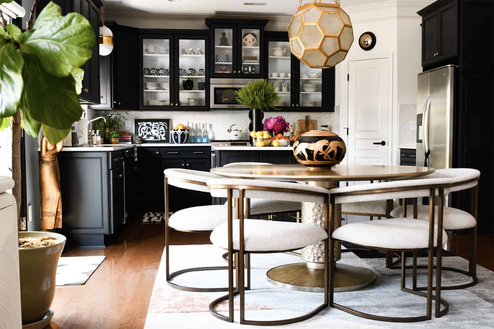
The neutral yet bold choice to go with black cabinets looks so pretty and expensive. But to avoid making it look too heavy, she gave one wall of cabinets glass inserts. Spoiler Alert! Those are the same fronts she had from before but had customized. I love that she was determined to use her original ones because that obviously cuts down on waste. Then with a new patterned backsplash and a new light (and less busy) countertop, Ariene’s kitchen looks completely brand new. But what is glam without a little sparkle even peppered throughout:) The beautiful pendants, chair, and table all add a high-end warmth that really makes the space sing. Here is her full post:) Erin Zubot DesignLesson: How To Create Special Traditional DetailsBoy oh boy is this a CUTE kids’ bathroom! Erin’s tile choices are so simple yet special and are totally in the world of what Em was talking about in her last tile post. But then you have that awesome wall paneling, the modern wall color, the black toilet seat cover, and the HANDMADE shower curtain. Excuse me?? It’s all so good. I do have to say that my favorite detail is the hole design on the vanity doors. I know they are kinda hard to see but I guess that means you’ll have to go over to her site Jordan And Barry Of The Brownstone BoysLesson: Don’t Be Beholden To One Style Throughout Your Home
Yes, those two photos are from the same ORC space! Ok, they are technically in different rooms but are both in their now awesome basement. I love them equally because they pull at two different design style heartstrings. I mean that stained glass window is SO BEAUTIFUL and the surrounding wood paneling detail (that’s also on the far right wall) makes the space feel more modern against that wonderful more traditional cabinetry. Classic with a hint of playfulness (also you have to see the wallpaper they used on the other side of the room because it’s a great and very fun optical illusion). But what is design if not REALLY FUN??? That laundry room makes me want to do laundry and was RuPaul’s Drag Race inspired. Just when I thought I couldn’t love it more:) So yes, don’t worry about every room being “cohesive” if you want to have an awesome, unexpected moment. Also, go now to their site because the full reveal is really special. Haneen Of Haneen’s HavenLesson: Say Yes To Ornamental Beams (You Really Can DIY Them)There are a million things to love about this bathroom (*cough* tub… *cough* tapestry and portrait). But one thing that I really love are those faux beams!! They add so much soul to an already beautifully designed space. I think it’s easy to get intimidated but the idea of installing faux beams but honestly they don’t seem tooooo hard. Look at this link! But aside from my love of those beams, this is definitely a special bathroom. You need to see the shower too! So head on over to check out the rest. Benson DwellingLesson: Using The Same Detail For Cohesive Dimension
Big Benson Dwelling DIY fan over here and this room only confirms it. The color palette is super happy but calm/chic and I love, love those sconces. However, what I want to focus on is the tubular motif. I think it was super clever of them to keep things interesting yet cohesive and to switch up the orientation, scale, materials in achieving this look. It’s a great reminder that you don’t have to make things super complicated to create something awesome and unique. 
Fun Fact: That secret-looking cutout on the right is A WINDOW! It was their solution to not have the bed look too off-center. Again, super clever! Check out the rest of the room here. Jewel Marlowe Of Jeweled InteriorsLesson: Dare To Go Even BolderThis is a masterclass in wallpaper installation. Aside from the tonal trim, that wallpaper is wrapped around everything and it looks so cool. Another laundry room I would happily prance to to wash my neverending amount of dirty clothes. Jewel was in need of a new washer and dryer so she took this opportunity to really go for it in the design/color department. Her original gold wallpaper was super pretty but the blue one is such a showstopper. Then you add in that perfect piece of art that brings in even more color and goes with the established floral theme, along with that killer light fixture and optimal counter for function…you have a perfect laundry room. This is another sign you should give into your colorful dreams and go for it in your laundry room! See more here. Nile JohnsonLesson: Accent Walls Done Right
To think these two photos are the same room is bananas. But that’s the magic of an incredible design, right?! So what you see below is actually a render (and a VERY good one because it took me a minute to realize). But it’s so good that I had to talk about it regardless. This bedroom is both totally luxe but also warm and welcoming. Sure, the mix of texture and pattern have a lot to do with that but I really think that accent wall is the secret sauce and the biggest reason. 
Now, accent walls are a HUGE topic in design. Some say never, some say what’s the harm, and others are on board if it’s in an architectural feature. Arlyn talked all about it in this post. And from this angle, it looks like Nile enlisted the architectural feature version (which is our favorite). We can’t wait to see this fully completely in IRL! But for now, here is more info. How do y’all feel about accent walls?? Natalie Papier Of Home Ec.Lesson: Ulitmate Pattern Play
Get ready for your eyeballs to explode! I mean I want to be in this bathroom IMMEDIATELY. I don’t think I can pick a favorite part. So let’s just go through all of the elements, shall we?? First, that yellow tile cabana stripe is so freaking awesome. We told you cabana stripes belong inside I would also be remiss to not mention that strawberry side table. SO FUN AND SO UNEXPECTED. Another slightly unexpected and easy moment are the asymmetrical mirrors. And lastly, that natural wood vanity adds so much warmth. It’s kinda the perfect modern (but not too modern) bathroom. Head here for more photos and all of the details:) Dominique GebruLesson: An Impactful Facelift

Now, Dominique’s old kitchen was in her words, “fine” and we totally agree. But the facelift that this kitchen (and dining room and new archway) got made it SO GREAT. Like Ariene’s kitchen, we see how a few cans of paint, a new backsplash, and hardware can literally transform a space. And had she just done that it would have been awesome. However, that cabana striped roman shade and the now bigger and better IKEA hacked island (very in line with yesterday’s post) make it that much more elevated. But there’s one thing about this kitchen that’s my favorite… Those custom floating shelves!! I think they bring a welcomed added warmth (wood almost always does) and look so good wrapped around that beam. You also see the tile so much better in this photo and I can’t get enough of the pink:) Head to Dominique’s site to see the rest. Kate Pearce Of Kate Pearce VintageLesson: How To Visually Ground A Colorful Color Palette
Kate is a pro at colorful and eclectic design so the fact that this basement is totally inspired is no surprise! Side note, I love how many basement renos we have this year and how different they all are. But what I really appreciate about Kate’s is that her colorful color palette is grounded by the fact that her ceiling and floor are neutral. Had she chose a nonneutral color for the ceiling and/or the floor it still could have been awesome but there’s something about the dark charcoal she chose that gives it kind of a sexy vibe. It is a speakeasy after all:) 
What also makes your eye happy is that there are dark neutrals throughout that keep it all balanced. But how great is the tile pattern, mixed with the larger scale diamond floor pattern and the super small scale gold grate pattern on the cabinet doors. Then you also have the contrasting curves of the two arches along with the back of the bar stools. It all just balances beautifully and truly feels like a speakeasy I want to be in right this moment (FYI this moment is at 5:14 pm;)). Head here for the rest. Tiffany Of Pretty Real BlogLesson: White Isn’t Your Only Neutral Color OptionSo happy that Tiffany knocked out another incredible ORC! Remember her office nook we featured last year? Anyway what I love about this space (aside from that amazing built-in), is her color palette. I think a lot of the time when we think of a neutral space, white is our immediate go-to. Well, it’s time for that to change because the colors that Tiffany chose add so much more large-scale depth and richness. I LOVE the color of the built-in (and notice how you hardly see the carpet…just a little call back to the first lesson). It also acts as an accent wall… architectural feature kind (another callback!). But then you have that light but rich brown on the walls which is immediately contrasted with white curtains and a light-toned sofa. It’s such a welcoming, cozy but extremely stylish space that you need to see the rest of it on her site. Enjoy! Victoria Ford Of Prepford WifeLesson: How To Make Antique Furniture Incredibly FreshIn my ORC research, I was introduced to Victoria and I am so happy! I love her modern traditional (with a heavier lean on the traditional) style. She took on not only a guest room but also the guest bathroom. NBD. Caitlin and I both loved her choice to use that stunning antique bed with that grid wallpaper and pops of bold colors. I wouldn’t have thought of putting that bed and pattern together but it’s so awesome. Any guest would be lucky to lay their head on those pillows:) Then this bathroom! That tile combo is SO GOOD. I love how the colors in the floor pattern perfectly speak to the color palette of the rest of the room. Also, how great is that oversized gallery wall?? I’m obsessed with how it nearly touches the tile trim and the ceiling. All the art is very traditional but that layout makes it feel so modern. You are also going to need to head to her site to get a closer look at that beautiful vanity and vintage sink. Every time I look at this bathroom I keep seeing more things I love. For more of the bathroom head here and for the bedroom head here. Sachi LordLesson: When In Doubt Install A Skylight (Or Two!)Y’all SKYLIGHTS! Another designer, that I am so happy to now know about truly made such a stunning transformation in her bathroom. First, that ceiling was just waiting to be exposed. If you are on the top floor and are looking for some more height, see if you are able to bust open your ceilings. Emily did that in the mountain house main bathroom and I can’t imagine it any other way. So aside from adding A TON of height, Sachi enlisted our favorite skylight company, Velux, to really make this bathroom an airy oasis. That beam likely made it impossible to just have one skylight, but I really love the look of the two. Moving down, that simple but creative tile pattern adds a ton of extra movement. So impactful! And speaking of simple and impactful, look at those niches next to the vanity. The wood detail really warms up that wall and acts as frames for the wonderfully styled pieces in them. Who needs art?? It’s all so pretty. Here is the full reveal which includes her bedroom! After a cool 3300 words, I hope you are as inspired as I am and maybe learned a thing or two from these incredibly talented designers. I know it’s impossible but do you have a favorite?? Are you ready to start on your next project (or pick one up that you got stuck on)? See you in the comments! Love you, mean it. Opening Image Credits: Design by Natalie Papier Of Home Ec. | Photo by Easterday Creative The post The ORC Reveals That Blew Us Away And The Design Lesson From Each You Can Use In Your Home appeared first on Emily Henderson. via Emily Henderson https://stylebyemilyhenderson.com/blog/favorite-spring-2021-orc-reveals 
Hello internet friends!! We’ve got a fun topic for you all that involves a highly popular Swedish budget furniture store…any guesses??? Here’s a hint: you can buy meatballs there…you guessed it…IKEA! Also, did you know we’ve all been pronouncing IKEA wrong? Small side tangent, anyway we’re here today to show you how you can turn boring (but affordable) IKEA products into actually awesome, totally custom works of art that scream “you.” Here it is: Storage Cabinet HacksHere’s a really great cane DIY done by the boutique design firm, House of Hawkes. The possibilities with this DIY are truly endless, you could create it with light cane in the middle and paint the wood black (which would look awesome) or you could paint the entire thing one color (including the cane). There are SO many opportunities for personalization & cane is SO pretty and adds instant texture so go for it. Another thing that’s highly attractive in design is the fluted wood trend. I mean, who doesn’t love a gentle groove texture in wood…it’s TOO GOOD. This awesome DIY cabinet was done by 2 really great bloggers. Here’s the Kismet House’s version from TikTok if you want to watch a video on how it’s done (technically not with an IKEA cabinet btw) and then here’s a full blog post over on Peony and Honey if you want a more detailed step-by-step with an IKEA cabinet 
Okay this is SERIOUSLY GOOD. I’m getting total Kelly Wearstler vibes from this lil lady and I am INTO it. Can you seriously believe this is IKEA?? I’m shook. All it takes are some IVAR cabinets and these sexy little legs from Pretty Pegs. DONE. (Btw these legs fit on the Besta unit and a couple of others too!!) 
This hack is another IVAR cabinet upgrade but with a little added compartment on the bottom making it totally unrecognizable and chic! This just shows what a couple of power tools and cane can do:) Window Bench Hack
GENIUS. How cool is this window seat?? Kelin hacked these pre-made IKEA drawers into an expensive-looking wall-to-wall window seat. It’s so epic. 
Here’s another awesome window seat hack done by that homebird life and boy is it also good. Plus, who doesn’t love a little leather pull tab hardware situation mixed with a moody navy window seat?? I’m falling in love fast. Oh and don’t miss that natural wood toe kick. It takes “the IKEA” right out of it. Credenza/Sideboard HacksThe Skinny Sideboard
This hack is a genius solution to creating a wall-mounted credenza that’s skinny enough to fit anywhere. The wood addition on top makes this piece look so much better than your average IKEA console!! Speaking of skinny wall-mounted sideboards… 
Sara’s house is filled with some pretty awesome hacks (shoutout to the designer, Velinda!), including this genius shoe storage solution for Sara’s narrow entryway. The cabinet is wall-mounted and super narrow, so it can work in virtually any entry –– plus this is the easiest hack ever (and I briefly mentioned it above): just swap out the hardware and TADA. Instantly more custom. There are a couple of different ways you could update a basic IKEA unit…one of them was done by EHD alum and friend, Arlyn Hernandez, from her all-around epic makeover takeover you may remember she did a while back… 
Arlyn worked with Semihandmade and Park Studio to give this baby the makeover of a lifetime and AIN’T SHE PURTY? If you haven’t heard of Semihandmade before, then hold on to your butts because they will change your life (as well as a few other IKEA-compliant companies:)). They basically create awesome cabinet fronts that attach onto IKEA cabinet bases, so it’s easy to make your products feel custom and all-around awesome. The whole company is one giant life hack and we love it. Arlyn went with their beaded front in desert gray from Sarah Sherman Samuel’s line with the brand paired with handles from Park Studio. We’ll show you one more example of this very easy hack: 
I mean how could I bring up the subject of IKEA hacks and not talk about queen Sarah Sherman Samuel’s console??? She seriously hacked the BESTA unit by adding wooden balls she found on amazon and then (obviously) she used her own line from Semihandmade for the doors. GEN-IOUS. Also, do you know how easy it is to swap out IKEA legs through Pretty Pegs?? Their options are all so good and they’re specifically made for IKEA products!! And it’s not just for consoles…you can swap out sofa legs, bed legs, really any legs you wanna swap, they got you covered. Ok, last one with a similar (ish) concept that was done by Ohana House Co. The main difference here is that she used regular wood from The Home Depot, so that’s an awesome (and probably even more affordable) way to go if you’re looking for that! Also, you can add a lot more custom personality. Here’s a full youtube step-by-step if you want more deets The Floating Console
Soooo we recently found out IKEA has a DIY blog (and yes it’s in Swedish but your computer can translate it to English… I totally thought this was some sort of scam when I first clicked on it but don’t panic like I did)…it has some of the best, budget-friendly ideas we’ve seen. They created a floating console hack with the IVAR cabinets and it’s pretty epic. All you have to do is paint the cabinets, attach them to the wall and then add cool hardware. BOOM. Floating console-level achieved. You could also totally add a piece of wood or marble on the top and make it a vanity or something Kitchen Cabinetry
Remember that cool Semihandmade thing we were talking about?? Well, another company we LOVE that does IKEA cabinets fronts out of Oregon is Kokeena. We’re firm believers that this will get you the quality you want without blowing up your bank account (which already tends to happen regardless whenever you’re attempting a kitchen reno). We’ve done this strategy in many projects…like Sara’s kitchen above and in Velinda’s client’s builder-grade budget kitchen reno below. Now, since we are talking a lot about IKEA kitchen renos I just wanted to throw out that if you’re considering going full-blown IKEA cabinetry all the way…here’s an honest IKEA cabinet review one year later that describes whether or not it’s worth the savings… FYI she used just IKEA so it’s a total review on their products. 
Custom Built-In HacksThe BILLY bookcase seems to be the go-to bookcase by a variety of DIY interior design bloggers. Considering it’s pretty much the most standardly shaped (and affordable) bookcase on the internet, AND it has lots of storage, it’s pretty clear why it’s so transformable. Wanna see?? 
An oldie, but a goodie from The Makerista. This BILLY bookshelf hack is iconic and looks AMAZING. This is a great way to go if you have an older home and want to add an architectural feature that looks like it’s original. Also if you’re going historic, we highly recommend adding the rolling ladder…we’re suckers for a good ladder over here. If you’re looking for a less fussy and more contemporary version of the built-in bookshelf look (or if you just want to do it faster & cheaper), then check out this incredibly smart hack by Elise Joseph which they accomplished for less than $500 and in 1 day: Then lastly, if you’re a renter, here’s a genius renter-friendly version from Grillo Designs. Technically she doesn’t use IKEA cabinets, but if you’re set on using IKEA then don’t sweat, you can still use the BILLY bookshelves and follow the same steps. Oh and by the way, if you don’t follow her on IG, then I suggest ya do because she has lots of awesome tips and hacks that are all renter-friendly! 
By the way…if you want to throw in a fun little situation for your cat at the bottom of your BILLY bookshelf, this Swedish company has got you covered. It’s so cute and budget-friendly. Coffee Table And Side Table Hacks
This coffee table hack is SO much easier than it looks and it’s a super simple way to add a fun little wood texture into your home. You could stain the top really any kind of wood color you’d want, so the opportunities are pretty much endless here. 
The tiled side stable has truly taken the social media world by storm, so if you want to attempt this hack your gen-z child will appreciate you so much. IKEA has a version of this DIY on their swedish blog where they tile a side table with legs, but you could also attempt the BESTA unit version that Lone Fox Home does in this photo above (here’s the full tik tok tutorial btw). The tile trend doesn’t end there guys. You can pretty much tile anything and everything –– I think this coffee table would work super well tiled and so would this desk/console table (btw these are selling for like $500-$2000 so if you want to start your side business now is the time). So that’s it for the IKEA hacks, I hope this was helpful…if you’re planning on attempting any of these (or if you have attempted them…) drop a comment below! Oh also feel free to link more cool IKEA hacks. Okay, that’s all. Bye! Opening Image Credits: Design and Photo by That Homebird Life The post When You Want “Custom Furniture” But Don’t Have The “Custom Budget”: How To Hack IKEA Products From Storage Cabinets To Custom Built-Ins appeared first on Emily Henderson. via Emily Henderson https://stylebyemilyhenderson.com/blog/how-to-hack-ikea-products-from-storage-cabinets-to-custom-built-ins 
Hi hello and welcome! It’s Sunday and chances are if you are here, you know what that means. It’s Link Up time and the EHD team has some awesome product recs that we simply can’t wait to share. So let’s get right into it, shall we? Today’s home tour is a modern traditional farmhouse located just north of Portland, OR. Sound familiar??? Its idyllic location and European inspired charm is SO good and makes us all want to follow Emily out of the city and into the Oregon “countryside”:) From Emily: If you are looking for another great read try Reckless, by Selena Montgomery (aka Stacey Abrams). The fact that Stacey Abrams is ALSO a romance novelist is so impressive to me, so I had to give it a shot. I thoroughly enjoyed Reckless, about three orphans who commit some mysterious crime then grow up to have to deal with it. There is a fun romance between the protagonist (Kell, a high-powered defense attorney) and the sheriff. It took a minute to get into it but trust me, not long. It’s a series so it doesn’t have a conclusion re the mystery, but I’ve already started the next book that follows one of the other children, grown-up. P.S. this is what most romance novels do – the love story doesn’t continue but you start another character’s journey. This is why Shonda Rhimes didn’t understand why people were freaking out about Bridgerton not renewing the hot guy (Regé-Jean Page) for multiple seasons. Their story is ended and we are on to the other siblings – so each book and each season is its own love story (and don’t worry – ALWAYS happy ending which I know can be annoying for some, but I find great comfort reading them). Anyway, Reckless is a fun romance thriller, but just more impressive is Stacy Abrams in every way. Also from Emily: If you liked Beach Read by Emily Henry, you’ll LOVE The Hating Game by Sally Thorne. It’s a workplace romance, the usual where the two HATE each other and compete against each other only to, you guessed it, fall in love. This one you can’t put down the second you start. It’s fun, steamy, and with really good snarky dialogue. From Ryann: Last weekend, I innocently went to Target to buy something that I actually needed (what that thing was has escaped me though. hmmm..) and what happened next was completely out of my control. I meandered through the shoe section and these sandals pretty much fell into my cart! So weird. Once I tried them on I realized it was fate because they are really nice, chic, and look expensive (but are only $25). I liked them so much I bought them in both black and yellow and I can already tell I’ll be wearing them with so many outfits. Also From Ryann: I have a new hobby and it is more proof that the year 2020 made me even more of a hermit. It’s called PUZZLING and I look forward to working on my puzzles every evening. My fiancé and I recently finished this one which was super fun but now I am very into all the Piecework Puzzles and want to collect them all. We are doing the Spaghetti Western one currently and next up is this beauty. The only problem is we don’t have a good table for larger puzzles so does anyone know of any compact puzzle tables or good puzzle mats?? Please advise. From Albie: Here is another bra from my haul that has blown me away — Third Love! I went with the classics kit so I could try more than one bra style & aside from being crazy soft, the shades of brown are so yummy! As a woman of color, not having to only choose between “nude” and black is a dream come true. I have sienna, espresso, and mahogany. From Caitlin: I’m back on the East Coast today for my best friend’s bridal shower, but I decided to extend my trip a little bit so I could squeeze in some beach time with my mom! Last fall, she scooped this sun shelter on clearance and I’m excited to get it back on the beach – it’s kind of tricky to fit back into the little bag alone (cue to a scene of me yelling “I DON’T NEED HELP” while sitting on the floor in the entryway when we opened it up for a test run) but once you figure out how to de-assemble it (spoiler: it involves someone holding the tent AND someone zipping the bag around it), it’s quick and easy and the price is pretty unbeatable. From Jess: I feel like every time I go out I wish I had a light jacket juuuuuust in case I want an extra layer but never have one that feels light or summery enough. I know I could have easily solved this long ago but for one reason or another just hadn’t. But then this past Monday I innocently popped into Target for a broom but per usual took a stroll through the clothes section. Then I saw this it! An easy-breezy, almost linen-like, light cream blazer. I love it so much and am probably going to buy the brown one too (looks more rust in person). It’s the perfect way to look like “you tried” without actually needing to. Highly recommend! Also From Jess: In case you’re in need of a bop. I’ve had it on repeat for the past week. From Mallory: I’m having a real candle moment over here so I bought these AWESOME candle holders from Food52 that I’m obsessed with. I paired them with these super overpriced but also awesome candles (in the ribbed green color) and I’ll say it again: I’M OBSESSED. Also from Mallory: It’s PERFECT timing for us to have a special Madewell code for you because I just bought these sandals and I was about to rave about them this week anyway. Emily has them in the calf hair version which is also very cute, but I was in need of a simple tan summer sandal and boy oh boy do these fit the bill. I also love that they’re velcro but don’t scream “LOOK AT MY VELCRO SANDAL.” It’s a classy velcro. Man, it is so easy to get on and off. As Mallory mentioned above, Madewell has extended a special discount for our readers! That’s all she wrote, folks. See you tomorrow? Yay, It’s a date! Opener Image Credit: Design by Jessica Helgerson and Yianni Doulis | Photo by Aaron Leitz and Lincoln Barbour | via Architectural Digest The post The Link Up: Two More Books Emily LOVED, A Bra That Comes In More Than One Skin Tone, & $25 Sandals Ryann Won’t Take Off appeared first on Emily Henderson. via Emily Henderson https://stylebyemilyhenderson.com/blog/affordable-summer-sandals Justina Just Launched Her VERY GOOD Target X Jungalow Line (And These Are Our Favorites:))6/26/2021 
When I started out in this crazy blog business there were very few people who did what we did (design content creator/influencer) so we all know each other, and thank god because over the years we’ve all really needed each other’s support – both emotionally, as well as in our collaborations. Justina and I have collaborated for years on different projects (remember the Airbnb project we did?), but more importantly, we are just fans of each other’s work and work ethos and knowing how hard she’s worked, knowing her different struggles over the year (same), I just get so proud of her every time she blows it out of the park (like today). 
We’ve spoken together at conferences and stayed up late many nights drinking and exchanging advice for whatever our business woes were at the time. The point is – I am SO EXCITED that not only is she working with Target in a similar capacity as mine, but she has launched her collection with them that is INCREDIBLE. When the EHD team saw it we all freaked out (and most of us are going to wait in line overnight for the first lamp below). Justina, I KNOW how hard you’ve worked over the years on your collections, books, lines of everything and I just love seeing every single second of your success. You deserve it all. So without further ado here is are our picks of her new collection that launched TODAY. 
1. Rattan Floor Lamp: I want this so bad. We all do. 2. Euclid Fabric Pendant: Love how special the shape and details are but that the colors are neutral so it can really go in almost any room. 3. Mixed Material Shelf Floor Lamp: YESSSSSSSSSS!!!!!! SO GOOD!!!!! Multifunctional furniture that’s SO DOPE!! 
1. Marin Stackable Pouf with Casters: The genius is too much. Not only does this pouf bring color and style to a room but those cushions COME APART FOR MORE SEATING!! Small spaces especially can rejoice. Oh and it also comes in a coral gradient. Both are so cute. 2. Anza Woven Rattan Nightstand: Nope it’s not a chair, it’s a nightstand! I love the unexpected function and of course the texture that it would bring to a bedroom. 3. Olivia Round Pouf: Another piece of furniture that has a secret! That VERY cute pouf splits into two pieces for extra hang-out seating. So great for teens (but also adults:)) 
1. Shapes and Lines Framed Wall Art (Set of 2): Justina is a TRUE artist and has painted and illustrated for years. To be able to do this and write and design is crazy. Such a good diptych. 2. Curvy Framed Wall Art: Another awesome piece but in a cool shape that would easily bring some variation to a gallery wall (so it’s not all squares or shorter rectangles) or work perfectly on a slender wall looking for a friend:) 3. Shapes Framed Wall Art: See! She’s an ARTIST! It’s just so good and I love the colors. 

1. Bolster Oversized Woven Uneven Stripe Pillow: Yes to this. IN my cart now. The broken stripe pattern is one of my favorites and the velvet ends just makes it extra elevated. 2. Maze Pattern Loop Tufted Pillow: Texture on pattern on coziness. Such a great pillow to throw onto any bed, sofa, or chair to bring in some depth. 3. Jungle Print Indigo Lounge Pillow: How cute for a playroom?! Or to use to watch movies or read on the floor?! I love the saturated colors and the whimsy of the pattern:) 4. Square Velvet Fringe Pillow: Such a great color and that fringe is so good. But it also comes in teal and gold so there’s a color for everyone. 5. Fringe Cotton Percale Sheet Set: I love love how fun these sheets are! Think how pretty your bed would look with these on it?? 6. Woven Striped Throw Blanket: You know I love fringe and blues so this throw is right up my alley. It also just looks cozy. 7. Yarn Dyed Gauze Stripe Duvet Cover & Sham Set: Justina obviously has a bunch of beautiful and bold bedding options but I love the softness of this one. The different scales of stripes are really good. 8. Scalloped Edge Quilt Sham: So cute!!!!! I’m still very into scallops:) 9. Abstract Punch Needle Pillow: Basically it’s her art on a pillow which I love. The large-scale abstract pattern that’s still colorful is awesome because it would work with A TON of different color palettes. 

1. Blue Terracotta Vase: I love a pop of cobalt (I loved how Orlando used it in his bedroom last week, too). 2. Striped Terracotta Vase: Just fun, cool, and a very easy way to bring in a little pattern into your space. 3. Chalk White Terracotta Vase: GAH!!! SO GOOD! (AND LOOKS SO HIGHEND). 
1. Woven Wastebasket: You may not know this but Jess has a thing for cool wastebaskets and she really likes this one. I mean it’s very cute. It’s again another VERY easy way to bring style and texture to a room that probably could use a little rattan:) 2. Wooded Rose Incense Sticks with Terracotta Plate Holder: If you are in the market for an incense holder this is such a cute one! Why not have your burning incense be as stylish as possible?? 3. Round Metal/Resin Gemstone Box Gold: Cool and unexpected. Would look great on your desk, bedside table, or in your bathroom! Congrats, my friend. I’m so proud of you and can’t wait to hoard your goods. Also, remember when we were babies? 
O and buy her newest book here!! The post Justina Just Launched Her VERY GOOD Target X Jungalow Line (And These Are Our Favorites:)) appeared first on Emily Henderson. via Emily Henderson https://stylebyemilyhenderson.com/blog/jungalow-target-launch-favorites 
Here’s what I’m going for – tile sooo quiet and special that like a good actor, you can’t even see them acting – they just are so good that you just engrossed by them. I sound like a broken record but I here I go again – designing and renovating an older house to be unique yet timeless in a MINIMAL way is my creative challenge on this house. Achieving my “simple but special” goal takes more time and brain space than you’d possibly think, but I’m honestly enjoying every second of it. If you have a contemporary style or post-modern home you have fewer rules – you are beholden to less architectural moments. But if you are working within a classic style of house (like a craftsman farmhouse built during the Victorian Era for instance) it’s my opinion that you should use more classic hard finishes. Of course, what “classic” means to you could be totally different than me and yes there are a BILLION exceptions (we are putting wall-to-wall carpet in the kid’s room for instance). Also, ANYONE can break the rules when done RIGHT. But for this house I want my hard finishes – I’m talking flooring, tile, countertop material, and cabinetry – to feel like a fresh twist on “classic”. Listen, these SHOULD be permanent once installed and IMHO should look like they belong to the home and to you. I want quiet but not expected. Fresh but not trendy. Full of life, but not busy. High quality but not ostentatious or “fancy”. Most importantly not boring. Interesting. I write about this in my next book ad nauseam but once you know the rules (which is the first half of the book) you HAVE to break at least a few of them to have an interesting home that reflects your creativity and personality. With the tile for the farm, we are working with Pratt + Larson who manufactures everything in Portland and has ENDLESS customization options. Like endless. They are wonderful. But I don’t want to do something WACKY with the tile, I want to do something quietly impactful and special. I almsost don’t want you to even notice it at first – which if you aren’t obsessed with design woud seem like an odd thing to obsess over – something people barely notice. But for the vibe of this house that’s what I want. Where you know you are somewhere special, but your eyes aren’t freaking out trying to understand it. The first step is working with high-quality material… after that, the challenge begins. So here is a brain dump of all the ideas I have to do this with tile. If you want into my creative process, today’s post is for you Search For Vintage Uses Of Tile – To Rethink What Is “Normal”
I secretly hate sharing this image (above) because once I found it (which took HOURS of digging) I caught my breath and knew that I needed to recreate a version of it. Especially with a house that goes a bit old world you can lean into some Victorian elements like this and still do it in a quiet way. Of course, this tile doesn’t exist so we have to literally build the pattern but it was a huge sense of inspiration to me. 
It’s EXTREMELY hard to find vintage kitchens and baths on the internet because most of them were “before photography” or considered “dated” so were not photographed before they were ripped out. I found way more success looking up hotels in Europe and just staring at what they did in their kitchens and baths and more importantly how they did it. While you might look at that kitchen and scream how dated it is, look past that and instead note what they actually did and brainstorm how you can do a fresh version of it. That tiny little tile border around the window is unexpected and cool. I’m considering just mixing it in around our windows in the same finish and color as the field tile to just give it a TINY unexpected detail that you don’t notice until you are up close. Go High Impact With One Simple Tile But Like A LOT OF IT – EVERYWHERE
Sure, these bathrooms have different tiles on the floor but the sheer impact of the one tile on all of the walls – floor to ceiling and wall to wall is enough to make this EXTREMELY special. Heidi Caillier is a design goddess and specializes in modern vintage soul – she is SO GOOD. Of course this look is a LOT more expensive than you’d think but doable if you are doing it yourself. We wanted to tile the ceiling of our main bathroom but ARCIFORM thinks it will be $3 – $5k just for the ceiling labor. We came up with a different solution that still feels VERY special but reduces the amount of tile and labor. Stay tuned 
I love the simplicity of this bathroom, too and it’s a big inspiration for our bathroom. Herringbone on the floor (I’ll add a border) in an interesting scale (stay tuned) and just a TON of simple tile on the all walls. 
Jessica Helgerson tiled every wall in her farmhouse kitchen and (notice even around the door and hood) and it’s just so pretty and special, but simple and classic. 
Granted that these tiles are handmade and obviously very special, but it’s just one tile, staggered – EVERYWHERE. Note the different orientation around the window. LOVE. Mixing Standard Tile Sizes (Subway, Square, Etc.)
I LOVE this look and will be doing my own version of it. We ordered samples in a lot of different sizes and I’ve played with them for HOURS. The key to this is the perfect amount of “randomness” (but not random at all). Your tile installer will likely hate you, but the look is simple and pretty. I’d also not do a dark grout so that you almost don’t even notice the variation, your eye just moves around easily and doesn’t register what is happening but tells your brain that it’s SO PRETTY. 
Here’s an example of subway installed vertically next to squares of the same height. Again, I also love that they didn’t just go back and forth between the two – that they did two subway next to one square then one subway next to one square, then two squares, AND they staggered them. Perfectly random. 
This wall is a combination of one row of squares followed by one row of staggered square and rectangular. But it takes your eye a while to figure that out – in a good way. 
In this one, Shea McGee moved from white subway to pink square and it totally works. You could strip that from floor to ceiling in color blocks. Stacking it would feel more contemporary but if you want an old world feel I think the mixed stagger shapes could totally work. Again the key to making sure this doesn’t feel dated is all in the quality of the tile and installation and in the colors. I think this looks super fresh. Also you could put the pink ALSO on the floor and just have it come up the wall. 
My friend Leanne did this one above which is so gutsy. She mixed different SIZES of squares, different tones, AND rectangles. She is brave and makes me want to be more brave. Rotate The Orientation Of The Tile To Highlight An Architectural FeatureThis is a new favorite thing to do – take the same tile and use it to enhance an architectural feature. Depending on how arched yours is you might have to cut every single tile perfectly, but you also might be able to play with grout lines to achieve this. Obviously, this can be done on any straight surface too – I.e. around cabinetry, recessed mirrors, windows, doorways, etc. 
You can see it on this fireplace – it goes vertical at the top of the fire box and then at the hearth it orients go to in – mixing in another orientation or shape. 

Such subtle impact on that fireplace just by changing the orientation of the tile. LOVE. The Difference A Tile Border Can Make
Oh I LOVE a tile border. We did one on our LA patio and it made it look instantly old world and took all the “trend” out of the cement tile pattern we used. I love how the above is just a simple color change and change in orientation but it’s not fussy. I usually do tile borders to run the length of the wall, but I love how they did this. 
It’s my personal opinion that a herringbone needs a tile border if you want it to look old world or more classic (like above). It could be a different scale of tile and that one could have been even thinner but it just instantly frames the room and looks more custom (because it is). It just buttons all the diagonals up. I love, again, how these two ran their borers perpendicular to the wall (or the transition floor) instead of along it. I love both but seeing this orientation locked a lot of ideas for me. Like then why not do a totally different scale into the wall. 
For all of you who want to do the checker or diamond trend but are nervous that is so hot right now, y’all, just add a victorian border. the customization of it really gives it more power and makes it more classic. We are doing our own custom version of this in the new sunroom (that will go more victorian than the rest of the house). 

The above pattern (octagon with square) would look cute without the border, sure, but that border makes it SO SPECIAL and makes it look like it’s been there for years and years. The more intricate they are the more special they are in my opinion, and yes, you have to lay it out and make sure the pattern works (which is what I’ve spent SO MUCH of my time doing lately – literally out of cut paper, playing on the floor for hours). Add Tile Trim For A Decorative Old World Detail
Just a little stripe makes it feel special. I’ve even thought about stopping the tile at the trim, but in another color and just carrying it throughout the room. It could just be a slight tone darker and a little stripe around the base. 
Look at the impact that that little bead has around the whole kitchen. I’m obsessed. Such a good detail. 
Now I’m on the fence about these but I think mostly it’s the color, but the above and below shots did unlock some new ideas about taking one color and blocking out top and bottom, divided by a pencil trim. OR using the pencil trim as a stripe from floor to ceiling. Y’all the ideas of endless which is obviously both a good and bad thing. 
Tile Border Around Doorway, Window Or Mirror
I know that this can look dated, but what is the fresh new version of it? I think it’s all about the quality of the tile and how you install it. It could be simplified OR it could be even more detailed and decorative, depending on what you are going for. It could be all the way around the mirror or integrated like theirs is. 
Talk about a LOT of tile. Here they used a contrasting tile around the border of the entire room, as a strong accent, including the floor bath and doorway. While this is certainly not the look I’m going for it inspired some ideas that we are working with. 
Here’s it’s hard to see but if you look closely you can see the tile on both sides of the shower niche. We are trying a version of this in the drawings and I honestly can’t tell if I like it or if I wished that we would just continue it on all the walls, so stay tuned on that. Of course, this post did not cover the difference grout can make but I wrote that post a few years ago – check it out here. Also, I’m doing a separate post all about making penny and hex tile special AND how I’m creating a custom mosaic tile for our sunroom out of existing shapes – I’m so excited about it. Next up I’ll discuss how we are doing this exact same process for our cabinetry – all the details that will make your standard cabinets feel wildly more special and custom without the risk of it looking dated. I’m learning SO MUCH Opening Image Credits: Design by Jessica Helgerson Interior Design | Photo by Aaron Leitz Photography The post How To Make Your Tile Look Really Special Without Being Dated In 10 Years – New Classic Tile “Trends” That I’m LOVING appeared first on Emily Henderson. via Emily Henderson https://stylebyemilyhenderson.com/blog/new-classic-tile-trends-that-im-loving For some time now, many tales have been told through the use of symbols. Tribal life allows the mind to focus on what really matters. Repeated symbols are not unusual either, usually because there's a particular importance to them. When it comes to minimalist design, repetitive symbols are a focus on the vital.
Berber Rugs These woven rugs make use of magic symbolism in their otherwise minimalist design. It is what gives them an appeal that's unique. Every single one has a desire from the weaver for the human spirit to have protection from negative energy. There is also a weaver's desire carried by the rug for the human body to have a shield from the elements. No matter how they're used (wall decor or on the floor), they are essentially works of art that double as talismans. Each Moroccan Berber rug has a different story to tell that is uniquely its own. Symbolism With the passage of time, many symbols have lost their meaning over time. Many weavers have passed certain designs and motifs to their grandchildren and children. However, commercialization has set in and many sources produce Berber-inspired rugs without knowing the meanings behind the symbols they learned to wave. Berber designs were deeply personal, even in instances that depicted tribal beliefs and traditions. Keeping that in mind, interpretation must be done with caution. Especially since there is a long route to take in order to translate or understand certain designs. This involves gaining a deep understanding of various tribes' legends, songs, and cultures. Aside from rugs, Berbers also use symbolism in tattoos. In Morocco, one way of storytelling is through Berber rugs. Each one is designed with the aforementioned weaver's desires: shelter from the elements for the human body, protection for the human spirit. Even the Berber's colors have a story to tell:
Berber Rug Symbols
Conclusion There is a deep meaning to symbolism when it comes to Moroccan Berber rugs, which signifies storytelling. The arrangements and motifs also make a considerable difference. Each Berber rug is unique, but there are meanings behind some symbols. This includes barley (for fertility), bird (for good fortune and healing), and finger (for protection). Looking to get an Atlas Berber rug? Reach out to Atlas Weavers today! We are a fair trade artisan project and a premier supplier of authentic Moroccan decorative rugs. Via https://atlasweavers.com/blogs/news/interesting-stories-about-symbols-found-on-the-berber-rug Via https://atlasweavers.weebly.com/blog/interesting-stories-about-symbols-found-on-the-berber-rug 
Hello. I AM MELTING. Over the past few weeks, I’ve been waking up from some crazy dreams in the middle of the night with my lower back drenched in sweat. I’ve since realized there were some environmental problems, like, uh, falling asleep while very stressed and wearing sweatpants while swaddled underneath a 20-pound comforter in an 80-degree room. But it got me thinking – how can I make the coolest bedroom ever without just turning up the AC or blowing a bunch of fans and hoping for the best? And when I tried to look into it, I just found pages and pages of articles that were like “here are 20 cooling sheet sets” which made me feel really overwhelmed – just give me the good stuff, pal!!! The creme de la creme only, if you will. So I did my research, asked around, read hundreds of reviews, and pulled together the 10 best-reviewed options – from a simple PJ shift dress to the best pillow ever to a $3,000 hydro-powered mattress – that will help keep your bed feeling cool and comfortable all night long. Menopause-experiencers, hot-flash havers, anxiety-induced night-sweaters, hot sleepers, folks without central air – we’re all going to get through this, together! Let’s start with the simplest solution and work our way up, yeah? Become’s Night Dress
Was this technically designed for folks experiencing menopause? Well, yeah. But get a load of this: while these PJs may look sweet and simple, they’re actually super fancy – each dress cools the skin, wicks away moisture, prevents odor buildup, and re-releases heat back onto the skin when you finally start to cool down. Plus, they’re seamless, timeless, and maybe even a little stylish. (Like, this is something that a woman in a Nancy Meyers movie would wear to bed before pulling on a beautiful robe in the AM and strolling about a sun-dappled kitchen in the AM.) Dresses will run you just under $60 and there are a ton of options and cuts available for those who prefer shirts and pants, too. In any case, clothing is a good place to start before you, you know, spend hundreds – or thousands – upending your whole bed and bedding situation. (Feel free to drop any other cooling PJs in the comments!) Coop’s Eden Pillow
This is it. The best pillow (not even just for night sweat suffers – I’m talking THE best pillow, period). 2,000 5-star reviews and my emphatic, enthusiastic endorsement can’t be wrong!!! Thanks to a gel-infused memory foam insert, both sides of this puppy stay cool all night AND each pillow comes with a half-pound bag of supplementary hypoallergenic fill, so you can make yours as firm or as floppy as you want. (For my side sleepers out there, the body pillow is just as great and if you grab a long lumbar cover, it can do double duty as your main decorative pillow when you make your bed in the morning!) Parachute’s Percale Sheets
Yes, linen is breathable and great…but have you ever been in a cool percale sheet? Let me paint the picture for you: imagine stepping out of an awesome shower, jumping into your clean, taut, freshly-made bed with chilled percale sheets, and rubbing your legs together underneath like a little anthropomorphic cricket. IT’S AMAZING. I love how slick these feel – and hot sleepers in the reviews agree, there’s lots of feedback that reads “crisp” and “cool” – but I also love that Parachute lets you skip the top sheet. (My top sheets have sat unused for years. A simple shift to reduce a little clutter and waste!) Buffy’s Comforter
This week, after a year-long love affair with my weighted comforter, I finally had to accept that it was “summer,” that I didn’t love sleeping under 20 pounds plus a duvet when it’s “90-degrees,” and that I may have been “overheating myself.” FINE. But that’s where this comforter from Buffy comes in – folks, the rumors are true. The cooling eucalyptus construction and perfect amount of fluff (not too puffy, not too flat) make it a dream for those who love feeling covered but hate feeling smothered. Plus, Buffy just dropped an even more lightweight version for folks who prefer more of a ~quilted~ look. Something for everyone! Bearaby’s Weighted BlanketSimilarly, this weighted blanket from Bearaby is also made from eucalyptus fibers. Each piece is hand-knit and the open weave construction also helps air circulate, which keeps you cooler at night. If you think your night sweats have been brought on by stress or anxiety (guilty as charged!), testing out a weighted blanket – especially one that’s this beautiful! – may be just the thing the doctor ordered Bedjet’s Cooling System
Alright, folks. We’re stepping into the BIG LEAGUES – we’re talking sleep systems and mattress upgrades from here on out. I first learned about the BedJet – a fan that circulates air under your covers – from Arlyn, who described it as a “veritable air hockey table.” You basically pick a temperature between 66 degrees and 104 degrees, and it’ll do its best to keep you comfortable all night. Added bonus for the BedJet: the air circulation helps pull sweat and heat out of the bed and there’s so real change to your current mattress, so you’ll barely notice it’s there. Chilisleep’s OOLER Sleep System
In 2020, a bunch of my friends used their stimulus checks to purchase OOLERs – and you know what? They’re SO. FREAKING. HAPPY. about it. Still. The price tag on this is no joke ($749 for half a queen; $1499 to cover a full queen bed), but it’s a hydroponic pad (AKA you put water in it occasionally and it’ll circulate) that can you can set between 55 and 115 degrees. While it seems like a hearty investment upfront, I’ve heard nothing but good reviews alongside glowing confessions of reduced HVAC bills. (Turns out that just heating or cooling the bed is a lot more affordable than heating or cooling a whole house!) Eightsleep’s Pod Pro Cover
Similarly, the Eightsleep Pro Pod Cover is zipped onto your existing mattress. Just fill-up the tiny tank every few months with water and enjoy their thermoregulation technology on the mattress that you already own and love! I personally am leaning a bit more towards this one over the Ooler, as Eightsleep offers an app that can track your sleep wellness without any wearables. Oh, and did I mention that the app also offers guided meditations, white noise sleep coaching, and more? THE FUTURE IS NOW. Tuft & Needle’s Original Mattress
Don’t have a huge mattress budget? ME NEITHER, PAL. The Tuft & Needle Original mattress is actually an awesome, budget-conscious pick. It combines two layers of memory foam with graphite and cooling gel, so it’ll pull heat away from your body all night. If you prefer mattresses with springs, never fear – the air channels in the Hybrid mattress also make it a super breathable pick! For what it’s worth, a ton of EHD staffers and contributors have T&N mattresses in their own homes – it’s tough to go wrong Eightsleep’s Pod Pro
We’ve made it: the Tony Stark of mattresses, IMO. This is what my nerd-driven data dreams are made of, folks. I’ve been eyeing this mattress for the better part of a year, so let me break down its wild selling points: there are ambient sensors for room climate and outdoor weather so it can react intelligently; it tracks your resting heart rate, respiratory rate, etc. (where was this when I was training seriously for sports?!); it can wake you up by gently shaking or warming your side of the bed (no annoying alarm clocks!); it offers dual-zone heating and cooling; there’s also the advanced sleep tracking app we mentioned before. Cooling your bed to 55 AND getting to review arbitrary health markers every day? I’M SO SOLD. It’s like Peloton, but for sleeping. I want it SO BADLY. And there you have it from me – the 10 products that can actually make a difference in your sleep temperature. I know there are tons of hacks out there, though, so PLEASE DROP YOURS IN THE COMMENTS. What’s worked for you to help you sleep through the night? Spill your secrets, please. Opening Image Credits: Design by Julie Rose for EHD | Photo by Sara Ligorria-Tramp | From: One of Emily’s Best Friends Gets The Cozy Yet Sophisticated Bedroom Makeover She Really Deserves The post “How Can I Stop Sweating While I Sleep?” Caitlin Desperately Searches For The Answer (P.S. She Came Up With 10 GREAT Options) appeared first on Emily Henderson. via Emily Henderson https://stylebyemilyhenderson.com/blog/products-to-stop-night-sweats 
It’s been pretty impossible to not start dreaming up vacations even if we aren’t actually planning on going on a vacation soon (aka me). And maybe it’s just me but the mere act of looking feels extremely adventurous, against the rules even. That sounded way lamer than I intended but for those of us still a little hesitant to hop on a plane you get it. FYI it’s not against any rules! And since vacations have been on the brain, we decided to share with you some of the places we plan on going to, “if money weren’t an issue” dream hotels and/or rentals, or just places on our “someday lists” that are really really beautiful! Ready, set, relax… Emily

While I really just want to go back to Ojai Valley Inn every single time we think of a “getaway”, I suppose if I were to try somewhere new it would be the Amangiri in Utah or Miraval in Austin. It’s more of a girls’ trip or with Brian, less for the whole family but both look STUNNING, secluded, quiet, and delicious. I’d also love to take the kids to a Dude Ranch like Paws Up sometime, and we will definitely be visiting Suttle Creek when we need a quick retreat from Portland. Ooh and at some point, I want to go to my hometown in Coos Bay and try this new place. I know none are too exotic but exploring the PNW or a quick plane ride sounds like way more fun to us right now than getting on a 12-hour flight. 


While I’m still in the “let’s wait to travel till the kid are older” phase of life, there is one location/destination that does tempt us all for a family trip – Scotland. Brian has never been and his family is Scottish, meanwhile, after binging Outlander I became OBSESSED with going. I went when I was 21 while touring Europe and my best friend and I LOVED it because everyone was so nice, it was so easy to navigate, and it has medieval castles everywhere – basically untouched from the wars. A deep rich history, with less crowds than the rest of Europe and it just feels very kid-friendly with a lot of nature, quaint towns, and some city culture. A few years ago our cousins took their older kids there and rented out part of a castle and they said it was an absolute success for the entire family. Not just “for kids” or “for grownups”. So right now if we were to travel internationally Brian and I both would want to go to Scotland and stay in a castle (this one above is very pricey but a SO COOL). Jess
Mexico is one of my favorite places in the world. I have dreamed of moving there more times than I can count but ya know, my Spanish is bad at best and I kinda love my friends and job here in LA. SO visiting is good enough for the foreseeable future. I first saw this Airbnb on Alexandra Cadiz’s (incredible designer and old office building neighbor:)) Instagram when she and her fiancé (incredible ceramicist) stayed there. I had actually forgotten about it when Julie reminded me and sent me the link. THIS PLACE IS MY DREAM!!!! Old, romantic, soulful, and in Merida where I actually went on a school trip to in middle school and have wanted to revisit ever since. It also sparked my love affair with this beautiful country. Actually, that trip was pretty transformative for me, and if your kids get an opportunity to do something similar LET THEM or maybe even insist! Anyway, I will be campaigning for me and 7 friends (8 is the max amount of ppl who can stay) to go to this utter oasis. *Starts Duolingo as she finishes typing this blurb* 


It’s Mexico again! I’ve been to Mexico City for a total of 5 hours because I was either on my way or coming back from San Miguel de Allende (which if you haven’t been is too magical to describe in this short blurb). And both times I was there I told myself I would be back for a proper trip. And while stunning hotel (Condesa df) is a little out of my price range, a girl can dream. Mallory

I’ve seen this airbnb’s backyard all over Instagram so it’s about time somebody links it and it’s gonna be me. Check out this awesome tiled, checkered sofa and all-around VIBEY desert lodge. Oh and the whole thing is bright pink which is so bold and never not cool. 


My friend recently stayed at this hotel and it was SO beautiful I had to know where/what it was. It’s called White Water Cambria and oh boy oh boy is it stunning. Total Scandi vibes (and it’s RIGHT on the water btw). Check out photos of the lobby…it’s GOOD. Ryann

Looking at these photos makes me physically ache with longing. I’ve never been to France (but am dying to) and this is exactly what I have always pictured my dream vacation home would look like. The cobblestone, the incredible view of Saint Paul de Vence, and the 12th-century exterior charm are magical but the interior is even more breathtaking. It is dripping with charm and has that cool, relaxed French style that I desperately want to emulate in my life. I am starting to wonder who gave this apartment permission to be this perfect for me and how do I manifest spending a summer here drinking wine and writing poetry?? 

I’ve only been to Austin, TX once but when I did it left a permanent mark on my soul. I’ve been wanting to go back ever since and if/when I do, I could die happy if I could spend just one night in this hotel. It has every design element and style that I am attracted to (including cabana stripes) as well as this unexpected old-world European charm that I am deeply in love with. Has anyone stayed here?? If so, I’d love to hear about your experience and live vicariously through you. Caitlin


This isn’t the first time I’ve written about how inspired I am by the Hotel Les Deux Gares in Paris (designed by my current all-time favorite Luke Edward Hall – he’s so good) and it surely won’t be the last! I am so inspired by the masterful pattern mixing, the fearless use of bright colors, the blend of Deco and Chinoiserie and traditional elements presented in a new way. O and the “leave no surface untouched” attitude of color pops on every. single. ceiling. It feels so finished and considered and beautiful – I’ve never been to Paris and feel like this would make the experience even better. 


For what it’s worth, I almooooost included a link to the Bachelor mansion here. I wanted to stay there for my 30th birthday, but then I learned that it’s bananas expensive… so I guess I’d also settle for this super clean, simple, uber-relaxing cave house (with a private outdoor plunge pool!) in Greece. It’s no rose ceremony, but I have a feeling that I could make it work. Can you imagine spending a week relaxing and drinking wine and reading and enjoying the sun and walking around Santorini? WHAT A DELIGHT IT WOULD BE. (Plus, I have a feeling that these listing photos may be a welcome treat for some of y’all with more minimalist tastes!) So those are ours! Any that you now have your eye on? Where are your dream vacation spots or ones that you are actually going on soon?? Love you, mean it. The post The Airbnbs And Hotels We Each Are Dreaming About Staying At appeared first on Emily Henderson. via Emily Henderson https://stylebyemilyhenderson.com/blog/the-airbnbs-and-hotels-we-each-are-dreaming-about-staying-at 
Emily’s team, Jess and Mallory, suggested I write about my experience as a renovator. We typically use the word “remodeler” but I like renovator too. However now I think of myself as an appliance, like a refrigerator or generator. Hmmmm. What is fun about this profession is that you learn something new every day. This is my favorite part, but it is also often very nerve-wracking. But before I go into my experience as a renovator, I want to tell you a little about my background as it relates to my journey of becoming a renovator. I grew up in Germany and after finding out that I have a learning disability, my parents decided to enroll me in our local Waldorf School after grade school. I loved it there. The curriculum included many trades like woodworking, gardening, smithing, sowing, as well as many languages, theatre, orchestra, and literature. It was not big on sports, which I am eternally grateful for, as I am the least competitive person I know and the second most clumsy one. 
My dad was a big sailor. If you wanted to hang out with him, you either sailed or work on his wooden boats. The two of us always dreamed of sailing off into the sunset to worlds unknown. So when I graduated high school, we ended up on an old wooden boat in Charleston, SC which we were going to sail across the Atlantic. For 1 ½ years, we spent restoring this boat while living on it. This is when I met Richard, my husband and business partner, and ended up moving to Portland with him. After I graduated from Marylhurst University, I realized that my love for old things could be made into a career. So, when Richard and I decided to partner up, we chose to make structures built prior to the 1930s… ARCIFORM’s niche market. It is very important to focus on what you love and want to learn about when you decide to start your own company. We created a business plan including 1 year and 5-year goals and budgets, which helped us stay focused and kept us in line. It also makes you good at what you do. You become the expert that people turn to. 
ARCIFORM prides itself in preparing for as many eventualities as possible to prevent our clients from getting sucked into an emotional and financial renovation vortex. We are lucky in that we can bring questions to the table and have the many awesome craftspeople that are part of our team and share their knowledge. Case in point: Yesterday I was meeting with Adam, Stephyn, and Jamie about Emily’s and Brian’s roof framing details. I had thought I had figured out all the connection details with our engineer, but of course, Jamie pointed out that there are unusual connections where the new beams join in corners… Had he not pointed this out, we would have been scratching our heads and hustling for answers while in the middle of hoisting up large beams. Thank you, Jamie! 
It is super important to have as many team members on board as early as possible. Start with an extensive list of what your project might look like, figure out who can help make that a reality and get them on board for feedback right away. If you want to change your structure, get an engineer on board; if your systems need to be updated or changed, invite in the electrician, plumber, and heating and cooling subs. There is a skill to this though–you do not want your experts to be inundated with having to review many options, (that is what your designer is there for), but during key decision-making moments, have them give you their feedback. 
Build relationships and respect those relationships. It can make or break the success of your project. In fact, the number one trade we try to teach our staff is good communication. Keep your team members up to date with quick check-ins. Do not write novels, just a quick “hello, this is where I am at,” goes a long way. Too much information is overwhelming and gets ignored, too little information causes anxiety and misunderstandings. Do not just point out a problem but suggest a solution right away. Renovation is about problem-solving. We are hired to think creatively based on our many years of experience. ARCIFORM is very diligent about the project development process, which includes navigation of the client’s expectations. Every client is different. We all like to splurge on some things but not on others. Renovation is not necessarily the most glamorous, as a lot of effort is invested in fixing what is already there. 
I will first outline how we tackle fixing and addressing what is there from a renovator’s point of view, and then I will give you a little insight into what people like to splurge on from the perspective of a remodeler. Here is typically how the initial process works:
Ok, now a quick look at top splurges. I do not consider renovations splurging as you really invest in what you have and will get a great return on your investment if you did it right. “Right” is the key ingredient. But even that can be very relative. 
The top splurge that ARCIFORM experiences is space. We build many additions and remodel many basements because people want more elbow room. If you can afford it, purchase a little bigger home, as adding onto a small home can be costly. Single story homes are not meant to support a second story, systems need to be in perfect working condition when covering them up during a basement remodel and building additions that meet the material and detail standards of the first half of the last century are complex and costly. In the long run, this can also be a good investment though, as adding space generally increases the value of your home exponentially. 
ARCIFORM is known for our great kitchens that we build with longevity in mind. Over the last 100 or so years, kitchens have become many people’s favorite space for their communal and creative pursuits. So here is where we splurge. Many of my clients love every detail: beautiful cabinets, lovely tile, stunning counters, and sparkly hardware, and let us not forget the awesome appliances on the market today. 
And of course… bathrooms. If it is the main bathroom or adding a bathroom for each kid or having a bathroom in the basement, bathrooms are a luxury that we all like to splurge on. Here, as like what is happening with the kitchens, the suppliers have really upped their game. Fixtures, fittings, tile and counters, everything is just becoming more and more beautiful, inspiring us all in creating spa-like spaces for ourselves and sweet privacy for our children and guests. My personal splurge is tile. The funny thing is my current house has all the original tile still in place, so I cannot create my Turkish bath dream. But if I could, and I am more than happy to splurge in my head, I would tile the entire inside of my house. When renovating historic homes, include the experts to help you spend money wisely, splurge on things that add comfort on a daily basis, and prioritize planning over rushing through the process. That’s my advice to you:) Opening Image Credit: Design by ARCIFORM The post What Is Renovating Historic Homes Like And What To Splurge On Via ARCIFORM’s, Anne De Wolf (Plus The Reno Formula She ALWAYS Uses) appeared first on Emily Henderson. via Emily Henderson https://stylebyemilyhenderson.com/blog/renovating-historic-homes |
ABOUT MEHi, I am Rashad Mello from Licking, MO. I am a textile designer by profession. I am also managing my online store for selling my designs. Archives
April 2023
Categories |


 RSS Feed
